Showing posts with label Faber-Castell. Show all posts

Tuesday, 24 March 2020

Yum | Dust it Off Challenge | March Homemade Kit


Hi all!
I can hardly believe I am saying this, but I have another layout to share using my March homemade kit! This brings my total number of projects from this kit so far to six, which is more than I thought I would create when I began! If you have been thinking about putting a kit together from your stash, I have to say that based on my own experience, I would highly recommend doing it. (I used the March homemade kit recipe from Khristina Sorge - you can read all about it and find a printable version of it on her blog HERE)

For this page, I really wanted to try and use up some of the Pebbles food themed die cuts from the kit, so I printed out some photos of my boys having hot chips after a day at the beach from a few years ago.

Here's my layout...
(Click on photos for a better view)


I decided to make an effort to use the Gelato set I had included in the kit, so I began with white cardstock. This time, I wanted to use all 4 of the colours so I grabbed the small floral stencil from the kit and I used a stencil brush to add some flowers to the background so it looked like this...


With the flowers done, I turned my attention to all the paper pieces I had left in the box. I grabbed an assortment of smaller sized scraps and starting layering them randomly across my page (trying not to cover up too much of the stencilling I had just done). 


Amongst my layers I also added half of a paper doily; a couple of transparency scraps;  and some paper lace strips that I punched from scraps with the Martha Stewart punch I included in the kit. One of the other items I had in my kit was clips, so I pulled a couple of brightly coloured arrow ones out and slipped them onto the edges of my photos before sticking my photos down.


Next it was time to go a little embellishments crazy! As I mentioned earlier, my goal was to use up some of the Pebbles food themed die cuts, so I began by tucking several of them into the paper layers and around my photos. 
I also grabbed the roll of leaf print washi tape that had made it into the kit and added several pieces around the page. 


Next on my hit list was the Prima chipboard, as I had hardly used any of the pieces from the kit so far. (And frankly, due to the "cutesy" nature of them, I don't think I will be using many more, so it will be off to school with them at the end of the month.) I did manage to use one though, a floral piece featuring the word hello that I slipped in under the left edge of my main photo.


Looking into my kit, it was clear there was something else that I had clearly been ignoring - flowers. I had a small assortment of paper and resin flowers, as well as a couple of fabric daisies that had come from the D-lish Scraps 'Just Add Paper Kit'. So I pulled them out and started sticking them down.

I thought the page needed a bit more vertical flow, so I created two small clusters at the top and bottom of the page using some scraps of paper and some of the flowers.


To finish off my page I dug through the kit to find a few more items. I used the Martha Stewart butterfly punch to punch out three different paper butterflies; added the date with a small journal tag, and splattered some of the 'Bahama Blue' Glimmermist around. I used the small lime Thickers to add the title and then pulled a different roller stamp from my stash to stamp the sweet life around my page. 

And with that I was done! It turned out to be a very busy page full of colours, layers, and fun elements; but most importantly, I used up a heap of stuff AND documented a memory so that made it a winner for me!

Thanks for stopping by today, until next time, happy scrapping! X

Sunday, 22 March 2020

Holiday Hair | Dust It Off challenge | March Homemade Kit


Hi friends! 
Can you guess what I have to share today? That's right! It's yet another layout using my March homemade kit. (This is number five!) For this page, I decided to document some photos of my daughter and her purple "holiday hair" as I knew I still had some purple paper left in the kit. I also wanted to use up the remaining pieces of the round die cut specialty paper I had cut into for my previous layout. 

Here's what I came up with...
(Click on photos for a better view)


I began my layout with a sheet of white cardstock and the purple and pink Gelatos from my kit. Rather than going with a wet method, I decided to use a dry application instead so I used them to add some abstract scribbles around the page, which I then blended out quickly using a baby wipe - so easy! 


Then I started on my paper layers - grabbing the large piece of the die cut paper first to use as my anchor point. Next, I added pieces of purple and pink paper running vertically, with a piece of the arrow print paper horizontally over the top. I then tucked a small piece of pink brocade print Hambly Screenprints transparency in under each end; and a small yellow paper doily in amongst the top layers.


Next, I mounted my three photos on top of the arrow paper, adding a white mat and some scrap cardboard under the centre one to help it stand out. At this point my I decided my colour palette needed a bit of a lift, so I threw in some pops of yellow. I used the Martha Stewart border lace punch from my kit to punch a strip of paper lace. I cut it into two pieces, tucking one to the right of my photos and one below. 

Now it was time for some embellishments!


I dug into the Jen Hadfield 'Patio Party' die cuts and stickers again, and began by creating a layered cluster above my photos. At this point I wasn't too fussy what the actual motifs were - as long as the colours worked, I was determined to use them up!


To the right of my photo I created another cluster comprised of die cuts and stickers. This time, I also added a small yellow ribbon bow that came from the D-lish Scraps goodies in my kit. I also added a purple arrow paperclip from the kit onto the edge of my photo mat.


I added a second arrow clip below my photo, plus a few more stickers and die cuts. I stuck the gold puffy hello sticker along the bottom edge of my main photo, then used fabric Thickers for my Holiday Hair title. (I had to alter a couple of letters to get exactly what I needed.)

And voila! That was another page from my kit complete. I still have enough left in my kit to get a project or two more done, so I will be sure to share whatever I create.
(I might even do a quick video when I am done to show all my layouts and show what I have left from the kit.)
Until next time, happy scrapping! X

Saturday, 14 March 2020

Remember ~ a mixed media layout


Hi all!
You probably already know of my love for all things Vicki Boutin (and if you don't, you must have been hiding out somewhere), so today I am here to share another layout featuring some VB goodness. This layout was created after I played along with Vicki's Facebook Friday night live last week (which is Saturday morning for me here in Australia and usually means I am still sitting around in my PJS! haha) I actually did the background for this page in real time, creating along with Vicki. (If you would like to see her video you can watch it HERE)

So this is the background that I finished up with after the video...


To create it, I used a combination of Faber-Castell Gelatos (as I don't have any of Vicki's art crayons), Dina Wakley 'Night' acrylic paint (one of my fave colours!), a stencil from StencilGirl, and Vicki's brand new 'Prism' glaze. I love how it turned out! (I adore those hard water lines in watercolour work.) You can see in the photo that I had already stuck a VB sticker on there as well before I thought to take a background shot. 

And here is what I did with it...
(Click on photos for a better view)


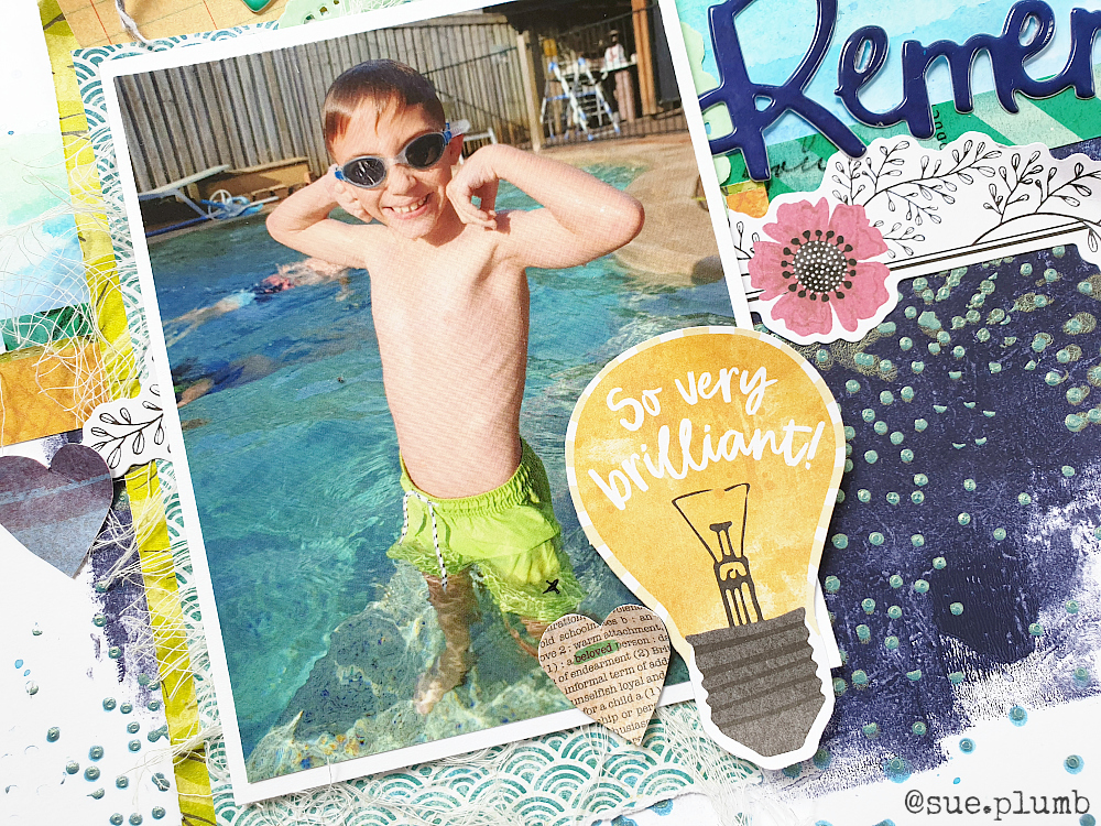
You will see that I kept the remainder of my page relatively simple, so as not to cover up too much of that beautiful background. The photo I used is one of my boys in my sister's pool during the Christmas holidays - we were celebrating the fact that after working very hard at swimming lessons that he had finally reached the stage he was competent (and confident) enough to swim in the deep pool without his swim vest on. A great achievement!


After adding the sticker horizontally across my page, I added some layers behind my photo using papers from the 'Color Kaleidoscope' collection, a small paper doily and some frayed gauze. I also tucked in a tag from the coordinating ephemera pack that I tied with a small piece of twine and used to write my journalling on.


I used the large lightbulb die cut with so very brilliant printed on it as I thought it was the perfect piece to go with the theme of my page. To the right of my photo I added another die cut, this time a black and white floral piece, along the horizontal line I had already created with the sticker.


I then used the sticker as the anchor point for my title word, which was the word remember from the VB Puffy Thickers pack, and I also popped a small heart from the same pack onto my journal tag. Below my title I added the attitude is everything phrase sticker from the 'Color Kaleidoscope' sticker book. Then I finished off my page with a few hearts that were fussy cut from one of the papers.

This was a super simple page to throw together after all the background work was already done and I love how it turned out. I am so excited that I now have the new VB 'Let's Wander' collection in the house - I think that will be getting a run on my table VERY soon!

Until next time, happy scrapping! X 

Saturday, 15 February 2020

Best Friends | Dust it Off Challenge


Hi everyone!
Back with another "just because" layout to share with you today. (I know, right?!) 
You may have seen my layout from last week that was inspired after watching a Facebook live from Vicki Boutin as she was creating watercolour backgrounds? (You can see the post with my layout HERE) After using Vicki's 'Color Kaleidoscope' collection for that one, I was inspired to create again whilst I still had it sitting out.

Here's what I created...
(Click on photos for a better view)


As I mentioned in my post last week, I don't have any VB mixed media supplies (yet!), so I had to make do with my current supplies. (If I use them I can totally justify any new purchases, right?!) One of my most under-used mixed media supplies is definitely my big set of Faber-Castell gelatos, so I thought it might be time to give them a workout. 

I began with a sheet of white cardstock as my background, and started by using the gelatos as a watercolour. To do this, I simply scribbled onto my non-stick craft mat, added a spritz of water to mix, and then moved my cardstock around over the top, touching it to pick up the colour as I went. Once I had finished with the first colour (teal), I went back and repeated the process with a light green.


Next, I grabbed a couple of small StencilGirl stencils from my stash. The first was a script style one called Rembrandt's Words. I love the large, loose font on this stencil, that was inspired by flowing script straight from an old ink pen. The second stencil is one of my absolute faves that I use often, and is called Organized Chaos, inspired by Van Gogh's "The Starry Night" painting. 

I chose to use my gelatos again, this time using a dry application method. To do this, I scribbled a small amount onto my non-stick craft mat and then used a stencil brush to pick up the pigment and brush it through the stencils. (I used a dark green and a dark blue.)


Next it was time for some papery fun! I already had a half sheet of paper from my previous layout with this collection, so I decided to make use of it first. I trimmed the edge off to shorten it, then tore it into a few strips. I used the pattern with the abstract circles for the main piece, then flipped the others over to show the contrasting green pattern on the reverse. I then layered them together and stuck them down on the page to provide my anchor point.


To make further use of the paper scraps I had left, I fussy cut a few of the coloured circles and tucked them in around the edges. I then created additional layers using patterned tissue paper and a small paper doily, before placing my photo on top. 


To embellish my page I used a mixture of the coordinating die cuts and stickers. I positioned my title alongside the photo and used the bold red arrow sticker (popped up on a little foam tape) to draw the eye into the subject. 

My handwritten journalling was added in the bottom right corner of the layout, which also helped create a natural diagonal flow through my page. 


To finish off, I added some small splatters of black ink and then some larger splotches using pink ink. I love the broad, eclectic mix of colours in this collection and hope to have another mixed media layout using it to share soon. 

I think I might make my own challenge to focus on using some neglected supplies from my stash and name it the #dustitoff challenge. If there is anything in particular you would like to see me use, or if you have any questions, please let me know in the comments. 

That's all from me today, thanks so much for stopping by. 
Until next time, happy scrapping! X

Saturday, 19 October 2019

She Was a Wildflower - Art Journal Page | Viva Las VegaStamps


Hi everyone!
Time to share another design team project with you. Today I have a simple, but fun, art journal page that I created for Viva Las VegaStamps using a variety of stamps; Distress Oxides; a Sharpie; watercolour pencils and inks.


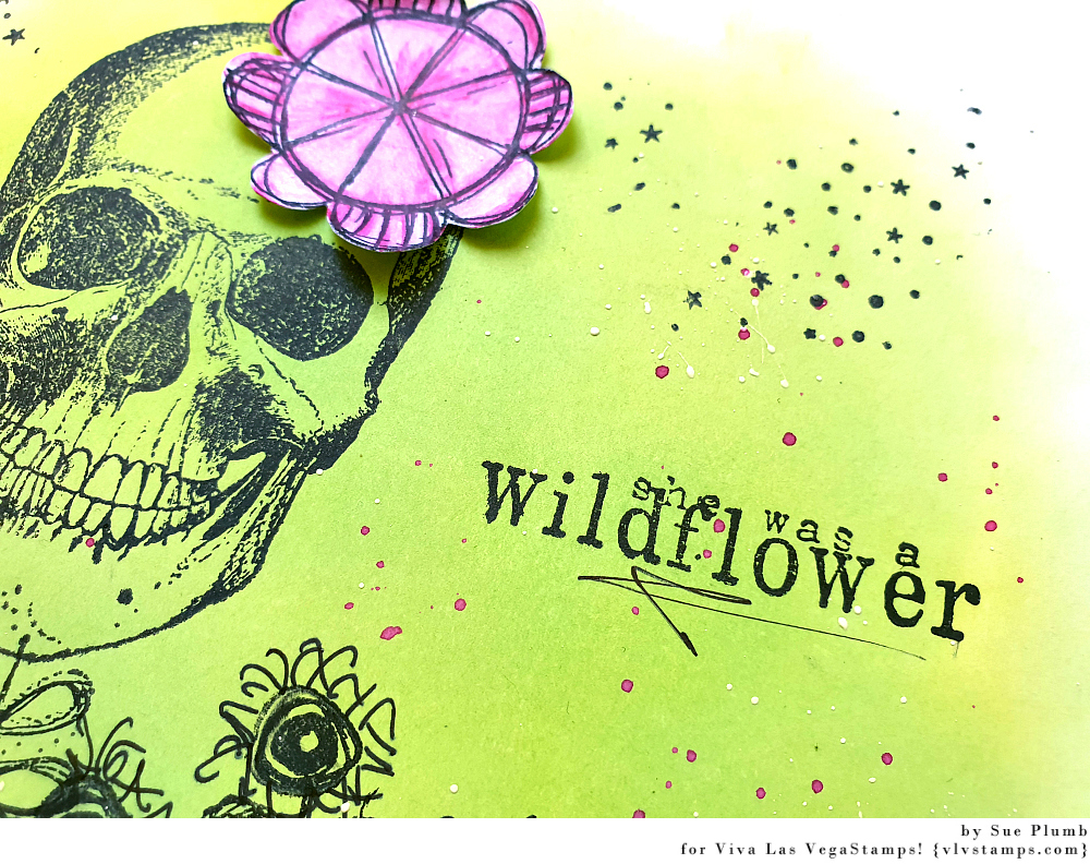
I began my page with an A4 sized sheet of white cardstock and Distress Oxides in the colours of Twisted Citron and Cracked Pistachio. I began using a foam blender to apply the Twisted Citron to an area in the centre of my page. I then blended some of the Cracked Pistachio into it to give it some extra depth.


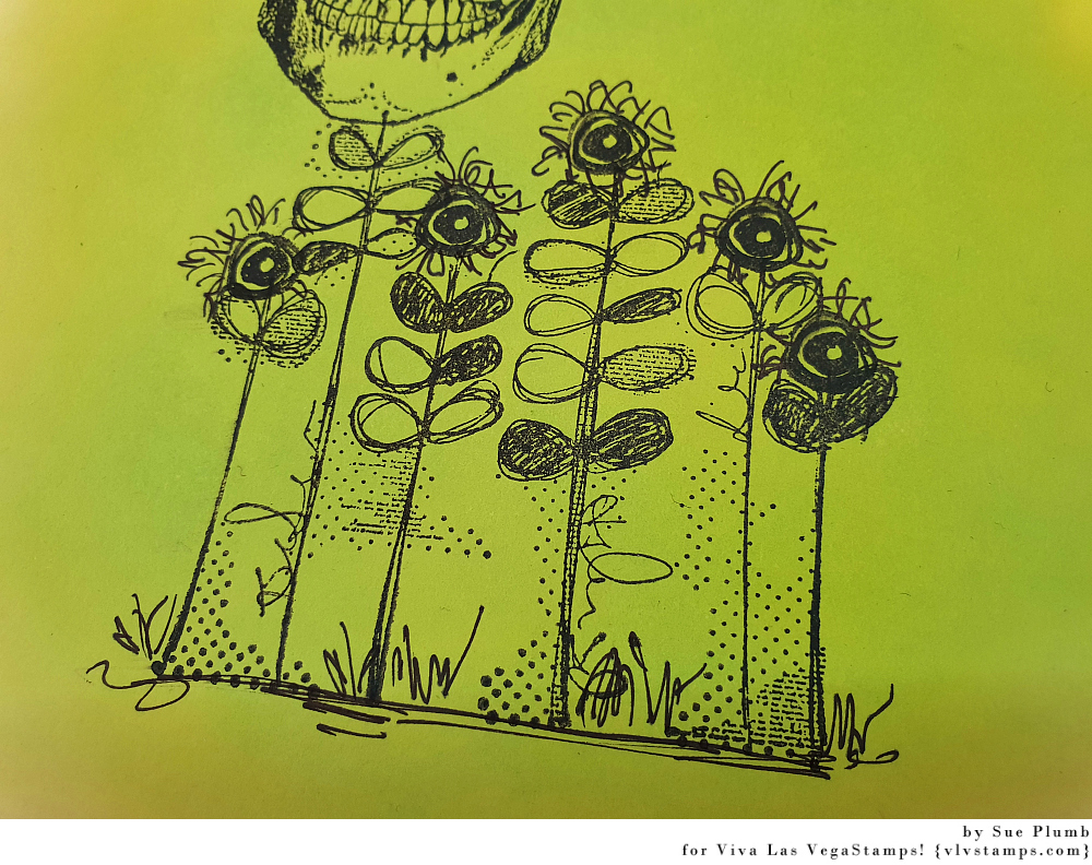
Once I had the colour down, I grabbed the Doodle flower/garden stamp to form the base of my focal image. I then stamped Skull stamp on top of one of the flower stems so it appeared as though it were growing in the garden.


I then used the Row of scribble circle/eyes to add "flowers" to the tops of the remaining stems.


I then added some extra detail by using a Sharpie to doodle some "petals" and also to add some grass amongst the bottom of the stems.


Next, I took the Striped pattern circle and stamped it out onto some extra white cardstock. I then fussy cut around the image before using watercolour pencils to colour it, and then blended it out with a water brush.


I then stuck the flower I had made onto the skull (like a flower in her hair). 


With the flower in place it was time to add my sentiment. I chose the She was a wildflower stamp and placed it alongside the skull.


I then added a little extra detail to my background by splattering some inks around the page using a small brush. I used 13Arts Ayeeda Ink in white and Colour Blast Colour Artist Ink in Slipper.


To finish off, I used the Sky of stars background to add some fine stamped detail.


That's all from me today, thanks for stopping by so I could share this with you. I hope I have inspired you to get inky too! X

VLVS stamps used:

Wednesday, 16 October 2019

New kicks, stencilled street shoes | StencilGirl®


Hi everyone!
Dropping by today to share a recent project I created for the StencilGirl® Creative Team. For this piece I was tasked with the theme "dress it or wear it". After a bit of thought I decided to dress up a pair of shoes so I could wear them all over town! (Who doesn't ever need a pair of new shoes, right?!)


I picked up a pair of plain white canvas high top shoes from Kmart (which were only $10 - bargain!) and removed the laces. (I was actually in need of a new pair of high tops after my last pair that had served me so well were recently retired to the bin.) This type of shoe is ideal for a makeover as the canvas provides a perfect blank slate just calling for layers of paint and ink to be applied.


Before I began, I decided I wanted my shoes to be street style - urban and a bit grungy; so I started by brushing my shoes with some grey Flutter Colour paint from Flutterby Designs to tone down the stark white. I used a "dry brush" technique - whereby the brush is relatively dry but still holds paint, to give scratchy-style brush strokes. This provided a perfect background to begin building my layers on.

Now it was time to add some patterns! I chose the Crazy Quilts Calm & Frenzy stencil designed by Andrew Borloz to start with. This versatile 9x12" stencil features a variety of bold patterns arranged into a quilt style design. This is ideal for creating entire backgrounds, or like I did, for using a small section to add specific details to a piece.


I paired the stencil with a darker shade of grey acrylic paint and used the circular pattern from the top left corner to add some circles to my shoes. I used a stiff, flat brush and a stippling technique to add the paint through the stencil then dried the shoes with a heat tool so I could move onto the next layer.


For my next layer I again stuck with the circular theme; this time choosing the Collage Textures and Patterns, Circles designed by Gwen Lafleur. 


I chose the section of the stencil that features scattered circles with X's in the centres to add the next layer of detail to my shoes. This time, rather than acrylic paint, I chose to use black StazOn ink and a sponge dauber to apply it through the stencil. (Be prepared for some messy hands when you do this!) 


With layers of grey and black already in place, it was time to stray away from neutral tones and add a hint of colour to my shoes. I switched back to acrylic paint, choosing one of my favourite shades 'Night' by Dina Wakley and to add another layer over the top.

This time my stencil choice was Organized Chaos designed by Cat Kerr - which happens to be one of my absolute favourite stencils (probably not hard to guess judging by how well used it looks in my photos). I love the random, organic design of this pattern; which Cat says was inspired by Van Gogh's iconic painting, The Starry Night. 


Again, I used a stiff brush and stippled the paint through the stencil; using a small section and moving it around the surface of the shoes.

Now it was time for some fun! With my background largely complete, it was time to add some focal points and colour to bring some real personality to my shoes. The stencil I chose that I thought would fit with my own brief of urban and a bit grungy, was the Go Your Own Way Mini stencil designed by Mary C. Nasser.


I used the 4x4" size stencil for my project, but this same design is also available as a 6x6" stencil here if you prefer larger sized arrows. 

Again I reached for a Dina Wakley paint - this time in the vibrant purple shade called 'Blackberry'. (I was inspired to use this colour so I could match my shoes with my nails and the streaks of colour in my hair.) I immediately loved the way the purple arrows popped against the neutral tones of the background!


After drying the paint with a heat tool, I decided to carry the arrow theme further by stencilling arrows around the edges of the soles of the shoes. Again I used black StazOn ink and a sponge dauber to stencil an assortment of arrows right around each shoe. 


At this point my shoes I decided my shoes definitely needed an extra pop of colour to give them a bit more personality, so I grabbed my Dina Wakley 'Turquoise' paint. I squeezed out a small amount of paint and then added water to thin it down before dabbing it onto my shoes randomly using a soft, round brush. 


Once that had dried, I noticed how dirty the edge line of the soles had become due to small paint and ink smudges. My answer? Cover it up, of course! I took a large black Sharpie and coloured over the rubber edge all the way around the shoes. Not only did this do the trick covering up those dirty smudges, but it also added an extra cool detail to my shoes - winning!


I still thought my shoes needed a little extra colour; so I watered down some more Dina Wakley paint (this time I used the deeper colour 'Ocean') and took my round brush and shoes outside to add some splatters over the top. I was really happy with how the extra splatters "grunged" my shoes up even more. 


To finish off my shoes, I wanted to draw more attention to the purple arrows, as they were the focal point of my design. To do this, I used a Faber-Castell correction pen to add extra white detailing over the top of the purple paint, which I thought really made them pop!


And with that my shoes were complete! Once dry, I added the laces back in and stood back to admire my handiwork - I had one pair of super cool, unique shoes that cost me little more than $10 and some time!


And of course I HAD to put them on and show them off to my family right away...now my kids are all lining up for a pair, so I guess I will be busy stencilling some more shoes soon!


Thanks for stopping by so I could share this with you. Until next time, happy creating! X