Friday 29 March 2019

Happy Days | Cocoa Vanilla Studio


Hi everyone!
Popping in today with another share for Cocoa Vanilla Studio using the brand new 'Happiness' collection. Recently, some of the CVS design team members were assigned a "scraplift" theme on the blog, where they chose a layout by a teammate and created their own version of it. I chose a gorgeous layout by Gwen Wruck that she shared last year using the 'Midnight' collection.
(You can read her original post HERE)

Here is Gwen's gorgeous "Happy Heart" layout...


And my "Happy Days" version of it...


I decided to document a photo of myself and some of my fave peeps that was taken at a scrappy retreat last year.

To create my page I began by inspecting the various elements and structure of Gwen's design and then interpreted those into my own page using the new 'Happiness' collection
Just as Gwen did, I started my layout using one of the mixed media style papers from the collection called Sprinkles - so soft and pretty. 


The next element I focused on was the double layered mat under the photo. I used two sheets from the 6x8" paper pad. (I love these size pads - they are perfect for matting 4x6" photos!)

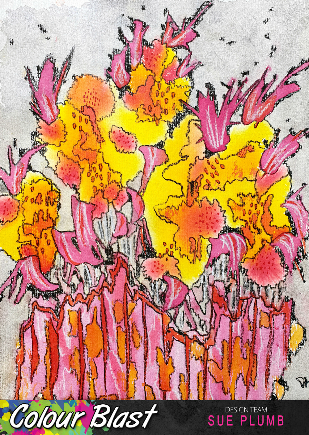
Once I had the photo matted, it was time to focus on all those beautiful flowers. Gwen had fussy cut hers from one of the floral print papers, so I did the same with the stunning Botanical Bliss paper. (I am totally in love with this floral paper - with its sketchy, watercolour style and all the vibrant colours.) I added some clusters around my photo, aiming for a similar placement as Gwen's. 


I also used a few pieces from the Die Cut Ephemera pack to add a few extra blooms into the bunches. (I especially like the additional of the little flower pot & jug, which I tucked underneath the paper so only the black sketchy style stems were showing.)
For my title, I used the words happy days from the Die Cut Titles pack.


Alongside my photo, I added one of the Flair Buttons, just as Gwen did in her original layout. To represent the banner that Gwen had used, I added one of the sweet tassels and part of the wreath frame from the Die Cut Ephemera pack.

Along the bottom edge of my photo I added the good stuff banner from the Accessory Sticker sheet, and a die cut heart.


To finish off my layout, I added some of the Clear Stickers around my page - a butterfly, a heart and the two watercolour painted marks stickers which I placed in a similar position to the little spots on Gwen's original background paper.

I just love how this page turned out - it's amazing how similar, yet completely different, the two pages turned out simply by using two different collections. Thank you Gwen for the inspiration!
I will be back again soon with another project to share. Until then, happy scrapping! X

Tuesday 26 March 2019

Remember This | Colour Blast


Hi everyone! 
I've got a mixed media scrapbook layout that was created for Colour Blast to share today - this one is a bit soft and pretty (and probably a bit more minimalistic compared to what I usually do). It features a combination of Colour Spray, Colour Shimmer Spray, and Colour Paste. It also features a photo of my kids that I took at Easter time at school last year.


For this layout I decided to pull out some products that I hadn't used in a while - my sprays. (Since the Colour Artist Inks were released I have tended to use those more often as I like the brighter, more vibrant colours and they also tend to fit better with the techniques I use.) However, I didn't want my older supplies being totally neglected so I decided to re-visit them for this page. 

I began by sticking a stencil over the top third of my page, masking off the areas that I din't want sprayed with the Colour Spray using scrap paper. (I always stick my stencils down with old washi tape, as it makes removal so much easier afterwards.) I started with a light spray of Lagoon, then added a little Saffron over the top. 


Once I had applied a light covering, I carefully removed the stencil and allowed it to dry. You can see how I chose a stencil with a very "organic" pattern, and how when I masked off the top edge I did it with paper torn unevenly to avoid a straight edge along the top.


Next, I want to go for a completely different look in the bottom portion of the page. I selected some complimentary Colour Shimmer Sprays (Deep Water, Sunshine and Apple of My Eye) and applied the spray directly from the bottles using a brush. I added small amounts of colour along the bottom edge of the stencilled section of the page, holding the cardstock vertically and allowing the colour to run down the page. 


I started with the Deep Water spray, then followed with Sunshine and Apple of My Eye. I allowed a short time for each colour to dry a little before moving onto the next one. I also tried to place the colours to limit the amount of blending that would occur, as I wanted each one to be visible. (You can see how they look once dry in the bottom photo below.)


With all my "runs" in place, it was time to work on the line where they met the stencilled pattern above on the page. I wanted to add a little texture, and also define the focal point for my layout, so I chose a stencil so I could apply a single floral line. Just like the sprays I had used, I also wanted a combination of colours so I chose Sunshine, Singin' the Blues and Apple of My Eye Colour Pastes


I used a narrow palette knife and started with the Sunshine paste, applying it to the stencil without covering it completely. I then added the Apple of My Eye and Singin' the Blues pastes, filling in the gaps I had left and overlapping the colours. 


The result was a gorgeous mix that showcased all three colours within the stencilled design, and blended perfectly with the sprays I had already applied to the page. I then left the paste to dry.


Once dry, I was happy with my background and set about creating the structure of my page. Again I did some stash-busting and used some older supplies (this time some scraps of a Jillibean Soup collection from long ago) that matched perfectly with my colour palette.


I added a torn strip of paper along the focal line of my page, as well as a couple of strips along the top edge of my page. I then used various pieces of paper, along with coordinating die cuts and stickers to create layers under and around my photo. 


Next, I fussy cut a number of butterflies from one of the patterned papers, which I adhered along the paint runs in the bottom section of the page. I stuck each butterfly by the middle section only, allowing me to bend up the wings away from the page to give it dimension.


To help balance out all the butterflies in the bottom section of my page, I also added a small embellishment cluster near the top edge of my layout. 


To finish off my layout I used a roller stamp and some grey ink to stamp out the word smile repeatedly near the butterflies. 

That's all from me today, thanks for stopping by. I will be back soon with another project to share. 
Until then, happy scrapping! X

Tuesday 19 March 2019

Book Week 18 | Viva Las VegaStamps


Hi everyone!
Popping in with my latest Viva Las VegaStamps design team project for you. Today I am sharing an 8.5x11" mixed media scrapbook layout I created to document some photos of my daughter from last year. These were taken when her school was doing a book character parade to celebrate Book Week.


To create my page I first decided where my photos were going to be placed, then painted a quick background using Dina Wakley acrylic paints. Once the paint was dry, I added my stamping using black StazOn ink.


At the top of my page I used the This Book Belongs To: stamp - adding it twice, then once again below my photos. I then added the Chevron Banner and Triangle Banner, so they would adjoin each of my photos and help create flow across the page. 


At the bottom of my page, I added the Be Adorable quote stamp (which is filled with sentiments that I absolutely love that are very appropriate for my daughter). 

I then added a few papery layers to go under my photos. First, I stamped a pair of paint sample cards with the Library Return Card stamp. I love using these cards in my layering, as it makes it so easy to coordinate colours and they are free from my local hardware store. 


I also added some book paper, a paper doily, washi tape, frayed gauze and some black cord into my layers before sticking the photos on top. 

For my title, I used Cocoa Vanilla Studio alphabet stickers, then stamped the "18" using the Grunge 1 and Grunge 8 stamps. 


After that, it was simply a matter of adding some quick journaling with a felt pen and I was done. I couldn't believe how quickly this page came together - I love it when things just fall into place! 
Thanks for stopping by today so I could share this, I hope I have inspired you to get inky too.
Until next time, happy scrapping! X

VLVS stamps used:
Grunge 1 

Sunday 17 March 2019

My Happiness | Cocoa Vanilla Studio


Hi everyone!
Today I am sharing my latest Cocoa Vanilla Studio design team project with you using the brand new 'Happiness' collection. If you are sensing a little excitement, you would be right! I know it's early to say, but I think this CVS collection could be my favourite one EVER. The gorgeous vibrant colours; the stunning florals; butterflies; and sweet, happy sentiments - all totally my jam! 

For my first page, I couldn't help but document a photo of my beautiful family...


I started my layout with the gorgeous rainbow striped Good Vibes paper as my base, cutting a piece of white cardstock down to 11x11" to fit inside it.

I then set about creating a layered mat for my photo against the right edge of my page. I used a small piece of the Good Vibes paper (cut from behind the cardstock); along with a frame that was fussy cut from the Frame of Mind paper; and a couple of pieces from the 6x8" paper pad.

I also added some scrap cardboard to the back of my photo and then tucked the die cut wreath frame from the ephemera pack around the corner before adding it on top.


I embellished around my photo using a combination of pieces from the Die Cut Ephemera pack and Accessory Stickers sheet, adding foam tape under some of them to create dimension. My title was created using words from the Die Cut Titles pack, and also adhered with foam tape.

To balance my page design, I added a floral cluster in the top left corner of my page using a piece fussy cut from the stunning Botanical Bliss paper. I also added a couple of cut die cut tassels from the ephemera pack.


To complete the "visual triangle" on my page, I added another floral feature along the bottom edge of my layout. Again, I used fussy cut blooms from the Botanical Bliss paper; as well as some die cuts from the ephemera pack and stickers from the accessory sticker sheet.


With the majority of the page complete, I decided to add some additional highlights using Faber-Castell watercolour pencils. I simply added some pencil along the edges of the some of the embellishments, and then blended to extend the colours out using a water brush.


To finish off my layout I added some small word stickers from the Accessory Sticker sheet below my title, and a then few Clear Stickers around the page.


I was so happy with how this layout turned out - how could you go wrong with a collection as stunning as Happiness is though, right?! Trust me, you NEED this one!
This collection is currently shipping to retailers and should be appearing in a store near you soon.
Until next time, happy scrapping! X

Friday 15 March 2019

Pretty Fierce | Scrap the Girls March Challenge


Hi everyone!
Popping in today to share my take on the March challenge at Scrap the Girls. If you haven't already seen the challenge, it's called "90's Chick"...


"It's time to be a little nostalgic and be inspired by one of your Favourite 90's films.  Create a layout inspired by it.  Now, this challenge isn't about reliving old photos (you can if you want), nor is it about picking one of the films on the moodboard (but you can if you want to) rather it is about being inspired by the style of the era or the genre of the film and using it in a modern layout.  When you link up your entry (however you choose) you MUST share which movie inspired your layout to go in the running for a prize."


For my layout I chose to be inspired by the 90's cult slasher movie "Scream"...


And here is what I came up with...


 I chose photos of my daughter taken at Halloween to represent the horror genre; and the original movie poster as the inspiration for my page design - using a black and white (with a tiny touch of blue) colour palette.

I started my layout with black cardstock and applied some Mont Marte Dimension white acrylic paint to it roughly using a wide brush. 


I then added some stamping over the top using stamps from Viva Las VegaStamps; and some texture using a Dusty Attic stencil and Colour Blast 'Dusty Charcoal' Colour Paste. I also added some white and pale blue splatters using thinned down acrylic paint. 


Once my background was dry, it was time to build some layers for my photos to sit on. I used various pieces of tissue paper, a paper doily, punchinella, plasterers tape, washi tape, and frayed gauze (many of these items from D-lish Scraps); stapling them in place before adding my black and white photos on top.


I then added some embellishments to my page - small pieces of blue wire, stapled in place; some wood veneer stars that I coloured white with a Posca pen; and my title - a fabulous custom acrylic piece from Corbett Creations


Thanks for stopping by today so I could share this with you. I am so looking forward to seeing everyone's interpretations of this challenge! You have until the end of the month to enter, and our sponsor is the awesome D-lish Scraps.
For all the challenge details, or for more inspiration from the design team, check the blog post HERE
Until next time, happy scrapping! X

Sunday 10 March 2019

Abstract Floral painting | Colour Blast


Hi everyone!
Popping in today to share a Colour Blast design team project with you. Today I have something a bit different - an abstract floral painting I created using Colour Artist Inks. 

This painting came about one day when I was having a bad day. I felt like losing myself in something creative, but just wasn't sure what I wanted to do. As I was sitting and looking out the window, I was staring at some flowering bushes over the fence in my neighbours yard. That was enough inspiration to get me started, so I pulled out a sheet of watercolour paper to see what would come out.

The result was an abstract floral painting, inspired by the colours and shapes of my neighbours plants...


I took photos along the way to document my process so I could share it. These are the supplies I started with - a sheet of watercolour paper and a range of Colour Artist Inks in warm tones (Slipper, Cranberry, Sunburnt, Citrus, Cider, Barley, and Spice.)


I started my misting my paper lightly with a water spray bottle to make it a little wet, to help the inks to wick out as they hit the paper. 
I began with the lightest tone - Citrus as my base, and then built on it from there; adding some smaller areas of Cider over the top; then smaller again with Cranberry. I used a small round brush and a gentle dabbing motion to apply the ink to the page, allowing the paper to naturally draw the colour from the brush.


You can see in the close up below how the inks wick out with the use of the water (bleed / spread across the page) and then in the second shot below how they look once they had dried.


Once the base colours had dried, I again used my small round brush, but this time used a sweeping stroke to apply some of the pink Slipper ink to the page. As these are dye based inks, they will reactivate and blend when wet, so I added the strokes into the spaces around and between the other colours.


I then allowed the Slipper ink to dry completely before adding more detail. The next colour I used was Sunburnt - used to apply the narrower sweeping strokes over the Slipper ink and the clusters of small dots. I used Spice to apply the small, short strokes. 


Now it was time to add my "fence" to the bottom section of the page. I used Slipper for the base colour, then Sunburnt and Cider for the detail and highlights over the top.


With all the inks in place, I left the page to completely dry before colouring in the background. I wanted a soft tone so as not to draw away from the focus of the picture, so I used Stormy Weather Colour Shimmer Spray (a nice soft, shimmery grey) and simply dipped my small brush into the bottle and painted in the remaining blank area of the page. I took care not to overlap any of the inked areas so as not to muddy the colours.


Once the background was dry, it was time to add the final details. I used my Stabilo All pencils (black and white) to draw in the detail over the top.


I started with the black pencil, using it to trace the lines around and between the colours; following the naturally occurring lines formed by the inks. I also used the black pencil to colour in any remaining spots of white around the edges, between the flowers and also on the background.


To finish off, I added a few highlights with the white pencil.


(I was so happy with the result of this painting that I even framed it!)


And there you have it - a fun, simple project that you can try yourself with very few supplies. You don't need any particular artistic talent to be able to create a project like this, just play with your supplies and see what comes out.
Until next time, happy creating! X