Hi everyone, today I have another project using the awesome new 'No Limits' collection from Cocoa Vanilla Studio. (Loving this collection SO much!) This layout features a photo of my hubby and one of my sons that I took while they were busy doing work in our garden recently. (This boy loves to help his Dad with projects in the yard!) I decided to use the wood grain print from the Big Bang patterned paper as my background for this page, as I thought it would work well for the outdoor theme.
You can see I have added some light mixed media layers to my background paper. I used a combination of acrylic paint, a stencil with ink, stamping, and splatters.
I used a mix of layered patterned papers for the focal area of my page that included Stardust, Orbit and Latitude and I used distressing, tearing and some frayed gauze to add texture. I also tucked in a paint sample card from my stash to help draw in the green on my sons hat, which I thought also worked well with the DIY that was happening on the day.
I used Die Cut Title words for my page title, but then used the always be your awesome self quote card from the Universal cut apart paper below it as a subtitle. Both of these were popped up from the page like my photo to create dimension and help them stand out from the background.
To embellish my layout I used lots of fussy cut stars from the gorgeous Nebula paper, which I combined with pieces from the Die Cut Ephemera pack and Accessory Sticker sheet.
I also added a few pieces from the Chipboard Sticker sheet which also provided some extra dimension.
Of course I couldn't help but include some of my favourite embellishment from this collection - those stunning Puffy Stickers. (Seriously, I wish I had a million of these things!)
If you would like to see how this layout came together, you can watch my process video here:
Thanks for stopping by today, I hope you are feeling inspired to use up those scraps on your desk! Until next time, happy scrapping. X
I've got a fun mixed media layout to share today that was created just for ME! If you have been around for a while you would already know that mid last year I took the plunge and subscribed to Hip Kit Club's monthly scrapbook kit. Unfortunately, not long after that I had to pack all my craft supplies away and move house, and I haven't really had a chance to play with my kits since. So it was high time that I crack one open and get some creating done! I chose the August kit, which was a bright, fun kit full of a mix of different brands. I chose to document a series of photos of myself after a visit to the hairdresser last year.
I started my layout with a sheet of 300gsm cardstock and Mont Marte Dimension paint in Paynes Grey. I used my favourite Number 4 brush and the dry brush technique to add some background colour to the page. I then used floral stencil from StencilGirl (Rose Bouquet) and BeeArtySnow White Colour Paste to add some subtle detail over the top of the paint.
Next, I cut a large piece of one of the Hip Kit exclusive papers, choosing the B side for the beautiful orange colour and subtle pattern. (I always love a B side!) I distressed the edges of the paper using scissors (I was scrapping away from home and didn't have my distress tool with me) and then used my fingernail to ruffle it up a bit more. I used another of the Hip Kit papers featuring a black and white sketchy style floral pattern to add a piece above and below the orange paper. I tore along the edges of each strip to add texture. On top of the papers I added a dark grey paper doily and some frayed gauze and before placing my photos on top.
When it came to the embellishments I actually found myself a little challenged. Most of the embellishments were either the wrong colour for the palette I had chosen (I didn't really think it through before I started), or didn't fit with the theme of my page. In the end I chose the Floral Study paper by Vicki Boutin, and fussy cut several flowers from it to use as my main embellishments and tucked them in around my photos.
I chose the word smile from the Amy Tan Thickers in the kit which matched well with the pops of red from the roses on my jacket. I also found a few small pieces in the Simple Stories ephemera pack that matched with the warm tones I was using and added them to the page.
Luckily, the Simple Stories foam alphas in the kit were the perfect match for the main paper I had chosen, so I used them in my title. I finished off my layout with some of the Prima crystals; handwritten journalling; some stamped phrases; and tiny red splatters using Barn DoorDistress Oxide.
Overall I was happy with how the layout turned out, but I would probably think more carefully about how my choice of colours / photos will work with the kit before I dive in next time. Oh well.
If you would like to watch how I put this layout together, I have a video available on my YouTube channel here:
If you have any questions, feel free to leave them in the comments section of my video, here on my blog post, or connect with me via my Facebook page.
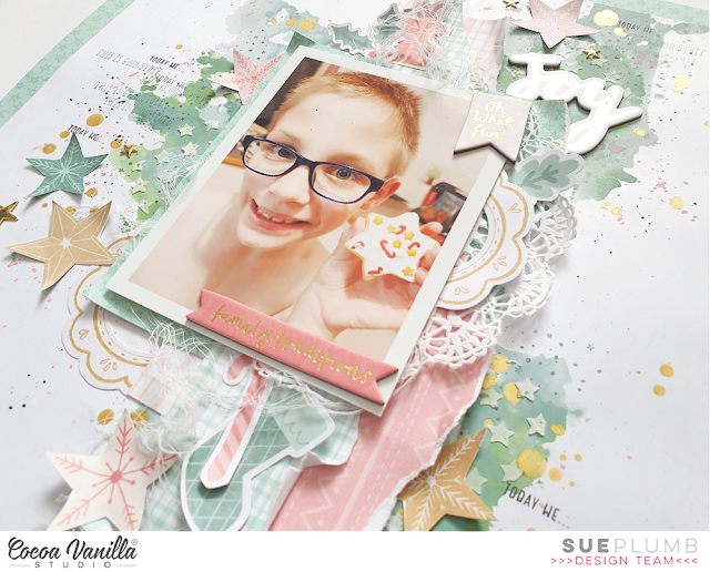
Hi everyone, popping in today with a new project to share with you. This layout was created for Cocoa Vanilla Studio using the gorgeous new ‘Joyful’ collection, and was inspired by the December monthly challenge. First, here’s a look at the “Bells & Baubles” mood board designed by my fellow DT member Tarrah…
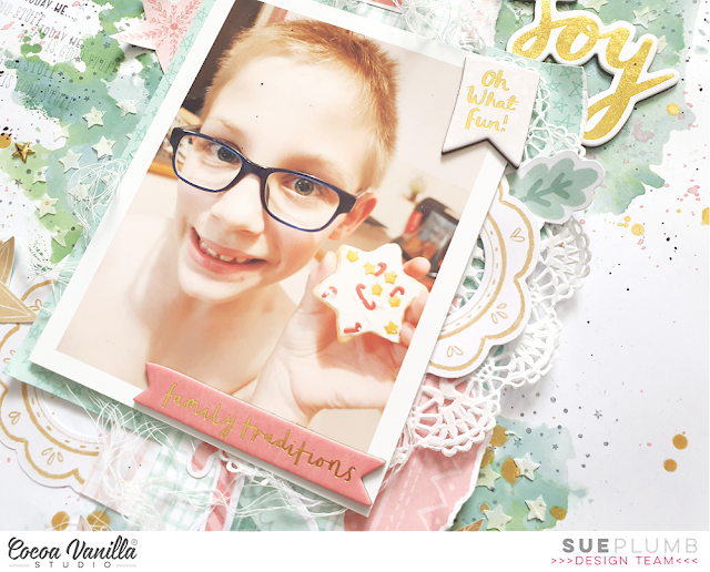
The image from the mood board that caught my eye was the one in the top right corner, with the pretty Christmas cookies. It immediately reminded me of making cookies with my kids, a tradition we do together every Christmas. I decided to document a photo of my son that I took last year with one of the cookies he made.
For my layout I wanted to create a mixed media page, so I started with 300gsm white cardstock and some Distress Oxides. I layered blue (Speckled Egg) and green (Rustic Wilderness), then used modelling paste to add some small stencilled stars over the top with a StencilGirl stencil. Next, I used another Distress Oxide (Worn Lipstick) to add small pink splatters, then stamped some tiny stars using a rubber stamp from Viva Las VegaStamps and black ink. I finished off with some big splatters of gold Heidi Swapp Color Shine, and set it aside to dry.
Once my background was dry I cut the cardstock down to measure 11×11″ so I could mount it onto some patterned paper. I chose the B side of the Deck the Halls paper, which is a soft green and features small stars on it. I cut away the centre portion of the paper so it wasn’t wasted, then mounted the cardstock on it to form a border.
I immediately used the centre piece had just cut away to create a mat for my photo, adding a torn edge down one side for texture. I then chose a few other small pieces of patterned paper (most from the A5 Paper Stack), which I cut and tore into various shapes, then stacked together to form more layers behind my photo. I also tucked in half of a white lace doily before securing it all together with staples. (This enabled me to move the entire stack as a whole piece without dislodging any of the pieces.) On top of my stack I added some frayed gauze for soft texture, then finally, my photo on top.
For the embellishments, I started with the Chipboard Stickers, choosing the gold foiled word JOY as my page title. From the same pack I also selected the small oh what fun! flag piece, which I affixed in the top corner of my photo; and the family traditions banner, which I stuck along the bottom edge of my photo.
From the Die Cut Ephemera pack I chose the green stocking and candy cane, when I layered together below my photo. Above my photo I added a little present and a small sprig of holly. I also chose a circular frame from the ephemera pack, which I cut in half and tucked into my layers on either side of my photo.
Scattered around my page, I added some large stars, which were fussy cut from the Making Spirits Bright paper. (These tied in beautifully with my photo and the star theme I had established with the stamping and stencilling.)
I finished my page by adding yet another variety of star – the pretty puffy gold ones from the Puffy Gold Title Stickers. (These are SO gorgeous!) I then added some stamped phrases and the date, and some black ink splatters.
If you would like to see exactly how it all came together, you can watch my process video below:
I have a bonus pocket page that I created as a companion page to this layout. I’ll be sharing it over in the Cocoa Vanilla Studio Community group next week and then here some time after that, so keep your eye out for it. In the meantime, I would love to see you play along with our December challenge, entries close December 31st.
Hi friends! I've got an extra project to share with you today - a layout that was created for the Scrappy YouTubers Lift-a-thon. (I know, it sounds kind of strenuous doesn't it? I promise it's not!)
This huge YouTube hop has a long list of very talented participants and I was so happy to be able to take part. For the hop, each participant scraplifts a project from the next person on the list, which means there is a new video going up every day for well over a month. (You can find the full list of participants and a link to each of their channels in my video description on YouTube.)
I was tasked to scraplift a project by the lovely Joanne Bartell, and below is a shot of the pretty layout I chose to lift.
I decided to put my own spin on Joanne's page by creating a boy page for my layout, and I used the 'Legendary' collection from Cocoa Vanilla Studio.
I documented a sweet photo of my boys that I took one day when one of them wasn't feeling well.
Besides the 'Legendary' collection, I also added some mixed media to my page using a Distress Oxide with a cool stencil from StencilGirl, and some stamping using one of my favourite background stamps from Viva Las VegaStamps.
I added texture to my page with the use of frayed gauze, and included metallic elements of wire and staples to help give it a masculine feel.
I also included a handmade star embellishment from Charms Creations, which I layered with the Cocoa Vanilla flair button.
I was so happy with how this layout turned out - I do love a good boy page!
If you would like to see exactly how this all came together, make sure you pop over and watch my process video. (And don't forget to visit all the participants as the hop progresses too.)
Popping in today to share my latest project for the StencilGirl® Creative Team. For today's project I was tasked with the theme "Pastiche". If you haven't been following the team projects that have come before me, then you may not be familiar with the term? Simply put, a pastiche is a work of visual art, literature, theatre, or music that imitates the style or character of the work of one or more other artists. Unlike parody, pastiche celebrates, rather than mocks, the work it imitates.
I began by choosing the work of an artist whose work I find not only beautiful, but also incredibly inspiring. Being Australian, I couldn't go past picking a fellow Aussie, so the artist I chose was Clair Bremner. Clair creates paintings that are inspired by nature, and she uses an amazing combination of both colour and form to translate the things she sees into stunning works of art. I had long wanted to try working in Clair's style, so this provided me the perfect opportunity.
Here's a sample of Clair's work from her online gallery so you can see her style...
I chose this example of Clair's work, as I decided to use a similar colour palette and materials. I chose watercolour paper for my substrate (A3 size), and like Clair, I worked with acrylics.
Here's my piece, I entitled "Enchanted Garden"...
I used a combination of brayer, silicone spatula, and brush to apply my base colours to the page. I worked in a random fashion, but unlike Clair's piece, I left some white space as I like the balance between busy and clean.
With the base colours down on the page, it was then time to begin building the layers. The fist stencil I chose was Bouquet Greenery by Wendy Brightbill. This 9x12" stencil features large leafy branches, which I thought would work for trees in the scale I was working in. I used Naples Yellow paint from Monte Marte to provide a contrast to the background colours, and applied the paint using a stippling technique with a brush.
Next, I moved onto some Dusky Pink paint and the Playful Petalsstencil designed by Jennifer Evans. I masked off a small section of the stencil and used the same stippling technique to add some groups of petals that I thought would make great bushes.
At this point I felt my painting needed a little more "light", so I chose white paint for my next layer. The stencil I used was June Pfaff Daly's Inspired by Frida stencil. Once again, I masked off a small section of the stencil, this time a leafy branch, and used it to add some branches into my layers, making sure to overlap them with other portions of my design to help add depth to the piece.
While I was using the white paint, I also added some sweet little fern branches in the foreground using the Maidenhair Fern stencil by Rae Missigman. I adore the whimsical style of the fern branches on this stencil, and thought it was perfect as part of my tribute to Clair's work.
The final stencil I used was the super cute Daisies 6 by Terri Stegmiller. In order to be able to be very controlled with my placement, I masked off a single daisy and used Marine (a very dark blue) to add a few flowers around the page. (Because this stencil design was a little more delicate, I simply painted through the stencil with a small flat brush rather than stippled with the larger brush.)
Once all the painted layers were in place, I used a black Sharpie, white Sharpie and a Stabilo All pencil to add the finishing touches to my page. This was simply a case of adding a combination of small mark and lines over the top of the paint. (Make sure the paint is totally dry before doing this, or you will completely ruin the tip of your pens!)
I am so happy with how this piece turned out, and I really hope I did justice to Clair's amazing style. You can view more of Clair's work on her website: http://www.clairbremnerart.com/
If you would like to watch me create this painting, I have a video of my process available:
Thanks so much for stopping by today so I could share this with you. Until next time, happy creating! X
Hi everyone, today I am sharing my take on the recent “school” theme I was tasked with for Cocoa Vanilla Studio. For my layout, I decided to document a photo of one of my boys with the academic award he received at the end of last year. This was the first time he had ever received an award like this, and it was a very big deal for him (and only came after a big attitude adjustment and a lot of hard work). I knew the ‘Boys Rule’ collection would be perfect to coordinate with the colours of my photo.
I began this layout with the printed backing sheet from the Large Die Cut and Backing Kit. I had already used the die cut top piece in a separate project, so I had this left over in my stash. I was drawn to use it because of the blackboard style print, with the doodled chalk border around the edge. As I only wanted to use the border part for my background, I cut the centre from the page and kept it aside for some fussy cutting later. I then got to work on some white cardstock that I had cut down to measure 10.5×10.5″.
I added colour to my background by swiping an ink pad to create vertical stripes on the page, then used a wide brush dipped in water to blend the ink out. I then used a stencil with a random spot pattern and grey ink to layer detail over the top.
For my paper layers, I used a combination that included the star print Happy Go Lucky; Expressionist; and a fabulous pop of green from the Straight & Narrow. I used torn edges and frayed gauze to add texture to the page.
When it came to embellishments, I used pieces (tag, label, frame) from the Die Cut Ephemera and Miscellany packs; as well as some stars that I fussy cut from the backing sheet I had begun my layout with.
I used an arrow from the Chipboard Pieces pack to help draw attention to my photo; and added a metallic touch by using some staples around the page. My title was a combination of the die cut word kid from the ephemera pack combined with awesome cut from the cut apart paper.
I used the Clear Stickers to scatter some phrases around the page, and three black crosses from the sheet too. I stamped a little extra detail on the background using a stamp with a random circles and dots pattern (similar to the stencil pattern) and finished off by stamping the date.
I am really happy with how this layout came together, and I hope I have given you some inspiration to create your own page to document some of those school photos, or even just a boy layout.
If you would like to watch me put this one together, I have a process video available:
I know my poor blog has been lacking content lately, I had a break away from my desk after my mum suddenly passed away and with my kids home on school holidays as well I hadn't been creating. I have just realised that I hadn't actually even shared this layout, which is my take on the January challenge for Scrap the Girls. This month's challenge is called "Dead Men Tell No Tales" and is an awesome inspiration image that looks like this...
And here is my take on it...
As you can see, my page has a completely different colour palette to the image, but I promise you the inspiration was there! Initially I was drawn to the mermaid's pose, which reminded me of my daughter in this photo. Only instead of a boat and water behind her, she had fire. I used the photo to dictate the colours for my layout, using a mix of Ranger Distress Oxides to create my "firey" watercolour background.
Next, I drew inspiration from the lace pattern on the mermaid's tail to use my Heart Mandala stencil from StencilGirl along with black acrylic paint to add the pattern behind where my photo was going to go. Then it was time to create some papery layers!
I used a floral print tissue paper (not sure of the brand, sorry - all I know is that I purchased it at a store in the US when I was there - it might have been Michaels?) I added a torn piece across my page where my photo was going, then replicated it with a smaller piece in the top right corner of my page. The reason I chose this paper was to draw in the floral theme from the inspiration picture.
Next, I cut some patterned paper to mat my photo, which I also layered with a small paper doily and some frayed gauze for texture. I then began building my embellishment clusters around my photo. I used a variety of Vicki Boutin stickers; some twisted coloured wire; and some glittered butterfly die cuts I found in my stash. I also added a Heidi Swapp acetate word along the bottom edge of my photo.
I then went back to the tissue paper in the right corner of my page and used some of the same elements again to create a smaller cluster. This cluster helped provide balance to my page, because it was quite "bottom heavy" at this point. I finished off with a little bit of stamping using my fave Doodle Dots stamp from Viva Las VegaStamps.
Thanks so much for stopping by today so I could share this with you. if you haven't already entered the challenge at Scrap the Girls, you have 4 day left to get your entries in to be in the running for the prizes. You can get all the details, as well as see what the rest of the design team created for this challenge HERE.
I am popping in today to share another layout I created for the recent Kitaholic Kits 'Spring Fling' cyber crop. For this challenge the criteria was a sketch that looked like this...
If you have known me for a while, you will already know that following sketches is not my strong point. I always begin with good intentions, but once I start working on my page it tends to take on a life of its own. I do always try to include the key elements though, and I think I achieved that here.
Here is my layout, "This is Life"...
I decide to work with the Cocoa Vanilla Studio'Daydream' collection for this layout because I just can't get enough of it! I started with the soft pink watercolour print on the reverse side of the Stepping Stones paper as my page background. Instead of using patterned paper for the large vertical block in the sketch, I decided to use paint instead. I added another layer over the top using Vicki Boutin gold glaze and one of my favourite StencilGirl stencils - 'Rembrandt's Words'.
With my photos I decided to use three, instead of just the two shown in the sketch. I still used two smaller ones, but added the third larger one as a feature in place of the title / journalling block. The photos were of my daughter with her phone (which is usually glued to her hand), and the reaction I got when I asked her to look up from the screen.
I used pieces of patterned paper to add some layers behind my photo, and a paper doily and a circular die cut frame to represent the round element from the sketch. For the smaller vertical blocks in the sketch I used strips of washi tape.
For my embellishments, I used a mix of coordinating products from the 'Daydream' collection - Die Cut Ephemera; Accessory Stickers; Puffy Heart; Flair Button and Die Cut Titles. I also used a handmade star from Charms Creations.
I finished off my layout with handwritten journalling, stamped phrases and splatters of black ink.
If you would like to see how I put this layout together, I've got a process video on my YouTube channel that you can watch below:
Thanks so much for stopping by so I could share this with you. Until next time, happy scrapping! X