Friday 13 December 2019

Jolly as F*ck | Scrap the Girls December Challenge


Ho, ho...no!
Can you believe we are on the final countdown to Christmas?! If you are one of those people I affectionately refer to as "Christmas freaks" then you have probably been ready for the big day since mid-June and have had your tree up for at least a month already. (You are probably also the sort of person that thinks hot cross buns DO belong on the supermarket shelves at the beginning of January?!) *mumble, mumble*

If you are more like me however, then Christmas always seems to creep up waaaaay too quickly every year, you've only just put your tree up, and at some stage next week you will start preparing everything else. (Look away now Christmas freaks! hehe)

So all this Christmas talk has led me to the latest design team project that I have to share. This page was created for Scrap the Girls for the "No Traditions Here" challenge this month. This is the image inspiration we were provided with the instructions "could be colour, what you see or what you read".


I bowed to the Christmas theme, and in keeping with the challenge title, there was nothing traditional about my page...


I used the gorgeous Cocoa Vanilla Studio 'Happiness' collection for this page, which I combined with my own watercolour background.


I started by fussy cutting the beautiful wreath from the So Fresh paper, which I backed with some scrap cardboard to help pop it up from the page, and then set it aside to create the background.


I used a Colour Blast 'Deep Water' Shimmer Cube (unfortunately these are no longer available, but you could substitute any watercolour paint) to create a ring on my cardstock where my wreath was going to sit. Next, I added some small splatters of gold, green and pink inks before sticking my wreath down over the top.


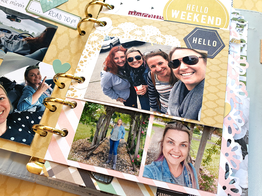
I then added my photos, tucking them under the edge of the wreath on the left side of the page.
For my title, I used the Jolly as Fuck Christmas ornament (with gum leaves - also available in a bottle brush version) from Kinder Kreations. These ornaments have a hole so you can add string or ribbon to hang them, but I couldn't resist giving this one a starring role on my layout instead. I painted it with a metallic gold acrylic paint to give it a festive feel and added some twine to the top of it.


To compliment my gold title, I grabbed a few cut file leaves I had left over from a previous project and painted them to match. I then tucked them in under the edge of the wreath, leaving some of them white as well. (This leaf design is from the Cocoa Vanilla Studio 'Colour Me Happy' cut file set.) To help blend my title with my page I stuck a small flower and butterfly from the 'Happiness' Die Cut Ephemera pack onto it.


 To finish off the page I added two flair buttons to my wreath from the 'Happiness' flair button set and some handwritten journalling with a felt pen.

I hope you will join in with our challenge this month - you can make your layout as Christmas-sy as you like (or not), just be inspired by the image! Make sure you visit the Scrap the Girls blog for all the details of this month's Australian and International sponsors and to see what the rest of the design team created.
Until next time, happy scrapping! X 

Tuesday 3 December 2019

Sweet Evil | Viva Las VegaStamps


Hi everyone!
Popping in today with a design team project that was created for Viva Las VegaStamps for you. This mixed media scrapbook layout features some of the creepy themed stamps from the last release and a photo of my sister and I dressed up for a "bad taste" theme night at a scrappy retreat. 


I began my layout with a sheet of white heavyweight cardstock, and created a watercolour style background using Distress Oxides. I did this by swiping the ink pads on my craft mat then spritzing with water, before laying the cardstock over the top to absorb the ink. I did this first with 'Iced Spruce' then dried it off and repeated the process with 'Carved Pumpkin'.


Once I had my background colour in place, it was time to add some stamping! I started with the Palmistry Palm, which I stamped over the top of the Distress Oxides.


I then stamped the Pirassoipi Bicorn and the Poison Caution stamps onto my background as well, using black StazOn ink again.


Once I had the stamping done, it was time to add my focal image, which was the photo of my sister and I that I had cut out. I mounted the image onto some scrap cardboard to help pop it up from the page.

To embellish my page, I stamped out the Cross Statue stamp three times onto some black cardstock using embossing ink, then heat embossed the images using gold embossing powder.


I then fussy cut around the crosses and added them to my page around the base of my photo.


Next, it was time for my title. I love a mixed font title, so I used a Kinder Kreations chipboard word hello, which I also embossed with Colour Blast 'Bling' Colour Embossing Powder; then the wood veneer word sweet from Corbett Creations; and then some Cocoa Vanilla Studio alpha stickers.


To add a little extra detail to finish off my page, I used the Sky of Stars Background stamp to add a few little stamped stars, then added a some wood veneer stars that I had coloured black with a Sharpie. I also added some small gold mist splatters.


And with that, my page was complete! Thanks so much for stopping by today so I could share this with you. I hope I have inspired you to get inky too.
Until next time, happy scrapping! X

VLVS stamps used: 

Wednesday 27 November 2019

"Epic Adventure" Mini Album | Scrapping Clearly


Hi everyone! Back again to share my final project that I created as a guest designer for Scrapping Clearly last month. Today I am sharing a special mini album I created to document an epic adventure I had with my sister - a surprise weekend away to celebrate her birthday that was organised by her partner (and a few sneaky scrappy gals!)


There is so much to love packed into this album - not just the memories, but some beautiful products too. I have found myself using a lot more patterned papers lately, and falling in love with paper all over again.

So, let's get started on this album. I began with a pile of photos and a small 6 ring binder-style planner I purchased at Kmart. I opened it up and removed everything from the inside, leaving me with the cover only. 


I started by making myself a "kit" of coordinating items to work from that included a variety of patterned papers; stickers; and die cut ephemera.


I chose a number of patterned papers from the Simple Stories 'Heart' and Heidi Swapp 'Emerson Lane' collections; with some odd sheets from Pink Paislee and Websters Pages added in. My main criteria when choosing the papers for my kit was colour choice - with both the A and B sides of each one needing to fit my chosen palette. 


I started by cutting the sheets of paper into smaller "pages" - trimming each one into a variety of different sizes and shapes. I then used a few different decorative border punches to punch along some of the edges. 


Now it was time to sort the pages into some sort of order. I shuffled and stacked them, making sure that the sizes were mixed up and that colours and patterns on facing pages were complimentary to one another. I then punched each page using an adjustable 6-hole punch; adding some hole reinforcer stickers as I placed them into the binder.


With all of my pages in place, it was time to start adding my photos. (I do admit that the order of the pages did get shuffled a little as I began to work my way through the book.)


I treated each page just like a tiny scrapbook layout - I had a background, photo/s and now they just needed embellishments. I didn't want to use anything bulky because I wanted to make sure the pages would lay flat, so I chose a mix of stickers and die cuts to use.


To coordinate with the papers I had chosen, I used the Simple Stories 'Heart' Cardstock Stickers; and the Heidi Swapp 'Emerson Lane' Stickers and matching Ephemera


Throughout the album I added extra interest to some of the pages by adding "tip-ins" (extra interactive flaps) using tags / ephemera / pieces of paper, which I fastened with washi tape. (There is even a set of coordinating 'Emerson Lane' Washi Tapes!)


I left some of the pages in the album photo-free and kept them simply decorative. You can see how having a good variety of different page sizes, colours and patterns adds plenty of visual interest.


I did choose a couple of embellishments that were slightly dimensional to use in my album - the super cute Pebbles 'Spring Fling' Puffy Stickers - Flowers; and the 1 Canoe 2 'Globe Gallery' 3D Butterflies.


I made an effort to include handwritten journalling on as many of the pages as I could - using a variety of labels, journal tags and even paper offcuts to write on.


Another way to switch things up in the album is to add the photos sidewards - just as I did with the landscape shot, which allowed it to be printed larger.


Never be afraid to punch directly through a photo to turn it into a page itself; and when dealing with small pages, sometimes it is better to embellish over part of the photo.


When working on a small scale like this, especially with papers featuring bold patterns, it is better to keep to the "less is more" rule with embellishments.


Look at the papers you have and see what can be fussy cut from them to use as embellishments, such as flowers, labels, shapes and quotes.


Design tip: to help your embellishments stretch further, cut things such as label stickers in half. The irregular shape also makes it more interesting to look at.


Another way to add extra interactive elements to your album is to include small envelopes, which can be used to hold memorabilia, journalling or even extra photos (just like I did in my special "sealed section").


This is by no means all the pages from my album - there are just too many pages to share here (and some still to be completed). Once I have them all finished I will try and film an album flip through to share with you on my YouTube channel and in the Scrapping Clearly Facebook group

A big thanks to the gorgeous Kylie and the team for having me as a guest - I so enjoyed creating and  sharing my projects with you.
If you would like to shop up a storm in Kylie's store, you can find it HERE
Until next time, happy scrapping! X

Saturday 23 November 2019

Traveler's Notebook Spreads | Cocoa Vanilla Studio


Hi everyone!
By now I am sure you already know of my love for traveler's notebooks, so today I am popping in to share two TN spreads I created recently for Cocoa Vanilla Studio.

The first one I am sharing features the oh-so-beautiful 'Unforgettable' collection. I had a couple of photos of my sister and I that I printed in black and white, as I figured that despite being two separate pages, that they would work well side by side in my book. 


I began with the 6x8" Paper Stack, as these are the perfect sizes papers for my notebook inserts. I chose the scaled down version of the stunning butterfly Lacewing 12x12" paper for the base of my pages. I trimmed down my sheet into two pieces and placed one either side of the spine.

On the left side I then added a pink and white striped piece of paper cut from the Pretty Bits 12x12" cut apart paper. I then adhered my photo and journalling on top. I then worked vertically from the top to the bottom to embellish my page.  


At the top I used the our little moments sticker from the Accessory Stickers sheet; followed by the captured word cut from the Story Teller paper; the large butterfly fussy cut from the Pretty Bits paper; and the small heart tab sticker from the Accessory Stickers sheet.
I finished along the bottom of the page with the best things in life are free sticker and stamped the date.

I knew I needed to work in a vertical style again on the right page so that the two sides of my spread had cohesion across the design. 


I started by adding the every photo has a story quote piece from the 6x8" Paper Stack; followed by the wood grain piece from the Story Teller paper with my photo and journalling on top. Below that I added the take a photo it will last longer sticker from the Accessory Stickers sheet; then finished off with the cute pink camera from the Die Cut Ephemera pack. 

For my second spread, I decided to work with the previously released 'Happiness' collection to document some photos of my boys and I on a day out together.


This time I was able to work with the spread as a whole, rather than two separate pages sharing a spread. I started with the 6x8" Paper Pad, choosing the scaled down version of the Sprinkles paper as the base for my pages. I cut the sheet into two uneven pieces and placed them either side of the spine. 

I then added my three photos and my journalling, which I stuck on top of a journal box cut from the Little Things paper. I also added the making memories quote card from the same paper. 


Next, I added some floral pieces from the Die Cut Ephemera pack - cutting the largest piece in two and placing in on either side of the spine at the bottom of the page. I also used a couple of single flowers, which I tucked under the edges of my photos. 


I then added two small phrase stickers from the Accessory Stickers sheet; and finished off with a few other elements from the ephemera pack - tickets, hearts and the title piece.

That's all from me today, I hope I have inspired you to try some traveler's notebook spreads if you haven't already - it's such a fun size to work in!
Until next time, happy scrapping! X

Tuesday 19 November 2019

Journey to a Hangover | Scrap the Girls November Challenge


Hi everyone!
Today I am here to share my take on the November challenge for Scrap the Girls which is called "The Hangover". You choose your poison - books, retreat, alcohol...I am sure we have all suffered one kind of hangover or another (some of us more than one...haha)
Here's a look at the mood board...


And here is my take on it...


Lazy Friday afternoons and double vodkas...I call this "journey to a hangover".
Besides being inspired by the alcohol theme, I also drew inspiration for my colour palette and design from the arrows in the book hangover image.


I started my layout by creating a messy, watercolour style background. I used green and yellow Distress Oxides, which I swiped onto my craft mat, added a little water and swirled it through with my finger, before laying my cardstock over the top. I tried to keep the colour restricted to the centre area of my page. I also added splatters of pink and black. 


I then chose the Crate Paper 'Good Vibes' collection to begin building my layers. I used assorted pieces of patterned paper as well as pieces from the ephemera pack to create a fun, cascading design down my page.


I then added my black and white photos over the top (in descending order), using some scrap cardboard behind each one to pop them up from the page. I also added some messy black cotton thread to add some extra contrast and texture.


To finish off my layout I added some cork stars from the 'Good Vibes' ephemera pack, then a flair button and some enamel dots from my stash. A quick line of handwritten journaling and I was done!


For more details about this month's challenge, or to see what the rest of our clever team came up with for this one, visit the Scrap the Girls blog HERE

**Design Team Call**
If you would like to join the Scrap the Girls team in 2020 and help inspire others, I would encourage you to apply, it's a great team to be part of! You can find all the requirements HERE

Thanks for stopping by today so I could share this. Until next time, happy scrapping! X