Showing posts with label Flutterby Designs. Show all posts

Wednesday, 16 October 2019

New kicks, stencilled street shoes | StencilGirl®


Hi everyone!
Dropping by today to share a recent project I created for the StencilGirl® Creative Team. For this piece I was tasked with the theme "dress it or wear it". After a bit of thought I decided to dress up a pair of shoes so I could wear them all over town! (Who doesn't ever need a pair of new shoes, right?!)


I picked up a pair of plain white canvas high top shoes from Kmart (which were only $10 - bargain!) and removed the laces. (I was actually in need of a new pair of high tops after my last pair that had served me so well were recently retired to the bin.) This type of shoe is ideal for a makeover as the canvas provides a perfect blank slate just calling for layers of paint and ink to be applied.


Before I began, I decided I wanted my shoes to be street style - urban and a bit grungy; so I started by brushing my shoes with some grey Flutter Colour paint from Flutterby Designs to tone down the stark white. I used a "dry brush" technique - whereby the brush is relatively dry but still holds paint, to give scratchy-style brush strokes. This provided a perfect background to begin building my layers on.

Now it was time to add some patterns! I chose the Crazy Quilts Calm & Frenzy stencil designed by Andrew Borloz to start with. This versatile 9x12" stencil features a variety of bold patterns arranged into a quilt style design. This is ideal for creating entire backgrounds, or like I did, for using a small section to add specific details to a piece.


I paired the stencil with a darker shade of grey acrylic paint and used the circular pattern from the top left corner to add some circles to my shoes. I used a stiff, flat brush and a stippling technique to add the paint through the stencil then dried the shoes with a heat tool so I could move onto the next layer.


For my next layer I again stuck with the circular theme; this time choosing the Collage Textures and Patterns, Circles designed by Gwen Lafleur. 


I chose the section of the stencil that features scattered circles with X's in the centres to add the next layer of detail to my shoes. This time, rather than acrylic paint, I chose to use black StazOn ink and a sponge dauber to apply it through the stencil. (Be prepared for some messy hands when you do this!) 


With layers of grey and black already in place, it was time to stray away from neutral tones and add a hint of colour to my shoes. I switched back to acrylic paint, choosing one of my favourite shades 'Night' by Dina Wakley and to add another layer over the top.

This time my stencil choice was Organized Chaos designed by Cat Kerr - which happens to be one of my absolute favourite stencils (probably not hard to guess judging by how well used it looks in my photos). I love the random, organic design of this pattern; which Cat says was inspired by Van Gogh's iconic painting, The Starry Night. 


Again, I used a stiff brush and stippled the paint through the stencil; using a small section and moving it around the surface of the shoes.

Now it was time for some fun! With my background largely complete, it was time to add some focal points and colour to bring some real personality to my shoes. The stencil I chose that I thought would fit with my own brief of urban and a bit grungy, was the Go Your Own Way Mini stencil designed by Mary C. Nasser.


I used the 4x4" size stencil for my project, but this same design is also available as a 6x6" stencil here if you prefer larger sized arrows. 

Again I reached for a Dina Wakley paint - this time in the vibrant purple shade called 'Blackberry'. (I was inspired to use this colour so I could match my shoes with my nails and the streaks of colour in my hair.) I immediately loved the way the purple arrows popped against the neutral tones of the background!


After drying the paint with a heat tool, I decided to carry the arrow theme further by stencilling arrows around the edges of the soles of the shoes. Again I used black StazOn ink and a sponge dauber to stencil an assortment of arrows right around each shoe. 


At this point my shoes I decided my shoes definitely needed an extra pop of colour to give them a bit more personality, so I grabbed my Dina Wakley 'Turquoise' paint. I squeezed out a small amount of paint and then added water to thin it down before dabbing it onto my shoes randomly using a soft, round brush. 


Once that had dried, I noticed how dirty the edge line of the soles had become due to small paint and ink smudges. My answer? Cover it up, of course! I took a large black Sharpie and coloured over the rubber edge all the way around the shoes. Not only did this do the trick covering up those dirty smudges, but it also added an extra cool detail to my shoes - winning!


I still thought my shoes needed a little extra colour; so I watered down some more Dina Wakley paint (this time I used the deeper colour 'Ocean') and took my round brush and shoes outside to add some splatters over the top. I was really happy with how the extra splatters "grunged" my shoes up even more. 


To finish off my shoes, I wanted to draw more attention to the purple arrows, as they were the focal point of my design. To do this, I used a Faber-Castell correction pen to add extra white detailing over the top of the purple paint, which I thought really made them pop!


And with that my shoes were complete! Once dry, I added the laces back in and stood back to admire my handiwork - I had one pair of super cool, unique shoes that cost me little more than $10 and some time!


And of course I HAD to put them on and show them off to my family right away...now my kids are all lining up for a pair, so I guess I will be busy stencilling some more shoes soon!


Thanks for stopping by so I could share this with you. Until next time, happy creating! X

Wednesday, 5 June 2019

Embrace Your Flaws | StencilGirl®


Hi everyone!
I was thrilled to recently share my first official project created for the StencilGirl® Creative Team over on the StencilGirl® blog . I was tasked with the theme of "an abstract or summer artwork". Both of these sounded fun to me, so I was torn between the two. My answer? Combine aspects of both themes into a single project!

I began my artwork by gathering a variety of papers to create a collaged background - book paper, music paper and tissue paper; and tore them into pieces. Working on an A4 sized piece of 270 gsm cardstock, I adhered them randomly around the page using matte gel medium. The collage provides an interesting background to work over, adding extra depth and texture to the piece.


Now it was time for colour! When I think of summer I picture the tropics. Lush greenery, brightly coloured flowers, and the sun shining down. I decided to translate this imagery into my piece by using bright acrylic paints. I chose warm tones to start - pinks, orange and yellow - and applied the paint using a silicone spatula in an entirely random fashion. 


With my abstract colour layer complete, it was time to think about the composition of my piece. I wanted to introduce some of the imagery that came to my mind when I thought of summer. I started with the Dream of Palms Mask to begin building my foreground layers. I applied green acrylic paint using a sponge in the diagonally opposing corners. 


To build further on the foreground, I applied a darker shade of green paint with my spatula around some of the edges of the page.


After the paint had dried, it was time to switch to ink to further build my layers. I selected the Floral Mandala Lace stencil, as it had a section I thought would add some interesting detail to my piece. 

Using only a selected area of a stencil, rather than the image as whole, is something I often do when creating artwork like this. It also influences my choice when purchasing stencils; as I find smaller details within larger designs that I know will give me more value from my stencils.


I used a sponge to apply teal ink through the section of my stencil; layering it over the green paint to mimic the foliage of my summer-inspired lush greenery.

I then repeated the same process, this time masking off a single image from the Blades stencil to represent a flower; which I stencilled several times on my piece. 


Now it was time for a focal image for my artwork. I had a printed paper napkin that featured beautiful coloured parrots on it that I thought would be ideal for my tropical inspired piece. (I have some of these available for sale in my mixed napkin bundle on my Facebook page - just click on the "shop" button to find them.) I carefully cut around the larger parrot and a few of the leaves before separating them from the backing layer.

To ensure that the image was not lost against the background, I lightly sponged some white acrylic paint onto the page where the parrot's head would be. I also sponged some randomly over several areas in the centre of my page, just to strip back a little of the colour.


The parrot and leaves were then adhered to the page using matte gel medium.
To add further depth and variation to the foreground, I used a small paintbrush to add some teal paint amongst the foliage.


At this point the page was all quite flat and needed some dimension to help lift it. I chose the Heartfelt stencil, as it had some leaf shapes I wanted to use to finish off the foliage. 


I masked off the first leaf I wanted to use and applied Colour Blast 'Envy' Colour Paste through the stencil using a palette knife. I repeated the same leaf several times on each of the foliage areas before drying it off with a heat gun.

I then repeated the process with the other leaf design and 'Apple of My Eye' Colour Paste, layering it over the other paste before again drying it off with a heat gun.


From the same stencil, I was also drawn to the cluster of abstract style flowers and decided to use this shape to add further textured detail and some contrast in colour using Colour Blast Lovely Lilac Colour Paste. I repeated the same flowers on three separate areas of my piece. 


After the lilac paste had dried I could see the piece needed some shadowing to help bring the focal image to the front. I used a water soluble pencil to draw around the outline of the parrot, then blended it out with water. 

I also added some stamped detail using my fave Doodle Dots stamp from Viva Las VegaStamps to the background using black ink, which helped to tie in the black from the shadow outline.


At this point I wanted to add some extra stencilled detail to help lighten the piece and tie it all together. I used the Organized Chaos stencil and white acrylic paint to sponge some random spots over the top. 


To finish off, I felt it needed some text, so I added the large embrace your flaws quote and the two smaller phrase stickers from Flutterby Designs. I also added some hand drawn scribbles with black pencil.


I am so happy with the result of this piece - all the bright colours and layers just make my heart sing! 


Despite my love for this piece, I decided that keeping it for myself wasn't the best use of it. Anita from Flutterby Designs will be running a charity art auction at her annual "Create by the Lake" retreat next month to raise funds for 'United in Compassion'. This Australian organisation advocate on behalf of cancer patients for better access to medicinal cannabis as an alternative therapy to alleviate their suffering. 

Here is my finished framed piece, which has been passed onto Anita to be auctioned and will hopefully raise some funds for this very worthy cause. (If you are attending the retreat, you will have a chance to bid on it - please help my piece go to a good home!) 


The Flutterby Designs "Create by the Lake" retreat is being held from the 18th - 21st of July at Lake Keepit Sport & Rec Centre in Gunnedah, New South Wales. If you have never been before, do yourself a favour and go! It's a super fun weekend with lots of like-minded people. (And at the time of writing this, there are only 3 spots remaining!) Click on the event page HERE for all the info.

If you love the stencils I used in this piece, they are available to purchase direct from the StencilGirl® website or you can contact your favourite crafty retailer to enquire. 

Thanks for stopping by so I could share this with you. Until next time, happy creating! X

Wednesday, 20 February 2019

Easter Selfie | Colour Blast


Hi everyone!
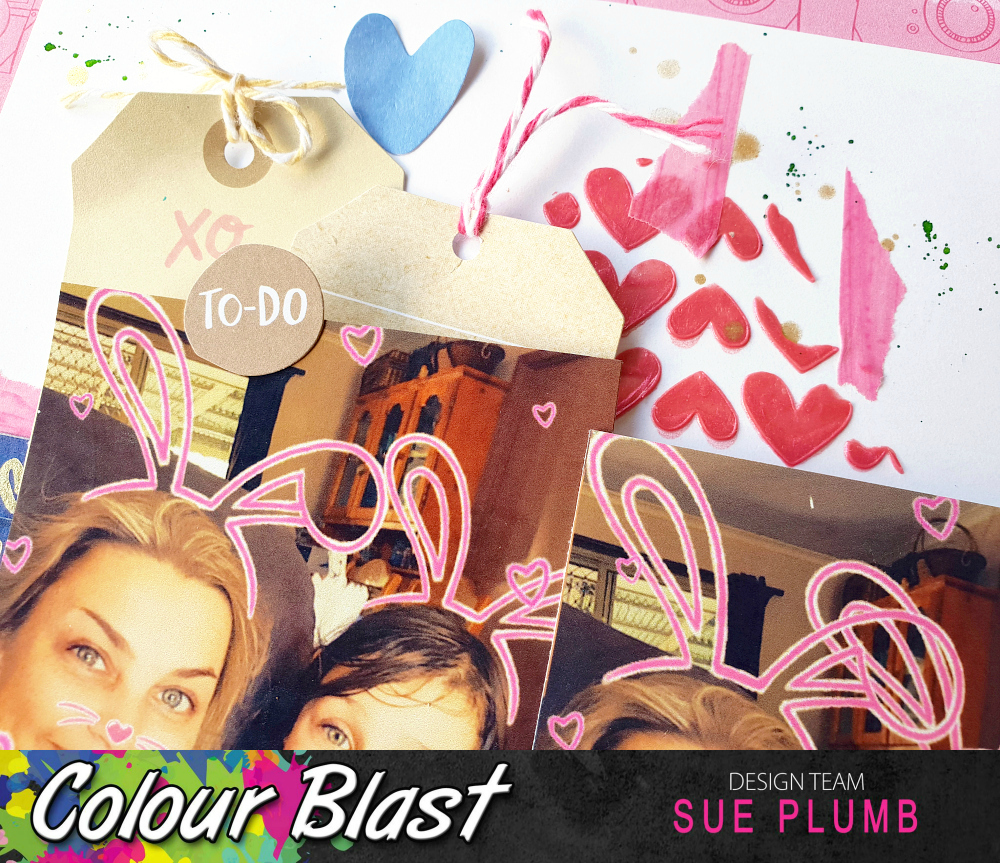
Popping in with my latest Colour Blast design team project for you. Today I am sharing a mixed media scrapbook layout that features a combination of Colour Spray, Colour Paste, Colour Shimmer Spray and Colour Artist Ink.
I created this page to document a series of fun SnapChat selfies I took with my kids last Easter. (I hadn't intended on taking a series, but once you do it with one of them, they all wanted a turn being a bunny!)

Here is my layout...


And now for my process.
I began this page with a sheet of white cardstock trimmed down to 11x11" as I intended on matting my page using patterned paper. I started by applying some 'Indigo' Colour Spray to my page with a wide brush using a vertical stroke and keeping the top third of my page free from colour.


Once the spray was dry, I added some 'Punch' Colour Paste to my page, which I applied using a palette knife through a heart stencil from Flutterby Designs. I added the paste in three small sections, which I kept fairly close in to where my photos were going to be placed.
Once dry, I added some small pieces of torn washi tape to begin building the structure of my page. At this point my layout was looking like this...


Now it was time for the photos and embellishments. I dug through my stash and found some old Amy Tangerine supplies I thought would work well, so I added a few bits and pieces as layers before adding my photos on top. I then matted my page onto a sheet of coordinating patterned paper. 


As a number of the pieces I had used had gold foil on them, I decided I need to add a little gold to my background to match. I used 'Bling' Colour Shimmer Spray to add some gold splatters, which I did by flicking the end of the nozzle around my page.


Next, it was time for my page title, which I added along with my handwritten journalling, in the bottom right corner of my page. 


I still felt as though my layout needed a little extra "something" to add colour, so I used 'Grass' Colour Artist Ink and a small, stiff brush to add some very fine splatters around my page.


And with that, my page was complete.
You can see how the addition of the green ink worked in with the green that featured in the embellishments, helping to bring all the elements together.


The placement of the 'Punch' Colour Paste above and below the photos helps to draw the eye through them.


This was a fun page to put together for some fun photos. I hope I have inspired you to get some of your own memories documented too. 


Until next time, happy scrapping! X 

Sunday, 20 January 2019

We Are Crazy | Flutterby Designs


Hi everyone!
As you may have already seen recently, after over two years as a member of the Flutterby Designs DT, I made the difficult decision to step down. I loved every minute of being part of this team but felt it was time to step aside and make room for some fresh faces.

So without further ado, here is my final project share - a fun, 12x12" layout created with the recently released 'We Are' collection...


I began this page with some fun photos of my daughter and her friend that were taken when they attended a circus skills workshop during the school holidays. I used one of the papers called 'We Are' from the 12x12" paper pack and applied some Arctic White Flutter Colour paint with a brayer to cover some of the pattern in the focal area of my page.


I then took some of the 'We Are' Everyday Etc filler cards and layered them to create a mat for my photos. I also added some scrap cardboard to the back of my photos to help pop them up from the page. I tucked one of the 'We Are' page tabs in behind my photo as well.


The large camera and the we are title words were all fussy cut from some of the 'We Are' Everyday Etc cards. The word crazy was from the 'We Are' Sticky Quotes sheet, as was the we're all mad here sticker I used near the top of the page.


The little emoji faces I used around the page to help tie in the blue colour were fussy cut from one of the coordinating filler cards, along with the yellow chevrons I placed to help draw the viewers eye into the photos.

The funny quote I added underneath my photos was from the 'We Are' Everyday Etc card pack, and was a perfect supporting sentiment for this page theme. (Both these kids would agree with it! hehe)


I thought my layout needed a little more black to help finish it off, so I used the where is my mind? sentiment from Viva Las VegaStamps and stamped it several times around the page with black ink. I also used my Stabilo All pencil to add some small marks and a doodled page border.

Finally, I added a few enamel dots for a little more visual interest, and my handwritten journalling using a Sharpie and I was done.


So that's a wrap on my final layout for Flutterby Designs. I would like to take this opportunity to thank Anita for having me on her team - I love this lady so much! I have had a blast creating with her products alongside so many talented ladies.
Until next time, happy scrapping! X