Tuesday, 29 December 2020

Go Girl | Kitaholic Kits December 2020


Hi everyone!

I am popping in today with another of my Kitaholic Kits projects using the fabulous December kit. This page was inspired by the Simple Stories cut apart paper, which was filled with beautiful bright colours, so I decided to dust off my Gelatos from my stash to create a colourful abstract background to match. 


The photo I was documenting was of my daughter and one of her best friends that was taken on their last day of primary school. I decided to pair it with the colourful banners from the cut apart that were filled with inspirational sayings. 


I decided to create a diagonal design for my page, working from top left to bottom right. This allows for the viewer's eye to be drawn down through the focal area of the page where the photo was placed.


In addition to the Gelatos I had used for my background, I wanted to add some further detail to help elevate the background and stop it appearing so flat. I used one of the Vicki Boutin "Storyteller" stencils paired with the Ranger Stickles "Asteroid" Glitter Gel - both from the December mixed media add-on kit. To apply, I simply swiped the gel through the stencil using a palette knife in several spots around my page. This added the touch of sparkle and extra detail I was looking for. 


Under my photo I added two layers of patterned paper (both Amy Tan papers); some frayed gauze; and a pink paper doily from my stash. I then began working on my embellishments, which I kept relatively simple due to the busy background.

In addition to the banner pieces that I had fussy cut from the Simple Stories paper, I also used some of the November floral printables. These were provided exclusively for kit subscribers, so if you would like access to extras like this each month, then make sure you visit the website HERE for information on how to become a subscriber.


In the bottom right corner of my photo I added the fussy cut rosette ribbon (also from the Simple Stories paper); a handmade heart from Charms Creations; and then finished off my page with a sprinkling of the gorgeous Pebbles puffy dots and a splattering of ink. 

If you would like to see how I put this one together, you can watch my process video on my YouTube channel here:


That's all from me today. Until next time, happy scrapping! X

Wednesday, 23 December 2020

Thankful | Kitaholic Kits December 2020


Hi friends! Today I am here to share the second of my projects for Kitaholic Kits using the gorgeous December kit. For this layout I decided to use the beautiful blue paper from Pinkfresh Studio as the starting point for my page, and document a photo of my hubby and kids that was taken a few months ago on Father's Day. 


I was really drawn to the beautiful foliage print around the edge of the Pinkfresh paper, which was contrasted by a constellation style print in the centre. And whilst I loved each of the patterns individually, the mixing of the two didn't sit well with me, so I decided to cut the centre of the paper out and put it aside for another project. I then replaced it with some white cardstock instead.


For the focal point of my page where my photo was going to go, I used another of the Pinkfresh Studio papers, as well as a piece from Amy Tangerine. These were complimented with some extra pieces from the Pinkfresh Studio cut apart paper, including the Moments that Matter phrase piece.


My embellishments were a mix of items from the kit, as well as some of the subscriber exclusive floral printables from November. These are super easy to simply print and fussy cut out. The wood veneer hearts and the Pebbles puffy dots from the kit were some of my fave things this month.


I also used an extra embellishment from my stash - the lovely hessian and felt heart from Charms Creations, which was easy to match with such neutral tones, and the perfect spot to add the Pinkfresh sticker on top.

You can watch my process video for this layout on my YouTube channel here:


 I would love it if you could pop over and watch my video, and please leave me a thumbs up and subscribe to my channel if you haven't already. And a BIG thank you to everyone who has already subscribed and supported my little channel - you guys rock!
Until next time, happy scrapping! X

Joy | Cocoa Vanilla Studio - December Challenge

Hi everyone! I am popping in today to share a bit of festive inspiration, which is my take on this month's challenge for Cocoa Vanilla Studio - the beautiful "Peppermint Place" mood board designed by Raquel Bowman. I decided to go with the Christmas theme of the board and document some photos of my boys laying under our Christmas tree last year.

Here's a look at the board...


And here is my take on it, using the fabulous new 'Merry & Bright' collection...


For my layout, I was initially drawn to the picture of the stacked lines in the top centre of the board, which inspired me to create a strip style layout. I chose 3 patterned papers - Season's Greetings; Jingle all the Way; and Oh Christmas Tree; and cut a variety of different sized pieces. I then distressed all of the edges, before layering them vertically down my page.


 On top of the paper strips I added a white paper doily inspired by the lacy pattern on the lantern in the bottom left corner, then some frayed gauze for texture, and finally, my photos on top.

For my embellishments I then decided to use a cascading design, and follow the flow of my page vertically down the page. I used a mix of Die Cut Ephemera pieces including flowers, tickets, banners, and hearts.


To the right of my photo, I added the Flair Button with the two hearts on it, whilst to the left of my photo I added the die cut Christmas tree from the ephemera pack, which I popped up on a little bit of cardboard to bring it up to the same height as the photos. 


For my page title I added the word JOY which I fussy cut from the Season's Greetings paper. Underneath that I added the large floral piece from the Die Cut Ephemera pack. To finish off, I stamped the date and added a line of handwritten journalling.

I hope you will play along with the challenge this month. There is a $25 store voucher up for grabs for one randomly chosen winner. To be in the running, load your entries via the Cocoa Vanilla Community Group by the 31st December.
Until next time, happy scrapping! X

Monday, 7 December 2020

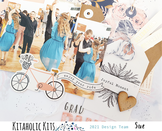
Grad Dance | Kitaholic Kits December 2020


Hi everyone! In case you missed my announcement on one of my other social media channels, I am so happy to announce that I have officially joined the Kitaholic Kits team as a permanent design team member. Today I am sharing my very first layout using the new December kit and mixed media add-on kit. This month's gorgeous kit is filled with products from Crate Paper; Amy Tan; Pebbles; Simple Stories and more. (If you would like to see exactly what is in the kit, I have an unboxing video on my YouTube channel HERE)


For my first project I wanted to focus on the row of tags from the Crate Paper cut apart sheet in the kit, because - tags! I love tags, they are great for creating layers and tucking in amongst other elements. This time I really wanted the tags to be the hero of the page though, so I mixed a few different ones from the sheet, with some that I fussy cut myself and a few Kraft tags from my stash.


For my background I used a couple of Distress Oxides from my stash, as well as one of the Vicki Boutin stencils from the mixed media add-on kit. My photos were a series of pictures that I took of my hubby and daughter dancing together at her primary school graduation.


For my embellishments, I used a combination of the Pebbles die cuts from the Jen Hadfield collection 'The Avenue'; some of the wood veneer hearts; and a fussy cut floral piece from another of the Crate Paper patterned papers. 


My title was a mix of the Simple Stories foam alphas and the Rosie's Studio small puffy alphas. I finished off with some tiny splatters of navy mist, a stamped date and handwritten journalling. 

You can watch my process video for this layout, on my YouTube channel here:


I would love it if you would pop over and watch my video, and please leave me a thumbs up and subscribe to my channel if you haven't already.
Until next time, happy scrapping! X

Sunday, 6 December 2020

Ho Ho Ho | Scrap the Girls December Challenge


 Hi everyone!
Popping in today to share my take on the December challenge for Scrap the Girls, which (not surprisingly) just happens to have a bit of a festive theme. It's called "The Story of Christmas" and besides the overall theme, it features a colour palette and an inspirational image.

Here's a look at the board...


And here is my take on it, using the new 'Merry & Bright' Christmas collection from Cocoa Vanilla Studio...


The photo I was documenting was a photo of my daughter with Santa that I took last year. Yes, I know Santa isn't a girl, but we make a special exception to our "no boys" rule for Santa in this challenge. (So if you have any Santa photos with your girls, this is a great time to get them scrapped!)

I decided to use a mix of two patterned papers for my background - the tiny spots on the Happy Holidays paper, combined with the candy stripes of the Jingle All the Way paper. I also added some tearing and distressing for texture along the top join between the two. 


Next, I cut a couple of pieces of patterned paper from the A5 Paper Stack to create a double layered matt for my photo. I then added some frayed gauze before sticking my photo down on top.

With my photo in place, my plan was to embellish along a horizontal line on either side of the photo, right where the lower join between the two patterned papers was. For this, I wanted to use some of the gorgeous little gingerbread style houses from the range to form a bit of scene to frame the photo.


The two larger houses were both fussy cut from a couple of the new Pocket Cards, whilst the third smaller house was from the Die Cut Ephemera pack. I also used the Hey Santa card from the Pocket Card pack. I then extended the line of embellishments out further by adding two tags from the ephemera pack that I had tied with small pieces of twine. The final large piece I added was the Christmas tree, which I tucked in behind the house on the left side of the page.

With all of my main embellishments in place along the line, I then decided to add a little bit of extra colour using a light peach watercolour paint which I just gently painted in around edges of my embellishments.


For my title, I fussy cut the words Ho Ho Ho from another of the Pocket Cards and stuck it down above my photo. A few little touches to finish my page off included a die cut flower tucked in along the top join where I had folded back the paper and secured it with staples; a small die cut heart down near the bottom of the page; a stamped date; and my handwritten journalling. 

I am really happy with how this sweet layout turned out and I hope you will join us for this challenge. You can grab all the challenge details as well as see what else the design team created, on the Scrap the Girls blog HERE
Until next time, happy scrapping! X

Saturday, 28 November 2020

Yum | Kitaholic Kits November 2020


Hi friends! Sadly, this is the last of my Kitaholic Kits guest designer layouts for the month using the November kit and mixed media add-on. This is the fourth layout I have created from this kit, along with some extra pocket pages, and I still have some left to create with!  

For this layout, I decided to document some photos of my daughter that were taken almost 10 years apart - to the day! The focus of my page was the remaining pieces I had of the cut apart sheet from the Crate Paper 'Marigold' collection and one of the subscriber exclusive cut files designed by Anita Bownds.


I used white cardstock as the base for my page, and added the Pebbles Jen Hadfield black and white checkered paper from 'The Avenue' collection over the top.


For my embellishments I used a mix of the Pinkfresh Studio floral ephemera, puffy alpha stickers and one of the subscriber exclusive cut files,which I coloured using watercolour paint.


I also used some stickers from the Heidi Swapp 'Old School' collection and added some sparkle with Ranger Stickles Glitter Gel.

I have a process video available for this layout on my YouTube channel if you would like to see how I put this one together. And if you haven't already, I would love it if you subscribed to my channel while you are there. 


Until next time, happy scrapping! X

Thursday, 26 November 2020

Sweet | Cocoa Vanilla Studio


Hi everyone! Popping in today to share a recent design team project for Cocoa Vanilla Studio with you. I was recently tasked with scraplifting a layout that had been shared in the Cocoa Vanilla Studio Facebook Community group. The layout was an entry into the October "Spring Vibes" monthly challenge by Debra Beer, and looked like this...


Scraplifting is when you take a design from someone else and use it as the basis for your own page. This could range from copying the design in its entirety using the exact same materials; to simply using the page as inspiration and treating the bones of the page like a sketch, which is exactly what I did.

Here is my take on Debra's page using the 'Daydream' collection...


The first thing I decided when it came to creating my page, was that rather than a white cardstock background, I chose to use the Sun Shower patterned paper instead. I topped this with a piece of the Daisy Days paper to form the focal point of my page. I added extra texture to the paper by distressing the edges; and stuck some torn strips of washi tape under the top and bottom edges of it - just like Debra had also used washi tape on her page. I also added some frayed gauze for more texture.


On top of the Daisy Days paper, I added a small piece of the navy Up in the Clouds paper to help separate my unmatted photos a little from the busy floral print. For my photos, I also chose to go with both a portrait and landscape shot, just as the original page had. I also added a paper doily, but changed the position of it slightly to tuck under the left top corner of my photo and I also tucked in a circular frame from the Die Cut Ephemera pack. 


Just like Debra's original page, I wanted to embellish my layout using clusters of flowers. I fussy cut several pieces from the Garden Variety paper and combined them with some ephemera pieces to create three clusters to frame around my photos. I also added a couple of small phrase stickers to my page from the Accessory Sticker sheet.

I finished off by adding a Die Cut Title word along the bottom edge of my photo, then added some scattered sequins from the Sequins and Flowers pack instead of the enamel dots Debra had used. A few tiny splatters of black ink, my journalling, a stamped date and I was done!


Thanks so much to Debra for her inspiration - I really love how this page turned out! If you ever find yourself stuck for ideas, take a quick scroll through the CVS Facebook Community group and see all the gorgeous pages shared by the members there - you might find something to scraplift too. 
Please note: if you are going to copy the work of someone else, it is common courtesy to credit the original designer when sharing your page. A small mention of who inspired you is often enough to make someone else's day!

Until next time, happy scrapping! X

Sunday, 22 November 2020

Good Vibes | Kitaholic Kits November 2020


Hi everyone! I am super excited to share the third of my Kitaholic Kits guest designer projects with you today. For this one, I decided to create another masculine layout, but use a bit more mixed media than my previous two projects.  


As I was documenting a photo of my boys at the beach that was taken on their birthday, I wanted to give my page a "watery" vibe, so I used Distress Oxides to create a watercolour style background on my cardstock using my messy mat.


Over the top of the ink I added some stencilling using one of the Vicki Boutin stencils and the Ranger Stickles Glitter Gel - both from the mixed media add-on kit, and (of course) there was some ink splatters too. 

The papers I used were a mix of Crate Paper and Heidi Swapp from the kit, along with some of this month's subscriber only exclusive printables thrown in. 


For my embellishments I used a mix of Heidi Swapp stickers; Pinkfresh Studio floral ephemera; and a Charms Creations handmade heart from my stash.


I have a process video available for this layout on my YouTube channel if you would like to see how it came together:


For current Kitaholic Kits subscribers I also have some companion pocket pages that I created to match this layout, which are available exclusively in the Subscribers Facebook group. (Additional content is only one of the benefits of becoming a kit subscriber. You can check out all the other benefits HERE)
I've got one more guest designer project to share using this kit, so make sure you keep an eye out for it.

Until next time, happy scrapping! X 

Tuesday, 17 November 2020

Together | Cocoa Vanilla Studio


Hi everyone,
Popping in today with a catch up layout that I created recently for Cocoa Vanilla Studio. This one was created for a theme entitled "1 paper, 3 ways" where three of the design team each shared a layout using the same patterned paper as our page background. The purpose of this theme was to showcase different ways to use the same paper, and hopefully give you some inspiration to create a page of your own. The paper we were all tasked to use was the gorgeous mixed media style Sweet Serenity from the 'Daydream' collection.

Here's the layout I created, entitled "Together"... 


For this page, I chose to document a recent photo of my daughter and I that was taken during a day at the beach. (And yes, it's a selfie! I often find that if I don't stop and take a selfie with my kids, I am rarely in any photos with them.)

So my layout began with the stunning Sweet Serenity paper, which I decided to add a little more subtle detail and texture to. I first used a criss cross patterned stamp along with some grey ink to add some stamping; then used a scattered hearts stencil with modelling paste to add some small white hearts.


I then set it aside to dry while I began work on the papery portion of my page. First, I gathered some pieces of patterned paper to create a layered mat under my photo. The papers I used were All Aflutter; Up in the Clouds; and Happy Place and I used both vertical and horizontal pieces to help ground the photo to the page. I also added a grey paper doily from my stash.

Now it was time for some pretty embellishments! I have to admit, I am totally obsessed with the floral print Garden Variety paper from this collection. I love it so much I just want to fussy cut the flowers from it and stick them on every page I create. I cut a few pieces from it and tucked them in around my photo to help frame it.


My next goal was to extend out my embellishment clusters from the focal point to reach the two main mixed media areas on the page, as I didn't want them to appear to be "floating" out on their own. I did this by using some cardstock leaves I had cut on my Silhouette with a cut file from Cut To You. This enabled me to ensure that all the stencilled areas on the page were connected to the focal point.


For my page title, I chose to use the word together from the Die Cut Titles pack, which I adhered along the bottom edge of my photo using some foam tape to pop it up a bit. On the top right corner of my photo I added the small happy days with you banner sticker from the Accessory Sticker sheet; then scattered a few hearts from the Die Cut Ephemera pack

I finished off my layout by adding a doodled pencil border, some soft grey ink splatters and a few stamped phrases.


Thanks so much for joining me today so I could share this with you. Stay tuned over the next couple of days to see what else the team has in store to inspire you using the Sweet Serenity paper. 
Until next time, happy scrapping! X

Sunday, 15 November 2020

Frank | Kitaholic Kits November 2020


 Hi everyone! I am here today to share the second of my guest designer projects for Kitaholic Kits using the November scrapbook kit and mixed media add-on kit. If you recall my first project, I documented some photos of my son dressed up as a character from a story he wrote, so for this page I decided I had better create a layout of his twin dressed as his story character too.


I used white cardstock for my page base, then layered it with the Crate Paper wood grain paper and the Jen Hadfield (for Pebbles) text print paper, which I punched with a notebook style punch. (I thought this would work well with the "story" theme.)

I also added a row of stencilled lines across the top and bottom of the page using one of the new Vicki Boutin 'Storyteller' stencils from the mixed media add-on kit. 


As with my previous project, the story was an important part of the page, so I used another of the Pinkfresh Studio pockets and a journal tag to be a prominent feature of my design. I also added almost identical journalling, just changing the relevant details to personalise it for him. I also added a QR code to the back of my tag that linked to a video of him reading his "Frank the Zombie" story. 


For the embellishments, I used a mix of the Heidi Swapp cardstock and phrase stickers; a few of the subscriber exclusive printables; and some of the Pinkfresh Studio floral ephemera pieces. I also used the Pinkfresh puffy alphas for my title. 


I have a process video available  if you would like to watch how this layout came together. (If you like what you see, I would love it if you would become a subscriber of my YouTube channel too.) 


That's all from me today. If you would like to check out the Kitaholic Kits shop, or investigate about becoming a kit subscriber so you can receive your own box of happiness each month, visit the Kitaholic Kits website HERE
Until next time, happy scrapping! X