Friday, 28 February 2020

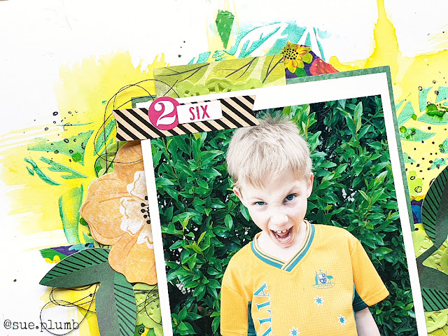
Summer Fun | Dust It Off challenge


Hi everyone!
Today I am back to share another layout that I created for my personal "Dust It Off" challenge. For this page, I delved deep into my stash and pulled out an assortment of scraps and left-over items that I hadn't touched in a looong time. I also had a special request (thanks Tina - great suggestion!) to use washi tape, so that was a good push for me to try to incorporate that onto my page too. I even used a photo that I printed ages ago but hadn't gotten around to scrapping yet. So yes, this page definitely ticked the "dust it off" criteria!

Here's what I came up with...
(Click on photos for a better view)


For my layout I began with a sheet of white cardstock and Distress Oxides in 'Carved Pumpkin' and 'Mermaid Lagoon'. I applied these to my page by swiping the ink pads onto my messy mat, adding a spritz of water, and then laying my cardstock over the top to pick up the ink. (I did the blue first and then repeated with the orange once it was dry - don't do them together or you will just make mud!)


Once I had the colour down on the background, I grabbed some patterned paper scraps to layer for my photo mat. These were left-over from the Echo Park 'Sweet Summertime' collection (released way back in 2015!), and I also found a few stickers and chipboard pieces too. 

Once I had the paper pieces down, I added a small yellow paper doily to the stack then went to town adding torn pieces of washi tape to add further layers. The washi tapes I used were from Dina Wakley and Amy Tan - I write on the inside of the rolls so I know where they come from. 
(I've included a process photo below so you can see where I was up to at this point.)


I added the Echo Park chipboard tag (which I tied with twine) and the cute little bird sticker below where my photo was going to sit; then added some frayed gauze to my stack before securing the photo on top. 


For my title, I fussy cut the word summer from one of the paper scraps, then used some of the small alpha stickers from the coordinating sticker sheet to add the word fun along the top edge of my photo. I also added some sticker clouds to my background.


To the right of my photo I created a cluster using a handmade felt star from Charms Creations; topped with an old flair button (it might have been from D-lish Scraps?) and a tiny phrase sticker I got from my sister. The small epoxy the good life sticker was a left-over from a Studio Calico kit. 


I finished the page off with a few acrylic hearts and some left-over sequins (pretty sure they were both from D-lish Scraps too); some stamped phrases and a tiny splattering of ink. 

So there you have it - a total stash-buster "Dust It Off" layout comprised of mainly scraps, left-overs and old items from my stash. I am thoroughly enjoying this challenge, so if you have any suggestions for me, please let me know in the comments or pop over to my Facebook page and leave me a comment there. (It could be something you have in your own stash that you want some ideas for?)
Until next time, happy scrapping! X

Tuesday, 25 February 2020

Best Friends | Cocoa Vanilla Studio


Hi everyone!
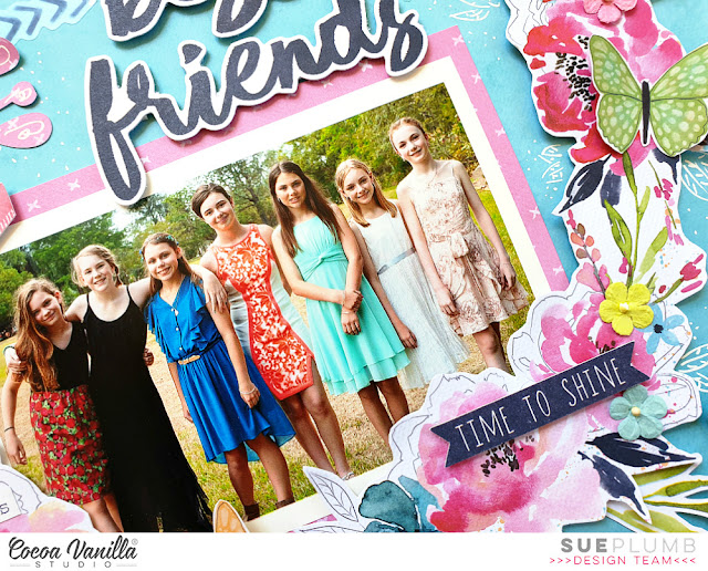
Popping in today to share a layout that I created for Cocoa Vanilla Studio using the ever-beautiful 'Happiness' collection. This page features a photo of my daughter (that's her in the blue) and her friends that was taken the night of their primary school graduation. She has such a lovely group of friends and it was a special time for them to be able to celebrate together. 

Here is what I created...
(Click on photos for a better view)


 For my layout, I began with the blue watercolour pattern on the B-side of the Good Vibes paper as my page base. Next, I took the oh-so-pretty So Fresh paper and fussy cut the beautiful wreath design from it. I then added some foam mounting tape to the back and positioned it on my page (without yet sticking it down).


I then matted my photo with the pink B-side of the Expressive paper before adhering it to the background sheet, then added the mounted wreath over the top. I bent the edges of the wreath up slightly from the page in some places to add extra dimension.


Above the photo, I added a small tab  and some leaves from the Die Cut Ephemera pack to create a small cluster. For my title I used the words best friends from the Die Cut Titles pack, highlighting it with the row of chevrons sticker from the Clear Sticker set. 


To help frame my photo and bring some extra balance to the page, I arranged a couple of phrase stickers from the Accessory Sticker sheet and the time to shine banner piece from the Die Cut Ephemera pack to create a visual triangle. I also added some extra leaves to the outer edges of the wreath by tucking in a few from the ephemera pack.


At this point I thought that my wreath felt a little “disconnected” from the background, so I drew some inspiration from my former team member Amanda Baldwin, and doodled some extra leaves around the wreath using a fine white paint pen. I also added a little extra prettiness by using some tiny paper flowers from my stash, which I placed randomly around the wreath.


I finished up by creating another “visual triangle” – this time using butterflies fussy cut from the Bright & Beautiful paper. (You probably already know how much I LOVE butterflies!)

I am so happy with how this pretty page turned out, and am pleased to report it found a very special home. It was popped into a frame and gifted to one of the girls in the photo for her birthday.
That's all from me today, thanks for stopping by. Until next time, happy scrapping! X

Saturday, 22 February 2020

Escape the Ordinary | Dust it Off Challenge


Hi everyone!
Today I am back to share another layout for my #dustitoff challenge. (If you missed my previous post explaining what this is all about, you can read it HERE) For this layout, I began by assessing my stash to find something to "dust off" and work with.

Here is what I chose...


 My (very neglected) Big Shot, and some metal dies. At this point I had no idea what I was going to create, so I just pulled out a few that appealed to me. I also decided to use the Vicki Boutin 'Color Kaleidoscope' collection (again) because I still hadn't packed it away and I was enjoying using it.  So I pulled out my photo box, found a photo of my sister and I, and set to work.

I started with my page background. I decided to go with a patterned paper background for this one, rather than mixed media as I was keen to get to my challenge items. I chose the beautiful "Look Up" paper, which featured pretty blue / pink / purple tones and clouds that worked well with my photo. (I immediately thought that it would be perfect to use with the sun die as well.) 

Here's a look at the entire page...
(Click on photos for a better view)


Now if you are anything like me, another item you probably have in abundance in your stash (but don't use much) is cardstock. Specifically, coloured cardstock. As this was my Dust it Off challenge, I thought what better time than to put some of it to use. I grabbed a sheet of pale yellow and cut three of the Stitched Suns using the die from Uniquely Creative.


I used a navy sheet from the 'Color Kaleidoscope' 6x8" paper pad as the anchor point for my design, then sat my photo on top (not stuck down) and began building my layers from there. I used the tag dies to cut a couple of tags from different patterned papers, which I tied with twine and tucked in alongside my photo. I decided to run the suns vertically down my page on the other side of my photo, so I added a couple of narrow paper strips first to help ground them to the page. I mirrored this element by adding some strips below my photo as well, including the row of birds that was fussy cut from another of the 6x8" papers.


At this point I decided to make a little change to my background, and add some cardstock behind the paper. I trimmed off a small amount along the top and right side of the patterned paper and mounted a sheet of Kraft behind it. This created a border on the left edge and along the bottom of the layout and helped tie in the kraft coloured elements on the page. (It also meant I was getting stuff USED!)


To balance out the row of suns on the right side of my page, I created an embellishment cluster to the left of my photo using a die cut and stickers. I adore that holographic foil heart on the today sticker, which I popped up from the background using foam tape. 

I also used a couple of small round stickers with foam tape under them on top of my suns; and a round die cut for my journalling over the centre one. My title came from the escape the ordinary sticker I placed above my photo.


I was really happy with how this one came out, and even happier that I managed to dust off my Big Shot; some dies; and use up some coloured cardstock!

Don't forget if you have any suggestions for anything you would like to see me use, leave me a comment and I will add it to my list. If you would like to play along with me, please use the #dustitoffchallenge hashtag on Instagram to share your own creations so I can see yours too!
Until next time, happy scrapping! X 

Saturday, 15 February 2020

Best Friends | Dust it Off Challenge


Hi everyone!
Back with another "just because" layout to share with you today. (I know, right?!) 
You may have seen my layout from last week that was inspired after watching a Facebook live from Vicki Boutin as she was creating watercolour backgrounds? (You can see the post with my layout HERE) After using Vicki's 'Color Kaleidoscope' collection for that one, I was inspired to create again whilst I still had it sitting out.

Here's what I created...
(Click on photos for a better view)


As I mentioned in my post last week, I don't have any VB mixed media supplies (yet!), so I had to make do with my current supplies. (If I use them I can totally justify any new purchases, right?!) One of my most under-used mixed media supplies is definitely my big set of Faber-Castell gelatos, so I thought it might be time to give them a workout. 

I began with a sheet of white cardstock as my background, and started by using the gelatos as a watercolour. To do this, I simply scribbled onto my non-stick craft mat, added a spritz of water to mix, and then moved my cardstock around over the top, touching it to pick up the colour as I went. Once I had finished with the first colour (teal), I went back and repeated the process with a light green.


Next, I grabbed a couple of small StencilGirl stencils from my stash. The first was a script style one called Rembrandt's Words. I love the large, loose font on this stencil, that was inspired by flowing script straight from an old ink pen. The second stencil is one of my absolute faves that I use often, and is called Organized Chaos, inspired by Van Gogh's "The Starry Night" painting. 

I chose to use my gelatos again, this time using a dry application method. To do this, I scribbled a small amount onto my non-stick craft mat and then used a stencil brush to pick up the pigment and brush it through the stencils. (I used a dark green and a dark blue.)


Next it was time for some papery fun! I already had a half sheet of paper from my previous layout with this collection, so I decided to make use of it first. I trimmed the edge off to shorten it, then tore it into a few strips. I used the pattern with the abstract circles for the main piece, then flipped the others over to show the contrasting green pattern on the reverse. I then layered them together and stuck them down on the page to provide my anchor point.


To make further use of the paper scraps I had left, I fussy cut a few of the coloured circles and tucked them in around the edges. I then created additional layers using patterned tissue paper and a small paper doily, before placing my photo on top. 


To embellish my page I used a mixture of the coordinating die cuts and stickers. I positioned my title alongside the photo and used the bold red arrow sticker (popped up on a little foam tape) to draw the eye into the subject. 

My handwritten journalling was added in the bottom right corner of the layout, which also helped create a natural diagonal flow through my page. 


To finish off, I added some small splatters of black ink and then some larger splotches using pink ink. I love the broad, eclectic mix of colours in this collection and hope to have another mixed media layout using it to share soon. 

I think I might make my own challenge to focus on using some neglected supplies from my stash and name it the #dustitoff challenge. If there is anything in particular you would like to see me use, or if you have any questions, please let me know in the comments. 

That's all from me today, thanks so much for stopping by. 
Until next time, happy scrapping! X

Wednesday, 12 February 2020

Beautiful | Scrap the Girls February challenge


Hi everyone!
Time for another design team share from me, this time for Scrap the Girls. This month's challenge is called "Dip Me in Colour" and is a very pretty colour inspiration board that looks like this...


For my take on the challenge I decided to document a photo of my daughter that was taken recently at a friend's birthday party. The birthday girl's mum just happens to be a photographer, so at the party she did a photo shoot for them. All the girls took a variety of outfits to choose from, and with a couple of extra ladies on hand to help with hair and make-up, she got some amazing shots of them all. (Isn't that a great idea for a party?!) For anyone local to me (Sunshine Coast / North Brisbane), check out Teresa's work at Purely Poetic photography HERE 

Here is my take on the challenge...
(Click on photos for a better view)


For my layout I decided to use the Cocoa Vanilla Studio 'Midnight' collection. (Which I have actually been using quite a bit of lately - I love a bit of stash-busting!) This range features the majority of colours from the inspiration board (except the aqua), so I chose to leave that out and include the touch of gold that was included in the inspiration picture instead. 


I began my page with the gorgeous Inspired paper for my background. I chose this paper because of the mixed media style and the spots that tied in with the inspiration image. I then added pieces of the Inky Depths, Moonlight, and Shine Bright papers to form a mat for my photo and title. I also added a gold doily before adding my photo on top, using some cardboard underneath to pop it up from the background.

To further draw the viewer's eye into the photo, I cut the Flower Crown cut file from Cut to You using white cardstock and layered it over the top, then popped a small chipboard heart on as well.


I placed my page title on the horizontal strip of paper to the right of the photo, and used the word beautiful, then added the small my darling banner below it (both pieces were from the Midnight Chipboard Pieces pack). I then added a large floral feature by fussy cutting a section of the stunning Bloom & Grow paper, which I tucked in alongside my photo. (Those sketchy style flowers are so divine!)


To balance my layout, I created a small embellishment cluster in the top left corner of the page using a torn piece of Inky Depths paper; a couple of flowers from the Die Cut Ephemera pack; and a chipboard banner.
I finished off by adding a few more ephemera pieces and some clear stickers from the Clear Stickers pack around my page. (Did I mention I how much I love clear stickers?)


Thanks so much for stopping by today so I could share this with you. Be sure to pop over HERE and see what the rest of the STG Design Team (including our newest members!) created to inspire you for this challenge. Our fabulous Australian sponsor this month is Cut to You and as always, Scrap Accent for our international entrants.

Until next time, happy scrapping! X

Saturday, 8 February 2020

My Kind of Day ~ a mixed media layout


Hi everyone!
Popping in quickly with a bonus share for you - hot off my desk! I watched Vicki Boutin on her Friday night Facebook live (Saturday morning our time) as she was creating some beautiful watercolour backgrounds. I found it really inspiring, and being a wet, miserable day here, I decided to pull out some of my own supplies and spend some time creating too. Unfortunately I don't actually have any of Vicki's mixed media products (as much as I would love them!), so I just used what I had on hand in my stash.

Here's what I created...
(Click on photos for a better view)


On a sheet of heavyweight white cardstock I started by applying some yellow watercolour (made by mixing Colour Blast by Bee Arty 'Sunflower' Colour Shimmer Dust with water) and painted it onto the page with a wide brush. If you have followed me for some time, you will already know how much I love my wide brushes. (The one I used for this was a #4, which measures 2 inches across.) 


I then added some green watercolour, which I just "smooshed" over the top - straight from my messy mat. (I used 'Lush' Colour Shimmer Dust also mixed with water.) Next, I added some darker green splats and splatters, using 'Mowed Lawn' Colour Artist Ink and a brush.I also tipped my page up, which allowed some of the pooled ink to run down. 

I couldn't stop at that for my background though, so my next step was to grab a stencil and some Colour Blast by Bee Arty 'Envy' Colour Paste. The stencil I used was called 'Leafy Doodle Border' from StencilGirl, and I simply moved it around the page to apply the paste using a palette knife. I then allowed it to dry before adding some stamping using my 'Doodle Dots' stamp from Viva Las VegaStamps and black ink.


Now it was time for some papery layers! Fortunately I do have some of Vicki's papercraft products, so I chose the 'Colour Kaleidoscope' collection to work with. First I added some small pieces of torn washi tape from my stash; then I layered pieces of patterned paper (both cut and torn to provide contrasting textures); as well as a paper doiley and some messy black cotton thread. I then added my photo on top, using some scrap cardboard behind it to pop it up from the page.


To embellish my page I used Ephemera pieces from both the Icons and Frames & Journaling packs. I also added the label and number stickers to the top edge of photo - both from the 'Color Kaleidoscope' Sticker Book.  The small celebrate phrase sticker was from the Cardstock Sticker pack, and I finished with the die cut My Kind of Day phrase from the Frames & Journal pack and some handwritten journalling. 

That's all from me today, I hope you are also inspired to create something with some of your own mixed media supplies!
Until next time, happy scrapping! X

Thursday, 6 February 2020

Happy Moments | Cocoa Vanilla Studio


Hi everyone!
Today I have another Cocoa Vanilla Studio design team project to share with you that I created recently. This page was created for a "Holidays and Vacations" theme that we ran recently on the CVS blog to inspire people to dig into their holiday photo stash and get the memories documented.

I used a combination of the ‘Boys Rule’ and ‘Midnight’ collections. I know what you are thinking – a bit of a strange mix, right? Despite the very obvious differences between the two, they did work together surprisingly well and were a perfect compliment for the colours in my photo.


For my take on the theme I decided to document a photo that was taken at the Cocoa Vanilla retreat that was held last May in Coffs Harbour. Scrap retreats are definitely one of my favourite kinds of holidays – besides spending time with great friends, you get to enjoy a change of scenery, have a break from your everyday responsibilities, AND you get to create! What’s not to love about that?!


I started my layout with ‘Boys Rule’, with a sheet of Star Fall as my base,which I topped with piece of white cardstock, cut slightly smaller than the paper, to leave a narrow border around the edge. I then added four blocks of paper to my background using pieces of the Messed Up; Expressionist and Straight and Narrow papers. I distressed each of the blocks by scrunching and then flattening them back out; then ran them horizontally on my page to compliment the landscape orientation of my photo.


With my background complete, I then added some scrap cardboard to the back of my photo and decided on its placement on the page. I chose the beautiful floral print Bloom and Grow paper from the ‘Midnight’ collection to begin embellishing my layout, fussy cutting several pieces to tuck in around my photo to frame it.


With the flowers in place I then added the little banner that said the best from the ‘Boys Rule’ Chipboard Pieces pack, and a small black and white butterfly sticker from the ‘Midnight’ Accessory Stickers; placing both near my top floral cluster.

I created another small cluster below my photo by combining another fussy cut floral piece with a small leafy branch and heart, both from the ‘Midnight’ Die Cut Ephemera pack. In my cluster to the left of my photo, I also added the shine bright flair button from the ‘Midnight’ Flair Buttons set.


For my page title, I used the words happy and moments from the ‘Midnight’ Chipboard Pieces pack; and then I finished off my layout by typing up my journalling and applying it in strips (again tying into the horizontal theme) near the bottom of the page.


That’s all from me today. I hope you are feeling inspired to document some of your own holiday moments. Until next time, happy scrapping! X
Sunday, 2 February 2020

We Remember Moments | Cocoa Vanilla Studio


Hi everyone!
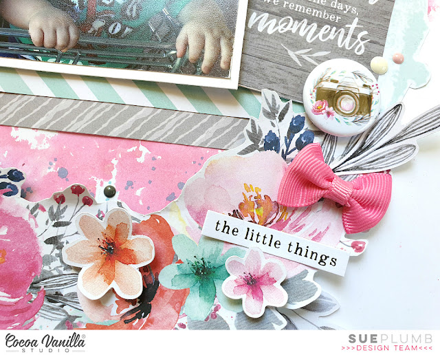
Popping in again today to share yet another design team project from the end of last year. This layout was created for Cocoa Vanilla Studio using the gorgeous 'Unforgettable' collection and a photo of my children that I took while I was shopping with them a few years ago. It used to take me a long time to get the grocery shopping done when I had the kids with me, as I would constantly be stopped by people asking questions about the boys. Twin seat trolleys were rare when I took this photo and our local supermarket only had two of them, so I usually had to get a staff member find one for me when we arrived. (Thankfully they seem to be the norm at most stores now.)


I started this page by creating a mixed media background on some white cardstock, using 'Picked Raspberry' Distress Oxide to create a watercolour style background, before adding some stamping and Colour Blast by Bee Arty 'Steel' Colour Paste through a stencil in a few spots on my page. I also added some blue watercolour splatters over the top for some extra interest.

Next, I fussy cut the wreath from the beautiful Garland paper, adding foam tape underneath the floral section to pop it up from the page, before sticking it down on top of my background. (You can see how I bent the edges up from the page to add extra dimension.)
I then added some pieces of paper cut from the B sides of the Glorious and Sprightly papers as a mat for my photo, which I stuck down on top.


Alongside my photo, I added the quote "we don't remember the days, we remember moments" from scaled down version of the Story Teller paper from the 6x8" Paper Stack to act as my page title. I was especially drawn to use this quote for this layout, as in the early days of having twins life seemed to pass by in such a blur. Going shopping with the kids and having two sitting in the trolley and one perched on the end like in the photo is something I will always remember though. 

On top of the quote card I added the cute camera Flair Button and popped a couple of Enamel Dots nearby.


Now it was time to embellish my wreath. I used a variety of flowers from the Die Cut Ephemera pack, which I stuck down on top of the wreath using foam tape to provide further dimension. I also added 3 bows from the Tassels and Bows pack; and a few small phrase stickers from the Accessory Sticker sheet.


I finished off my layout by adding more Enamel Dots; a die cut butterfly; and then a few hand-stitched crosses using embroidery thread.

That's all from me today, I hope I have inspired you to create something pretty too. 
Until next time, happy scrapping! X