Showing posts with label Colour Shimmer Spray. Show all posts

Tuesday, 26 March 2019

Remember This | Colour Blast


Hi everyone! 
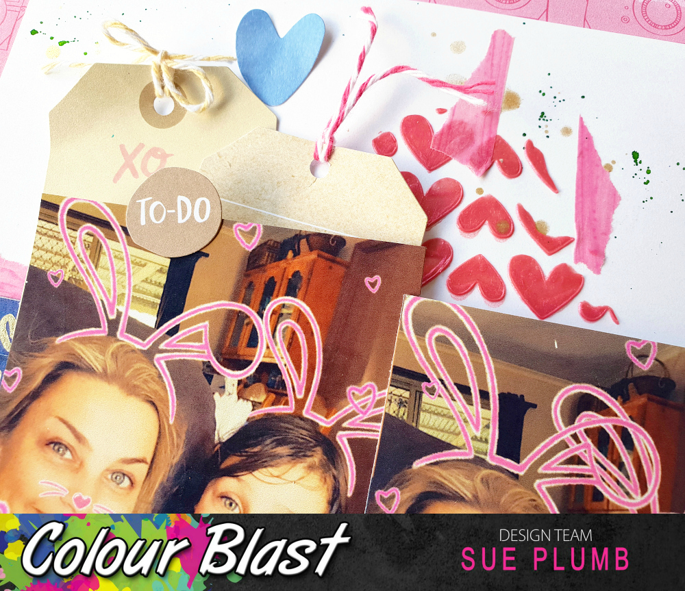
I've got a mixed media scrapbook layout that was created for Colour Blast to share today - this one is a bit soft and pretty (and probably a bit more minimalistic compared to what I usually do). It features a combination of Colour Spray, Colour Shimmer Spray, and Colour Paste. It also features a photo of my kids that I took at Easter time at school last year.


For this layout I decided to pull out some products that I hadn't used in a while - my sprays. (Since the Colour Artist Inks were released I have tended to use those more often as I like the brighter, more vibrant colours and they also tend to fit better with the techniques I use.) However, I didn't want my older supplies being totally neglected so I decided to re-visit them for this page. 

I began by sticking a stencil over the top third of my page, masking off the areas that I din't want sprayed with the Colour Spray using scrap paper. (I always stick my stencils down with old washi tape, as it makes removal so much easier afterwards.) I started with a light spray of Lagoon, then added a little Saffron over the top. 


Once I had applied a light covering, I carefully removed the stencil and allowed it to dry. You can see how I chose a stencil with a very "organic" pattern, and how when I masked off the top edge I did it with paper torn unevenly to avoid a straight edge along the top.


Next, I want to go for a completely different look in the bottom portion of the page. I selected some complimentary Colour Shimmer Sprays (Deep Water, Sunshine and Apple of My Eye) and applied the spray directly from the bottles using a brush. I added small amounts of colour along the bottom edge of the stencilled section of the page, holding the cardstock vertically and allowing the colour to run down the page. 


I started with the Deep Water spray, then followed with Sunshine and Apple of My Eye. I allowed a short time for each colour to dry a little before moving onto the next one. I also tried to place the colours to limit the amount of blending that would occur, as I wanted each one to be visible. (You can see how they look once dry in the bottom photo below.)


With all my "runs" in place, it was time to work on the line where they met the stencilled pattern above on the page. I wanted to add a little texture, and also define the focal point for my layout, so I chose a stencil so I could apply a single floral line. Just like the sprays I had used, I also wanted a combination of colours so I chose Sunshine, Singin' the Blues and Apple of My Eye Colour Pastes


I used a narrow palette knife and started with the Sunshine paste, applying it to the stencil without covering it completely. I then added the Apple of My Eye and Singin' the Blues pastes, filling in the gaps I had left and overlapping the colours. 


The result was a gorgeous mix that showcased all three colours within the stencilled design, and blended perfectly with the sprays I had already applied to the page. I then left the paste to dry.


Once dry, I was happy with my background and set about creating the structure of my page. Again I did some stash-busting and used some older supplies (this time some scraps of a Jillibean Soup collection from long ago) that matched perfectly with my colour palette.


I added a torn strip of paper along the focal line of my page, as well as a couple of strips along the top edge of my page. I then used various pieces of paper, along with coordinating die cuts and stickers to create layers under and around my photo. 


Next, I fussy cut a number of butterflies from one of the patterned papers, which I adhered along the paint runs in the bottom section of the page. I stuck each butterfly by the middle section only, allowing me to bend up the wings away from the page to give it dimension.


To help balance out all the butterflies in the bottom section of my page, I also added a small embellishment cluster near the top edge of my layout. 


To finish off my layout I used a roller stamp and some grey ink to stamp out the word smile repeatedly near the butterflies. 

That's all from me today, thanks for stopping by. I will be back soon with another project to share. 
Until then, happy scrapping! X

Sunday, 10 March 2019

Abstract Floral painting | Colour Blast


Hi everyone!
Popping in today to share a Colour Blast design team project with you. Today I have something a bit different - an abstract floral painting I created using Colour Artist Inks. 

This painting came about one day when I was having a bad day. I felt like losing myself in something creative, but just wasn't sure what I wanted to do. As I was sitting and looking out the window, I was staring at some flowering bushes over the fence in my neighbours yard. That was enough inspiration to get me started, so I pulled out a sheet of watercolour paper to see what would come out.

The result was an abstract floral painting, inspired by the colours and shapes of my neighbours plants...


I took photos along the way to document my process so I could share it. These are the supplies I started with - a sheet of watercolour paper and a range of Colour Artist Inks in warm tones (Slipper, Cranberry, Sunburnt, Citrus, Cider, Barley, and Spice.)


I started my misting my paper lightly with a water spray bottle to make it a little wet, to help the inks to wick out as they hit the paper. 
I began with the lightest tone - Citrus as my base, and then built on it from there; adding some smaller areas of Cider over the top; then smaller again with Cranberry. I used a small round brush and a gentle dabbing motion to apply the ink to the page, allowing the paper to naturally draw the colour from the brush.


You can see in the close up below how the inks wick out with the use of the water (bleed / spread across the page) and then in the second shot below how they look once they had dried.


Once the base colours had dried, I again used my small round brush, but this time used a sweeping stroke to apply some of the pink Slipper ink to the page. As these are dye based inks, they will reactivate and blend when wet, so I added the strokes into the spaces around and between the other colours.


I then allowed the Slipper ink to dry completely before adding more detail. The next colour I used was Sunburnt - used to apply the narrower sweeping strokes over the Slipper ink and the clusters of small dots. I used Spice to apply the small, short strokes. 


Now it was time to add my "fence" to the bottom section of the page. I used Slipper for the base colour, then Sunburnt and Cider for the detail and highlights over the top.


With all the inks in place, I left the page to completely dry before colouring in the background. I wanted a soft tone so as not to draw away from the focus of the picture, so I used Stormy Weather Colour Shimmer Spray (a nice soft, shimmery grey) and simply dipped my small brush into the bottle and painted in the remaining blank area of the page. I took care not to overlap any of the inked areas so as not to muddy the colours.


Once the background was dry, it was time to add the final details. I used my Stabilo All pencils (black and white) to draw in the detail over the top.


I started with the black pencil, using it to trace the lines around and between the colours; following the naturally occurring lines formed by the inks. I also used the black pencil to colour in any remaining spots of white around the edges, between the flowers and also on the background.


To finish off, I added a few highlights with the white pencil.


(I was so happy with the result of this painting that I even framed it!)


And there you have it - a fun, simple project that you can try yourself with very few supplies. You don't need any particular artistic talent to be able to create a project like this, just play with your supplies and see what comes out.
Until next time, happy creating! X

Thursday, 28 February 2019

You & Me | Cocoa Vanilla Studio


Hi everyone!
Today I have a layout to share that was created for Cocoa Vanilla Studio for the "Throwback Thursday" feature, when team members are challenged to create something new with an older collection. I couldn't help myself but re-visit the gorgeous 'Life is Beautiful' collection from 2015, which still remains a favourite of mine. 


Butterflies (which I adore, in case you didn't already know) are a big feature of this collection, so I wanted to create a page with some large feature butterflies. I decided to use the Mixed Butterflies cut files from Cut to You, choosing three in the same design but cut in different sizes. They were cut from white cardstock and then I coloured them using Distress Oxides (Broken Glass and a touch of Twisted Citron). I backed each of the butterflies with patterned paper - using Heart Song for the two smaller ones and Blossoms for the larger one.


I cut a piece of the reverse side of the Beautiful Day paper as a mat for my photo, and backed my photo with some cardboard to mount it up. I then took a sheet of the In Bloom paper with its gorgeous floral print, and fussy cut several pieces which I set aside. (This paper just begs to be fussy cut!)

I arranged the three butterflies on my page, placing them so they formed a visual triangle around my photo; then added three floral pieces near to each butterfly to reinforce the triangle. I layered some of the edges under, and some of them over the butterflies to give variation to my layers. I also left the edges of the flowers free from adhesive so I could bend them up from the page.


On top of each large butterfly I layered a smaller butterfly from the die cut ephemera pack, which I then topped off with a coordinating enamel dot. (Although the ephemera pack is now out of stock, you could also use the butterflies from the accessory sticker sheet for this purpose.)

For my title, I used the you & me die cut from the ephemera pack; which I adhered to the bottom right corner of the photo then added foam tape behind the remainder.  I also placed the happy days flair button next to the title.


To finish off my page I added the yellow just perfect die cut banner to the top left corner of my photo; and a small yellow heart from the accessory stickers to the right side of my page. I then splattered some orange, yellow and green Colour Blast sprays and I was done!

Thanks so much for stopping by today. You can find the 'Life is Beautiful' collection in the Cocoa Vanilla Studio store HERE (And despite the fact that a number of items have already sold out from this range, you will still find more than enough coordinating pieces left to create with.)
Until next time, happy scrapping! X 

Wednesday, 20 February 2019

Easter Selfie | Colour Blast


Hi everyone!
Popping in with my latest Colour Blast design team project for you. Today I am sharing a mixed media scrapbook layout that features a combination of Colour Spray, Colour Paste, Colour Shimmer Spray and Colour Artist Ink.
I created this page to document a series of fun SnapChat selfies I took with my kids last Easter. (I hadn't intended on taking a series, but once you do it with one of them, they all wanted a turn being a bunny!)

Here is my layout...


And now for my process.
I began this page with a sheet of white cardstock trimmed down to 11x11" as I intended on matting my page using patterned paper. I started by applying some 'Indigo' Colour Spray to my page with a wide brush using a vertical stroke and keeping the top third of my page free from colour.


Once the spray was dry, I added some 'Punch' Colour Paste to my page, which I applied using a palette knife through a heart stencil from Flutterby Designs. I added the paste in three small sections, which I kept fairly close in to where my photos were going to be placed.
Once dry, I added some small pieces of torn washi tape to begin building the structure of my page. At this point my layout was looking like this...


Now it was time for the photos and embellishments. I dug through my stash and found some old Amy Tangerine supplies I thought would work well, so I added a few bits and pieces as layers before adding my photos on top. I then matted my page onto a sheet of coordinating patterned paper. 


As a number of the pieces I had used had gold foil on them, I decided I need to add a little gold to my background to match. I used 'Bling' Colour Shimmer Spray to add some gold splatters, which I did by flicking the end of the nozzle around my page.


Next, it was time for my page title, which I added along with my handwritten journalling, in the bottom right corner of my page. 


I still felt as though my layout needed a little extra "something" to add colour, so I used 'Grass' Colour Artist Ink and a small, stiff brush to add some very fine splatters around my page.


And with that, my page was complete.
You can see how the addition of the green ink worked in with the green that featured in the embellishments, helping to bring all the elements together.


The placement of the 'Punch' Colour Paste above and below the photos helps to draw the eye through them.


This was a fun page to put together for some fun photos. I hope I have inspired you to get some of your own memories documented too. 


Until next time, happy scrapping! X 

Sunday, 18 November 2018

My Girl | Colour Blast


Hi everyone!
Popping in today to share my latest Colour Blast design team project with you. This 12x12" mixed media scrapbook page was created using Colour Shimmer Sprays; Colour Paste; Colour Artist Inks and Colour Spray; and features a recent photo of my daughter that I captured at the local park.


To create my page I started by applying both Blush and Tangerine Dream Colour Shimmer Sprays to my cardstock using a brush.


I then applied Snow White Colour Paste using a palette knife and a stencil, to add some subtle texture to the background. Once applied, I dried it off with a heat gun - it is at this point the paste comes to life, and the true colour and shimmer of the product is revealed.


With the base for my background complete, I then moved onto my papery layers. I used some scrap pieces of patterned paper from the Cocoa Vanilla Studio 'Life is Beautiful' collection, which I layered together to form a photo mat, then secured the stack with staples.


I then added the little stack to my page (again securing it with staples), before adding some frayed gauze and then my photo on top. 


The floral embellishments I used were designed by Wilna Furstenberg. I purchased the digital files from her online store at I Heart Studio and simply printed them out on some smooth white cardstock, then fussy cut them with scissors. I added the floral pieces using foam tape, and placed them so that they would frame the photo.


I then added the remainder of my embellishments - two sweet little acetate birds; as well as Cocoa Vanilla Studio resin flowers, flair button and enamel dots.


Next, it was time to add a little more colour to the page to help bring it all together. I used Citrus and Cider Colour Artist Inks to add some fine splatters using a small stiff brush.


I then repeated the process using Indigo Colour Spray before adding some small phrase stickers and my title (also a printable from Wilna Furstenberg).


If you would like to see exactly how this page came together, I have a process video available on my YouTube channel here:


**Please give me a thumbs up and subscribe if you visit my channel**

Thanks so much for stopping by today so I could share this with you. Until next time, happy scrapping! X