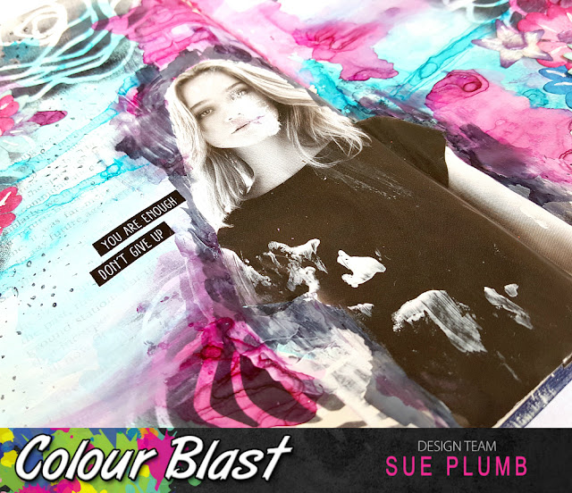
Hi everyone! Popping in today with my most recent design team project for Colour Blast, and I have another spread in my altered book art journal to share. (I did warn you there would be more!) For this one, I again reached for my favourite product - Colour Artist Inks, along with white heavy gesso and Colour Paste. I just love the colour and vibrancy of these inks!
Here's a look at the full spread...
As you can see, I used a super pretty blue / pink / purple colour palette; and a variety of techniques including watercolour, stencilling, layering, collage, and stamping to achieve my result. (Which I love!) I will take you through my full step-by-step process so you will be able to try it too - bear with me, as I have lots of photos to share.
I started by laying down a coat of white heavy gesso on my pages. This primed my pages and ensured they were ready for the mediums I was going to apply. I used an old gift card to scrape the gesso across the paper which ensured a thin, even coat. (I didn't want the gesso too thick, as I still wanted to be able to see the book text underneath.)
Next, it was time to apply some colour using 'Oasis' and 'Slipper' Colour Artist Inks. I started with the 'Oasis' and simply brushed the inks onto random areas of my page, using extra water to help move the ink around. Once I was happy with the coverage, I dried it off using a heat gun. (That is how I achieved the "water lines" you can see in the ink. If you prefer a softer look, leave the inks to air dry.)
Once the 'Oasis' had dried, I simply repeated the process with the 'Slipper' ink; using it to fill the gaps I had left earlier, whilst also layering it over the blue in some places. (Again, I achieved the strong "water line" effect by drying with a heat gun.)
Next, it was time to add some layers! I used the fabulous 'Deconstructed Floral Bouquet' stencil from StencilGirl, along with black Staz On ink and a sponge to apply some floral details to several areas of my page. (I love the way this technique adds a layer, but still allows the layers underneath to show through.)
Once the stencilling was complete I then decided where my focal image and quote were going to be placed, then used my finger to apply some white heavy gesso to each area. (Don't be afraid to get your hands dirty - fingers really do make the best brushes!)
I then added my feature quote (which was from the Flutterby Designs 'We Run the World' collection); along with some Flutterby Designs phrase stickers and my focal image (which was cut from a magazine). As the theme of my page was about being flawed, I took the opportunity to "modify" my image by cutting off one of the model's arms, and by rubbing back the paper on one side of her face.
At this point, my page was looking like this...
It was now time to start adding some texture. I hit on the idea of using up a (very) old supply I had lurking in my cupboard - flat paper flowers. I used many of these when I first began scrapping all those years ago, but they have laid dormant and unused in my cupboard for a long time; so I thought this would be a good way to use some of them up.
I used the "visual triangle" principle of design ad stuck them in 3 clusters on my page using a multi matte medium. (I brushed the flowers down as flat as I could and layered them together.)
After the flowers were applied I decided my page need a little extra "something", so I used 'Lovely Lilac' Colour Paste to add a small smear to the centre of the flowers using a thin palette knife, and then I also added some random smears around my page with the excess.
To help my focal image and quote stand out a little more from the background, I used a water brush filled with 'Soot" Colour Artist Ink to add some shadowing around the outside of them. I also used a correction pen to add some white highlights to my flower petals. (Thank you Lisa Oxley for the tip!)
To finish off my page I used my 'Doodle Dots' stamp from Viva Las VegaStamps to add a little stamping to a few areas of my page.
And with that, my page was done! I hope you have enjoyed seeing my entire process and that it might inspire you to try recreating your own version of it.
Here's a couple close up shots of the finished spread...
Thanks for stopping by so I could share this with you.
Until next time, happy scrapping! X


No comments:
Post a Comment