Showing posts with label white heavy gesso. Show all posts

Thursday, 23 May 2019

Be You! | Colour Blast


Hi everyone!
Popping in today to share my final design team project for Colour Blast. Yes, after two and a half years on the CB design team, the time had come for me to step down. After a lot of time and effort devoted to this team over the past couple of years, this now gives me some breathing room and the freedom to look for some new creative opportunities and avenues.

So today I am sharing the last layout that I created for CB using the 'Limited Edition' collection. The theme of this collection is all about being yourself so I thought I would document a couple of cheeky selfies (which pretty much sum me up. hehe)


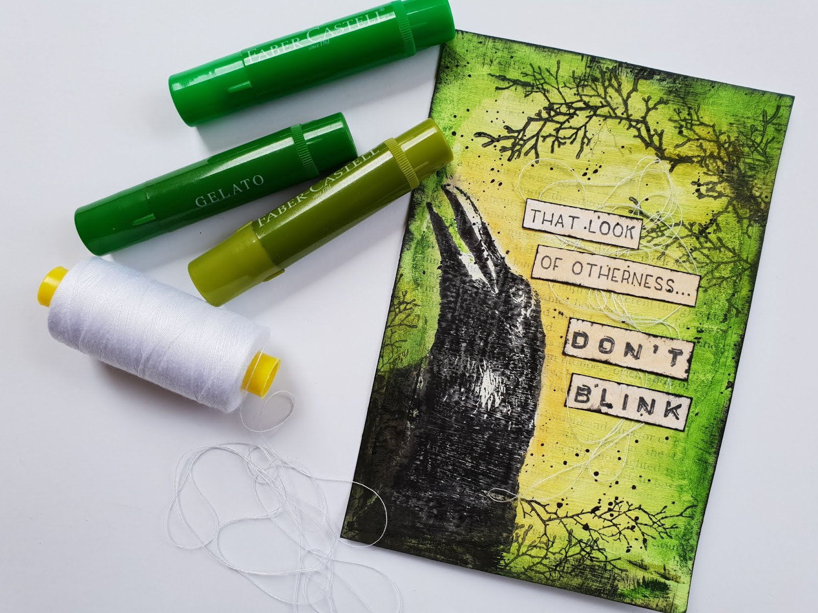
Here's a look at the supplies I started with...


I began with the One of a Kind patterned paper from the 'Limited Edition' collection as my page background. The first step was to add some White Heavy Gesso to the area I decided was going to be the focal point of my page. I did this using a small brayer.


Whilst the gesso was drying, I gathered some pieces of the 'Stand Out' patterned paper and layered them together to form a mat for my photos. 


I then went back to my background sheet and added some stamping around the edge of the focal area using the Peony Dreams stamp set from the 'Spread Your Wings' collection and 'Faded Jeans' Distress Oxide.


Next, I wanted to add some subtle texture to the page. I used the 'That Way' stencil from the 'Going My Way' release with 'Apple of My Eye' Colour Paste; applying small amounts randomly around the page using a palette knife.


At this point I felt my layout needed some black to tie in with the black in my photos and also to provide a some contrast. I used 'Soot' Colour Artist Ink, and simply used the dropper from the bottle to drip some directly onto the page. I then set my page aside for a little while to dry. 


Once it was dry, I added the layered mat I had created earlier; bending up the edges of each of the pieces to give the stack more dimension, before sticking my photos on top.


I then took the Floral Cluster cut file from Cut to You and tucked them in under the edges of my photos. I also created a circular frame using coloured wire, which I stapled on top of my photos. 


With all of the main structure in place, it was simply a matter of adding some finishing touches. I added some messy black cotton thread, which I tucked in amongst my layers.


I fussy cut three small bees from the Glorious Tags paper and added those to the page.


 I finished off my layout by adding three phrases cut from the Exception Word Sheet paper, placing two above my photos and one below.


That's all from me today, thanks for stopping by. Until next time, happy scrapping! X

Tuesday, 14 May 2019

Brave Wings | Colour Blast


Hi everyone!
Popping in with a recent Colour Blast design team project for you. Today I have a mixed media scrapbook layout to share featuring the 'Spread Your Wings' collection; combined with a bit of the 'Graffiti Grunge' collection; Colour Paste; Colour Shimmer Cubes and Heavy White Gesso.
I created this page to document a selfie of my best friend and I as we sat on top of Mount Beerwah (after climbing it in 36 degree heat.) 


Here's a look at the supplies I pulled out to start my project with...


I began with the Fly paper from the 'Spread Your Wings' collection for my background. To give the page some extra depth, I added some stamping using the Do It Stamp Set and 'Stormy Sky' Distress Oxide.

I then added a piece of the Fearless paper from the 'Graffiti Grunge' collection across the centre of the page, distressing the edges to give texture, before stamping over the left edge to blend it in with the background sheet.


Next, I wanted to tone down some of the colour and pattern, so I used a small brayer to apply Heavy White Gesso to the centre of my page.


Whilst the gesso was drying, I gathered up some paper pieces to create a layered mat for my photo. I arranged the pieces in a small stack and secured them with staples before sticking it down.

Next, I took the Peony Dreams paper and fussy cut some of the large floral designs from it, which I then tucked in under the edges of my photo mat. 


Once the floral pieces were stuck in place, I rubbed a small amount of white gesso over each of them to help blend them into the background.

Then it was time for some texture! I wanted it to be subtle, so I used a small floral design stencil with 'Snow White' Colour Paste and applied it in a few areas on the page and left it to dry.


To embellish my layout, I dug through my (extensive) flower stash and pulled out an assortment of paper and fabric blooms (most of these were from D-lish Scraps). I created a circle using a pip berry stem, which I layered behind and over my photo before sticking my photo down. I then adhered the flowers on my page using hot glue; starting with the largest flowers first and working my way down in size until I was happy with the arrangement.


With the flowers all stuck in place, I then dry-brushed a small amount of gesso over them. This helped tone down some of the brighter colours to make them more subtle.

To finish my page off, I fussy cut the with brave wings she flies quote from the Earth Angels paper and stuck it down using a strip of cardboard behind it to pop it up a bit.


I then took 'Apple of My Eye' and 'Singin' the Blues' Colour Shimmer Cubes (these are now discontinued, so simply substitute another product if you don't have them in your stash); and used a small brush to apply pools of colour to the page. This added subtle, shimmery detail to the layout once it had dried. 


You can see how brushing the gesso over the flowers not only toned down the colours, but also provided cohesion to bring the mix all together.


That's all from me today, thanks for stopping by so I could share this with you. Perhaps you might be inspired to pull out some old flowers from your stash and create something too? It's fun mixing old supplies with new!
Until next time, happy scrapping! X

Saturday, 29 September 2018

"Beautiful Disaster" Canvas Class - Scrap & Chat Retreat


Hi everyone!
Just popping in with a project share and a quick wrap up of the class I taught last month at the annual Scrap & Chat retreat in the Dandenong Ranges near Melbourne. (If you have never been on a retreat, let me tell you that there is nothing that compares to being around 60 like-minded people for a weekend full of creating. So good for the soul!)

I had so much fun teaching my class to all these gorgeous ladies...


The piece I taught was a mixed media canvas panel, entitled "Beautiful Disaster" and it was a great opportunity to fly the flag for a number of my favourite brands including Colour Blast, Cocoa Vanilla Studio, Flutterby Designs and StencilGirl.


The canvas was was coloured with my favourite Colour Blast product - Colour Artist Inks, and we used the warm tones of Slipper, Cranberry, Cider and Citrus for the background; then the cool blue colour of Oasis for adding some contrasting highlights. 


Besides the Colour Artist Inks, we also used one of my other favourite Colour Blast products - Colour Paste. We used Deep Water for contrast and texture, applied through a Flutterby Designs stencil (although there were a couple of ladies who used Lovely Lilac from my stash because we thought it would work better with the pieces they had created). 


We also used Colour Blast black and white heavy gessos on the canvases - using the white to strip back colour and offer the eye a place to rest; and black to add contrast and tie in with the StencilGirl 'Talaya: Goddess of Rain' stencilled image and the Flutterby Designs quote. This was probably the messiest part of the class as I encouraged everyone to test my motto that "fingers make the best brushes" - so fun! 


We finished off the canvases with some 'Bohemian Dream' vellum accent embellishments from Cocoa Vanilla Studio. The gorgeous colours of the printed vellum die cuts worked beautifully with the tones of the inks and paste. 


I so enjoyed the opportunity to fly the flag for some of my favourite products and to share my love of mixed media with such a lovely group of ladies. Thanks to everyone who attended!

If you would like me to come and teach at your local scrapbook store or event, I am happy to discuss your requirements and see if we can make it work. You can email me via the contact tab at the top of the page.
Until next time, happy scrapping! X

Monday, 24 September 2018

Don't Blink | Viva Las VegaStamps


Hi everyone!
Today I am here to share my latest Viva Las VegaStamps design team project with you. This piece was inspired by the September "For the Birds" monthly challenge and it showcases one of the amazing new release stamps, which I couldn't wait to use!

Here's a look at the challenge inspiration...


One of my arty friends (yes I am looking at you, Leanne Jago - I said you had a lot to answer for!) has been using index cards a lot lately, and I was inspired by the pieces she has been creating to use an index card for my project. (One of the good things about index cards, is that they are almost exactly the same size as a standard photo, so they fit nicely into 6x4" photo frames!)

Here's my card inspired by the challenge...

To begin my project, I used some gel matt medium to adhere some book paper onto the index card. I then applied Colour Blast white heavy gesso using a brush. I chose to use a brush as I wanted the texture of the brush strokes to show through; but in hindsight, next time I will go a little thinner with the gesso so the text is more visible on the finished piece.


After the background was prepared; I used black Staz On ink and the new Raven Looking Up stamp as the focal image of my piece. I then added some tree branches across the top and bottom of the card using the Branch Antlers stamps. I also inked around the edges of my card.


Next, it was time for some colour! I wanted my piece to have an eerie feel, so I opted for green as the main colour. I used Faber-Castell gelatos to scribble gently onto the card, then used a baby wipe to blend the colour out. 


I started with the darkest shade around the edges of the card, moving towards lighter shades in the middle. In the centre of the card I used a yellow, blended with a small amount of green; and along the edge of the raven's silhouette I also added a small amount of orange.


Once the colour was complete, it was time to add some text. I used the recently released That Look of Otherness stamp and combined it with Don't Blink to form my focal quote. I stamped each of them out on some scrap white cardstock, then used the orange gelato and a baby wipe for blending to add a small amount of colour over the top.


I then cut the words out and inked the edges of each piece with black ink. To add some texture to my project, I added some messy white cotton thread before sticking the pieces of the quote down.


To finish off, I used Colour Blast 'Soot' Colour Artist Ink and a small brush to add some fine splatters randomly around the card.

Thanks for stopping by so I could share this with you.
Don't forget to enter this month's Viva Las VegaStamps challenge for your chance to win some new rubber and a feature spotlight on the VLVS blog. (Link your entries HERE)
Until next time, happy stamping! X


Saturday, 22 September 2018

Galaxy Painting | Colour Blast


Hi everyone!
Sue Plumb here to share my latest Colour Blast design team project with you. Today I am sharing a galaxy themed painting I created using Colour Shimmer Dusts and black and white heavy gesso. I cannot claim that this piece was my own idea, as I was inspired by several videos I saw on YouTube (search galaxy painting tutorials if you want to see some yourself). 


To prepare for this project, begin with a sheet of watercolour paper. It is important to use watercolour paper, as you need a surface that will allow the paint to move and blend freely. To keep the paper flat, I used washi tape to secure it to my craft mat. I then mixed up the Colour Shimmer Dusts I was going to use with a little water in my paint palette, and set them aside.
(Also ensure you have on hand - a cup with clean water and paper towel.)


To begin, I brushed the surface of the paper all over with water (not too much), as this piece uses the "wet on wet" watercolour technique.
I started by applying the lightest blue colour I had chosen, which was Duke, using a wavy motion with my brush. You will see the colour start to wick out onto the wet paper. The colour will pool more heavily in some areas than others - this is completely fine. (There are lots more layers to go yet!) Be sure to leave a little spot or two of white space in the centre area of the page.


Once the first colour is in place, you can repeat the process with the next colour (working from lightest to darkest). I actually opted to leave out the 'Cobalt' Colour Shimmer Dust at this point and moved straight to 'Navy' instead.


I followed some of the natural lines already formed by the previous colour and used more of a dabbing motion to apply the colour this time. 
Here's a quick look at what I mean...


As you work, if you find an area is getting too wet or the colour runs where you don't want it, simply blot away with paper towel. Remember that you want the piece to be darker the closer you get to the edges. 


Once you are happy with the 'Navy', repeat the process with the 'Midnight' Colour Shimmer Dust, keeping this darkest tone more concentrated to the edges of the piece
Once you have all these colours in place, allow the piece to dry a bit so you can assess it (you can use a heat gun to speed it up a bit if you wish). If you find some areas are a little dark, go back in with a brush loaded with clean water and reactivate the paint where you want to strip the colour away and simply blot some off with paper towel.


You can then go ahead and add some purple into your piece in these using either 'Passion' or 'Velvet' Colour Shimmer Dust. (Just remember not too much, and keep to the lighter areas in the centre of the page intact.) You can go back as many times as you want to with any of the colours until you get the desired effect. Once you are happy, allow it to dry completely until moving onto the next step. 


Using the White Heavy Gesso and a wooden skewer (you could also use the flat end of a small paintbrush or pencil), add some dots to represent stars around the page. Then, using the pointed end, drag the tip outwards from the centre of a couple of them to imitate the light shining from them.


For the remaining stars in the galaxy, mix a small amount of gesso and a few drops of water to make a thinner consistency. Take a small, stiff brush and use a tapping motion to add small splatters randomly all over the page and allow to dry.


To finish off, take some black heavy gesso and paint some tree silhouettes along the bottom edge of the page. (Don't try to be precise with these, you are not looking for perfection!)


And there you have it - painting complete! Here's a little video of the finished project close up so you can check out the details and shimmer...


Thanks for stopping by so I could share this with you. I hope I have inspired you to try one of these yourself. If you do, please share it in the Colour Blast Creative Corner so I can see it!
Until next time, happy creating! X