Tuesday, 27 February 2018

Awesome Memories | Cocoa Vanilla Studio


Hi everyone!
Today I am sharing a mixed media scrapbook layout I created using the 'You Rock' collection from Cocoa Vanilla Studio and products from Colour Blast. I chose to document a couple of snaps of my boys swimming in their Nana's pool over the Christmas holidays; which obviously dictated my colour choices for my page. 


I wanted to emphasise the water theme of my page, so I started with wood grain print of the Plus One paper; then applied Colour Blast white heavy gesso and Colour Artist Inks (Marine and Oasis) over the top to create a water inspired background. I also smeared some Colour Paste (Deep Water) with a thin palette knife around my page to provide a textural element and a feeling of movement.


Once I had the background complete, it was time to start working on the paper elements of my page. I started cutting and layering assorted size pieces of patterned paper in the focal area where I knew my photos were going to be placed. I used pieces cut from both the Stripped and Galactic papers in my layers, which I also mixed with some frames from the die cut ephemera pack to give more depth.


Once all my layers were in place, I added my two photos on top, adding some scrap cardboard behind them to mount them up a little higher. I also added some more pieces from the die cut ephemera pack with foam tape behind them to provide more dimension.


The next embellishments I added were some wood veneer stars from the wood veneer shapes pack; along with some stars that I fussy cut from the Starshine paper; and some yellow enamel shapes.


For my title, I used the “awesome” word from the wood veneer pack, which I coloured using some white gesso (smeared on with my finger) and the Marine Colour Artist Ink I had used on the background; then added the little “memories” banner from the die cut ephemera pack to complete it.

Thanks for stopping by today so I could share this with you. I will be back again soon with another project to share. Until then, happy scrapping! X

Wednesday, 21 February 2018

I Am a Queen | Flutterby Designs


Hi everyone!
Time for another design team project share, and today I have a mixed media scrapbook layout for Flutterby Designs. This page was created using the 'We Run the World' collection, and a selfie I took after spending the day doing demos on the Colour Blast stand at Craft Alive back in November. (I had smurf hands, even after a scrub! haha)


I knew which quote was going to be used as my feature, so started by creating a watercolour style background to match using Colour Artist Inks from Colour Blast and stamps from Viva Las VegaStamps. This defined my focal area, whilst leaving plenty of white space for the eye to rest.


I then added my quote, cut from one of the Everyday Etc cards from the 'We Run the World' collection. I also used a couple of narrow strips from one of the coordinating filler cards to define the focal line from which the rest of the layout was going to be structured. Underneath the quote, I added a torn strip from another of the filler cards; and phrase sticker from the white tiny sticky quote sheet.


I then added my photo, which I cut away from the background and then mounted on some scrap cardboard before sticking it down. I added the wood veneer crown and the this is me quote (both from the 'We Run the World' wood veneer set). I also added the note speech bubble from the Speech Bubbles 2 Photo Cut Out. (These are awesome for adding that little bit of extra personality to a page and you get several per sheet.)


Next, it was time to add something to the to of my page, as it was looking very "bottom heavy" at this stage and I wanted to balance it out. I took another strip torn from the black & white striped filler card; as well as the she is cut from one of the white sticky quotes. I paired it with the words confident and bad ass from another one of the 'We Run the World' Everyday Etc cards; and the strong wood veneer from the coordinating set. The crown sticker came from the WRTW Sticky Quotes sheet.


To finish off, I added another couple of torn strips of the black and white striped filler card along the bottom edge of my page; as well as a white sticky quote and a flair button. (This high five one I used was from set #306.)

That's all from me today, I will be back soon with another project to share.
Until then, happy scrapping! X

Sunday, 18 February 2018

Show Us Ya...Paste | Colour Blast


Hi everyone! Popping in to share my latest Colour Blast design team project with you. For today's post I was inspired to create a page that not only featured Colour Blast products, but a photo of some of the Colour Blast team as well. This snap was taken at a scrapbooking retreat last year, when we were posing for photos and decided to have a bit of fun with our Colour Paste stash.
(I love these chicks!)


I decided to do a bit of stash-busting for this page - using up some old Crate Paper papers and stickers I had in my cupboard. It's amazing how you can give old products a new lease on life by simply adding some mediums to them!

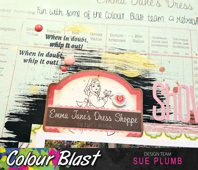
I started my page with a patterned paper background, but livened it up by adding some swipes of Black Heavy Gesso to it. This gave me a clearly defined focal area to work with.


Once the gesso had dried, I added a little extra colour using Sunset Colour Spray and Bling Colour Shimmer Spray by splattering them around my page.


Next, it was time to add some papery layers. I cut a few assorted pieces which I layered together and then secured with staples, then adhered it to my page.


Once I had the paper layers in place; I added my photo on top and then some various stickers around it. I still wanted a hint more colour though, so I took some Rainforest Colour Spray and added some extra splatters before I began adding my title and embellishments.


At this point I decided my layout needed a little more contrast, as well as some subtle texture; so I took my Bling Colour Paste and smeared some around the page using a small palette knife. (And I could hardly have a page featuring a photo of Colour Paste without using it on there could I?)


Let's take a closer look at some of the details.

I used the fun when in doubt, whip it out! phrase stamp from Viva Las VegaStamps! to stamp randomly around the page.


I used foam tape under some of the stickers to give a little dimension.


I also added some scattered enamel dots around my page for a little extra colour and visual interest.


I love a good mixed font title, so I used a combination of Jillibean Soup alphabet stickers and some script style foam Thickers.


That's all from me today. Why not have a look through your own stash and see if you can be inspired to use up some old supplies by mixing them with Colour Blast products?
I will be back again soon with another project.
Until then, happy scrapping! X

Thursday, 15 February 2018

Jelly Fish Mail Art | Viva Las VegaStamps


Hi everyone!
Popping in today to share my project I created for the Viva Las VegaStamps Mail Art Monday. I was actually inspired by the current VLVS "Under the Sea" Monthly Challenge to design this sea themed piece. Although I have created mail art before, it has usually been on a bigger scale (pizza boxes); so creating on this envelope was a good push to do something outside what I am used to. 


When I started this piece, I realised I didn't have any larger sized white envelopes left at home, only some yellow ones. The answer? Gesso of course! And then lots of lovely layers over the top!
I started with some Colour Blast 'Calypso' Colour Artist Ink, which I applied directly over the gesso, along with lots of water to help move it around before drying it off.


Next, I wanted to blend the edges of the envelope, so I used a Faber-Castell Gelato to scribble some colour around the edge before blending it with a baby wipe.


Then it was time to turn my attention to my focal images for my envelope. I had previously stamped some gorgeous jelly fish out onto tissue paper using the Jelly Fish stamp. Because the tissue paper is so thin, it means the image can been seen well from either side, which allows you to flip its orientation to face the other way. 

I added some subtle colour to the jelly fish bodies using another Gelato, then used a Faber-Castell watercolour pencil to add some colour along the tentacles before sticking them down onto my envelope.


Once I had the jellies in place; I then took a piece of scrap cardboard to mark out the address box, before I used the same blue Gelato to blend around the edges of it, and also around the edges of my jelly fish.

Next, it was time to add a little greenery to my under sea scene, so I used the Doodle Flower/Garden stamp to add some plants along the bottom edge.


I also added some "bubbles" to create a sense of movement using my favourite Doodle Dots stamp. (I told you, there is no project this stamp can't be used on!) I also added some more pink to the jellies with a darker pink Gelato, as I didn't think they were "popping" enough.


 I used a green Gelato to roughly scribble some colour over the top of my stamped plants before blending with a wipe.


To finish off my envelope, I added some splatters of 'Marine' Colour Artist Ink before removing the cardboard to reveal the address box. To help further define the box, I used a watercolour pencil to quickly draw around the inside border.


I am really happy with how this piece turned out; although sadly, I don't think it will make the mail. As soon as my daughter saw it she said "can I have that?" (she loves the ocean and its creatures) and I didn't have the heart to deny her. 
If I was planning on posting this however, I would recommend a quick spray with a water based sealant to protect it from the mail handling process and prevent the colours being rubbed away.


Here's a linked list of the VLVS stamps I used: 

Thanks for stopping by so I could share this - I hope I have inspired you to get inky today! I will be back soon with another project to share. Until then, happy scrapping! X

Monday, 12 February 2018

3 | Scrap the Girls February Challenge


Hi everyone!
Today I am here to share my take on the February challenge at Scrap the Girls. This month, the challenge is a sketch, which just happens to have been designed by me! As February is traditionally the month of "love", I designed a simple themed sketch called 'Star Crossed Love'...


Given that this was my own sketch, you would have thought I would have no trouble sticking to it, right? Not exactly...haha! Once I sat down to create my page, it did take on a bit of a mind of its own. 
Here's what I created...


I chose to create a page documenting this photo of myself, my sister and one of my besties (and the third amigo) Krisy. I took the opportunity to do some stash busting as well, using up some assorted items from my stash.


Most of the papers on my page were from the Crate Paper collections 'Confetti' and 'Bloom' by Maggie Holmes. (I have been hoarding these for entirely too long, so it was time to use some up.) The awesome I just knew we'd be friends quote came from a Flutterby Designs Everyday Etc card from the 'Partners in Crime' collection.


I also included some coordinating Crate Paper ephemera pieces and chipboard frames, which I included in my layers on my page. I then added some Flutterby Designs Tiny Quick Quotes stickers; a few pieces of torn washi tape and some staples with my tiny attacher.


To finish off my page, I added the Flutterby Designs trouble maker flair button, which I nested on some cotton thread; stamped the bitch please... phrase with my Typo stamp; and splattered some Colour Blast 'Soot' Colour Artist Ink.


Thanks for stopping by so I could share this with you. Don't forget that you have until the end of the month to get your entries in for this challenge. You can head over to the Scrap the Girls blog for all the details and see what else the team created with my sketch.
Until next time, happy scrapping! X

Friday, 9 February 2018

You | Cocoa Vanilla Studio


Hi everyone, happy Friday!
It's time to share my latest design team project with you, and this one was created for Cocoa Vanilla Studio. We are currently celebrating a "love" theme on the CVS blog, and I couldn't go past using the new 'More Than Words' collection for my project - it's perfect for creating pages about the ones you love most. I decided to create a page for my hubby, as I don't do enough pages that are dedicated to him.


For this page, I decided to focus on a simple white / black / blue colour palette to compliment my black and white photo. I used the spotted pattern on the B-side of the Radiant paper as my background and added some Colour Blast 'Just Blue' Colour Shimmer Cube watercolour paint to help define the focal area. I also added some stamping around my page, using the cluster of small hearts from the clear stamp set.


I then added some lovely papery layers to create a mat for my photo. I used the black and white floral print from the 6x6" paper pad immediately under my photo, as the predominantly black paper helped my photo to stand out. Under that was a piece cut from the Collage paper featuring a grey and white leaf print design. To build my layers I also tucked in a small piece of the Treasure paper; and a tab and tag (tied with some twine); both from the accessory sticker sheet.


Next, I took the gorgeous floral Sketchbook paper and fussy cut some of the floral motifs from it. (I was careful to avoid any colours other than grey or blue.) I then tucked these pieces in around my layers adding some small leafy branches from the vellum accents pack as well.


Alongside my photo I added some phrase stickers from the accessory sticker sheet in place of journalling; as well as the "so very thankful for you" sticker directly onto my photo. To balance them out, I added a butterfly from the vellum accent pack on the opposite side of my photo.


To finish my page I added the word "you" from the chipboard titles pack. I prefaced my title with a small spotty heart from the chipboard stickers sheet. In keeping with my "rule of threes", I added two other chipboard hearts to my page - one at the top above my tag, and the other, a tiny one directly onto my photo.

Thanks for stopping by today so I could share this with you. The new 'More Than Words' collection is available in many stores already, so make sure you check with your favourite retailer to see if they have it in stock.
I will be back again soon with another project to share. Until then, happy scrapping! X 

Wednesday, 7 February 2018

Together We Can Rock the World | Flutterby Designs


Hi everyone! 
I am here today to share my latest design team page for Flutterby Designs using the recently released 'We Run the World' collection. This page features a photo of my sister that was taken on a theme night at a scrapbooking retreat. (When we dress up, we ALWAYS commit!)


I started this page using the 'Connie' paper from the 'We Run the World' 12x12" paper pack. Because the paper had such a bold pattern, I used a little 'Arctic White' Flutter Colour paint to tone the pattern down in the centre of my page first. I then gathered together a few different 'We Run the World' Everyday Etc filler cards, which I cut and placed over the paint to create a layered photo mat.


After I had my mat in place, I added one of the tabs from the 'We Run the World' Die Cut Bits & Bobs pack; before sticking my photo on top. I then used a Colour Blast Colour Shimmer Cube to add some watercolour highlights around the edges of my mat.


To the right of my photo, I added the quote from one of the 'We Run the World' Everyday Etc cards, which also served as my title. Above the quote I added the camera sticker which came from the 'Mad About You' Sticky Quotes sheet; and a heart sticker from the 'We Run the World' set. (I popped the heart on a bit of foam tape to give it some dimension.)


Below my photo I added more stickers from the 'We Run the World' collection; before scattering a few tiny hearts from the same sheet around my page.
To finish off, I added some splatters of Colour Blast 'Love' Colour Spray.
(I found it challenging to keep myself from adding more embellishments, but as the paper pattern was so bold I didn't think it needed any.)

Thanks so much for stopping by today so I could share this with you, if you are looking to top up your stash of Flutterby goodies, now is a great time to do it! Anita has just added a new 'clearance' section to the website, and added LOTS of lines to it, so you can snap up plenty of bargains!
Pop over and check them out HERE
Until next time, happy scrapping! X