Hi everyone!
Today I am sharing my second March project for Kitaholic Kits and my first one using the main kit. (You may recall the focus of my first project was the mixed media add-on kit, which I used to create a pretty layout background - you can find my video for it HERE) This month the main kit is jam-packed full of the gorgeous 'Sunkissed' collection from Cocoa Vanilla Studio (lucky me!)
As with any kit, I always find the first layout the hardest one to do. This is largely because I get overwhelmed with the huge choice of materials, but also because the hoarder in me wants to keep everything intact and hold onto it forever. Thankfully, this usually settles down by the time I get to my second layout, and I just rip into it with wild abandon.
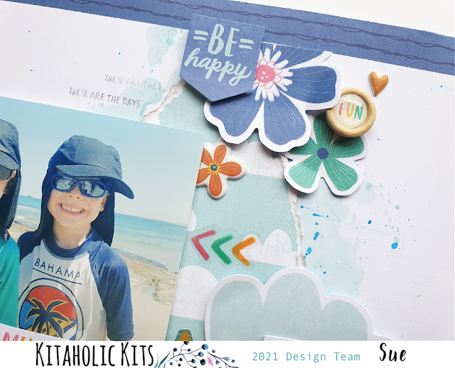
Here is my layout, "Sunshine State of Mind"...
I kept the mixed media relatively simple on this page, in order to allow the 'Sunkissed' collection to really shine. I used Distress Oxides (Tumbled Glass and Salty Ocean) to create a "watery" style background on my cardstock, which I had cut down to measure 11x11" so I could mount it on the Bright Side patterned paper to create a border.
Next, I chose the cloud print from the Just Chillin' patterned paper, which I tore in a way to try to create a similar shape to the one that I had on the page from the Distress Oxide. I then stuck it over the top of the background colour. This then defined the focal area of my page.
I had two cute photos of my boys at the beach from a couple of years ago, which I added some scrap cardboard to the back of, before sticking down on the page. I chose my title piece Sunshine State of Mind from the Fun in the Sun cut apart paper, fussy cut it out and tucked it in beside my photos. Then it was time for some embellishments!
There are so many gorgeous embellishments in this kit. I used a mix of the Die Cut Ephemera; Floral Ephemera; Wood Buttons; Accessory Stickers; Clear Stickers and Puffy Stickers. I arranged them in close around my photos and followed the cascading design of my paper from top to bottom, focusing on creating three main clusters for balance.
To finish my page, I added journalling then stamped the date and a few phrases. This layout was fairly clean and simple (well for me anyway), and I love the fact that all the elements I chose get their chance to shine.
If you would like to see me put this layout together, you can watch my process video here:
Thanks for stopping by today, I will be back again with another project share soon. Until then, happy scrapping! X


No comments:
Post a Comment