Hi everyone! Time to share another design team layout, and this one is for Scrap the Girls. This month's challenge at Scrap the Girls is called "P is for Pink" and it looks like this...
There are no prizes for guessing what I took as my main inspiration from the board, of course it was the colour pink! I wanted to delve a bit deep into how the board inspired me though; so I thought of what else "pink month" for breast cancer awareness signified to me. I immediately thought of sisterhood. Women banding together to not only look out for themselves, but also each other. Breast cancer is a topic that unites all women. It was for this reason I decided to scrap this photo of me with one of my scrapping besties, Krisy. This chick always has my back, and she knows I have hers; plus, she totally gets me - true sisterhood.
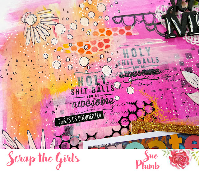
I started my layout with some white cardstock and my fave pink Dylusions acrylic paint. (They don't come much pinker than this one!) I added a few random smears of yellow as well, just to give the background some contrast.
Next, it was time to set to work with some ink. I started with my Dusty Attic 'Squared' stencil and applied ink with a sponge to a few areas of my page. I then added lots of stamping using some of my fave stamps from Viva Las VegaStamps. Once all the ink had been applied I then added a bit of Colour Blast white heavy gesso to some areas of the page to strip it back a bit.
Next, it was time to start adding the paper based elements of my page. I cut up some paper doilies and added them to the area where my photo was going to go, and also a piece in the top right corner. I then added some strips of washi tape to hold the doily pieces down, and also some small torn pieces around my page.
I then gathered together some pieces to layer under my photo - tissue paper; punchinella; hand dyed muslin; and some glittered die cut pieces. (At this point I was really just looking to add an assortment of eclectic items to my layers that would help tie in some of the colours from the photo.) I then added some of the same elements to my cluster at the top as well, along with the custom wood veneer title from Corbett Creations that I had painted black and highlighted with a white paint pen.
To the right of my photo, I added some messy white cotton thread, topped with the Flutterby Designs do epic shit flair button. I also added some pink wire, which I twisted and attached using staples. Beneath my cluster I added a couple of black tiny sticky quotes from Flutterby Designs. I then added one above my title and another above my photo.
I also added a second piece of wire on the left side of my photo, along with the butterfly heart from Charms Creations.
To finish off my page I added all the white detailing. I used a Crafters Workshop 6x6" template for the floral shapes - tracing them out with a black Sharpie pen first, then colouring them in with a paint pen and adding some black detail on top. The bubbles were added using my Flutterby Designs 'Bubble O'Fun' stencil (currently on sale in the Flutterby store.) Again, I used a white paint pen, then added some black detail over the top. I then added a few other little doodled black details to my page and I was done!
If you got through all that reading, thanks for sticking with me! Although it may have sounded like a long process or a lot of work, it really wasn't. The layout came together easily and in the end I had to make myself step away from it because I was having so much fun.
You have until the end of the month to get your own entry in for this month's Scrap the Girls challenge. See how the "P is for Pink" board inspires you, and you could be a winner! This month's main prize is from the Resin Rainbow, and there is also a prize for a winning international entrant too! Head to the blog HERE to link up your entries or see what the rest of the team created.
Til next time, happy scrapping! X


No comments:
Post a Comment