Wednesday, 31 October 2018

Happy Days | Colour Blast


Hi everyone!
Time again to share another design team project with you. This mixed media scrapbook layout was created for Colour Blast and features Colour Artist Inks; Colour Paste; and a Colour Shimmer Brush Marker.


To create my page, I applied drops of Colour Artist Inks in Oasis, Calypso, Mermaid and Marine directly to my messy mat using the dropper. I then placed my cardstock on top to soak up the ink. I also added some splatters using a small brush.


Once I had the ink down on the background, I used 'Singin' the Blues' Colour Paste through a stencil in a few areas to add some subtle texture.


Next, I added some papery layers behind my photo. I used up some old Echo Park papers from my stash, along with some frayed gauze for texture. I also used some of the coordinating Echo Park stickers, and some puffy stickers from Cocoa Vanilla Studio.


Alongside my photo I added a Charms Creations heart embellishment, topped with a Cocoa Vanilla Studio flair button. I also added a couple of Cocoa Vanilla resin hearts to my page.
For my title, I used a Kinder Kreations wood veneer, which I coloured by painting it with 'Marine' Colour Artist Ink.


I used a fine tipped white paint pen to add some details to the title, before adding some shimmer with a Clear Colour Shimmer Brush Marker


To finish off my page I added some final splatters using 'Marine' Colour Artist Ink and a small, stiff brush.

If you would like to see exactly how I put this page together, you can watch my process video on my YouTube channel here:


Until next time, happy scrapping! X

Sunday, 28 October 2018

Trick or Treat | Viva Las VegaStamps


Hi everyone!
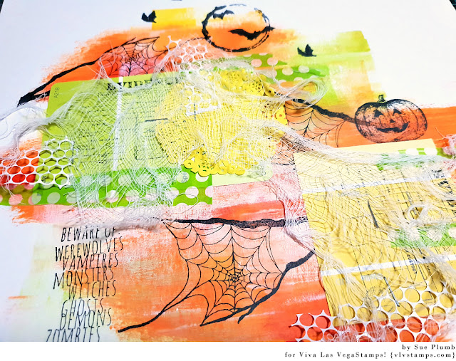
With Halloween fast approaching, I thought it was time to share a recent Viva Las VegaStamps design team project with you. This mixed media scrapbook layout features some of the recently released Halloween stamps from VLVS.
Although Halloween isn't as big here in Australia as it is in the US, it is steadily growing in popularity each year. (My kids think any occasion where you get to collect candy from the neighbours is a great idea, and I am happy to hand out treats to kids who have made an effort to dress up.)


I started this page with a sheet of Bazzill Marshmallow cardstock and some Dina Wakley acrylic paints. I used the colours Lime, Sedona, Tangerine, Lemon and Cheddar. I used several methods of applying my paint - starting with a brush, then a brayer and finally, my fingers! Once I had all the colours down, I went back over it with some white acrylic and my brayer where I wanted to place my photos.


Once my background was dry it was time to pull out my stamps. I started with the awesome Spider Web in Tree Branches and stamped it several times on my page. I followed that with the Bats Over Moon at the top of my page. (I repeated the smallest bat a few times to increase the "battiness" factor.)
I then added the Jack O'Lantern on the right side of my page, before adding the Beware Of: list in the bottom left corner. 


I love the way the black images pop against the warm colours of the paint!


With all the stamps in place, the main structure of my page was all mapped out and it was simply a matter of filling the blanks between them. 
I wanted to add an extra layer behind my photos, and reached for one of my favourite items - some paint sample cards from the hardware store. I love using these! Not only are they easy to coordinate with whatever colours you are using, but they are also free! I stamped them with the Evidence Label for some extra detail before adding them to my page.


Now it was time for some texture! I added some pieces of torn printed tissue paper; a paper doily; some small pieces of punchinella (all from D-lish Scraps); and frayed gauze to my page and then secured it with staples.


Next, I added some small red ink splatters randomly around my page using Colour Blast 'Sunburnt' Colour Artist Ink and a small brush.


To finish off, I added some cardboard to the back of my photos to mount them up, before sticking them down on the page.


I then added some handwritten journaling with a felt pen and my page was done!


I was really happy with how this page turned out and can't wait to take some more Halloween photos this year to use these stamps again. (First I need to convince my kids to dress a little creepier this year!)


Thanks for stopping by so I could share this with you. I hope I have inspired you to get inky too! X 

VLVS stamps used:

Thursday, 25 October 2018

Peace, Love, Pineapples | Flutterby Designs


Hi everyone!
I am here today to share my latest design team project created for Flutterby Designs - a mixed media layout featuring the 'Good Vibes Only' collection and Flutter Colour paints. I documented a photo of myself, my hubby and a couple of our mates that was taken at a local event on Australia Day. (In case you are wondering how the pineapples are relevant, the event featured a pineapple throwing competition.)


To go along with the theme of Australia Day, I chose a green and gold colour scheme. I used Flutter Colour paints to paint my background - first using a brush, then a brayer, and finally my fingers to add some highlights. 


On top of the paint I added some Colour Blast Colour Paste using the super cute 'Be a Pineapple' stencil. I then dropped some green Colour Blast Colour Artist Ink randomly over the top before drying it off. 


Next I took some of the 'Good Vibes Only' Everyday Etc cards and created a layered mat for my photo; then added some frayed gauze for texture before adding my photo on top. I tore up some small pieces of washi tape from the 'Good Vibes Only' kit and placed them around the page.

I fussy cut my peace love pineapples title piece from another of the Everyday Etc cards, overlapping the corner of photo with it, and popping some foam tape under the corner to help keep it up off the page. I then added the hello there flair button from set #286 on top.


I added some stickers from the 'Good Vibes Only' Sticky Quotes sheet around my photo as well as some wood veneer pieces. I added the good vibes only wood veneer further down my page. I decided my page needed a little more black so I added a few black Tiny Sticky Quotes to the page. 


To finish off, I added some enamel dots; my handwritten journalling; a few stamped phrases; and some splatters of black ink.

I am also happy to say that I created my FIRST EVER process video for this page. (Yes, I have officially crossed over to the dark side! LOL) If you are interested in seeing how I created this page, you can watch it on my YouTube channel here:


(And while you are there I would love it if you could subscribe to my channel too!)

Thanks for stopping by today so I could share this with you.
Until next time, happy scrapping! X

Saturday, 20 October 2018

Remember | Cocoa Vanilla Studio


Hi everyone!
Popping in today with my latest design team project for you. Today I am sharing one of the layouts I created for my classes at the Brisbane Scrapbook Expo earlier this year using the beautiful 'Bohemian Dream' collection and some snaps of my daughter and one of her friends. 


Although I did use a little mixed media on this page, for the most part I let the mixed media style papers from this collection do most of the work for me. I started with the super cool painty 'Abstract' paper as my page base; then cut a piece of white cardstock to measure 10x10" and stuck it down on top, leaving me with 1" border of the paper showing all the way around.


I wanted to create lots of colourful, contrasting layers to go under my photos; so I used the gorgeous 'Beautiful Mess' cut apart paper and stacked lots of the pieces up. I also used a small piece of the 'Abundant' paper that I had left over from another project. In amongst my papery layers, I also tucked some frame pieces from the die cut ephemera pack and a few accessory stickers


Once I had all the flat layers in place, I added more pieces from the die cut ephemera pack - this time floral pieces and words, using foam tape under some of them to pop them up for extra dimension. I also added some coordinating enamel shapes around my page. 


For my title, I used one of the chipboard title stickers along the bottom edge of my page; adding some subtle colour to the bottom half of it using a pink watercolour pencil, which I blended out with a water brush. I also used some other complimentary colours to add extra colour and shading along the edges of some of my paper pieces before blending them out with a water brush as well.


That beautiful big butterfly (that I simply adore!) was fussy cut from the 'Boho Bits' paper, and I adhered it with a small amount of glue in the centre before folding its wings up from the page. 
To finish, I added a small arrow from the chipboard accent stickers sheet in front of my title and I was done. 
That's all from me today. I hope I have inspired you to pull out any of the 'Bohemian Dream' collection you might be hoarding and make something pretty with it!
Until next time, happy scrapping! X

Monday, 15 October 2018

Unique | Colour Blast


Hi everyone!
Time to share another design team project with you - this one created for Colour Blast. Today I have a 12x12" mixed media scrapbook layout using very simple techniques that combine for a great result. The products I used on this page include Colour Shimmer Dusts; Colour Paste; Colour Spray and a Colour Shimmer Brush Marker.


I created this page after seeing this photo of my daughter and her friend pop up in my Facebook memories and realised that I hadn't scrapped it yet. The photo of them was really vibrant and featured quite strong colours, so I wanted to create a colourful and fun page to go with it.

This photo actually presented an interesting visual trick. The striped shirt my daughter's friend was wearing was actually blue and red stripes, but when you view the combination of the two colours so close together it actually gives the impression of purple, so I decided to use purple as a feature on the page.


I began with some white cardstock, a small floral stencil from D-lish Scraps, and 'Royalty' Colour Paste. I applied the paste through the stencil with a palette knife, repeating the image 3 times in the central area of my page (I usually use the visual rule of threes when I create a page). Once the paste was down, I dried it off with a heat tool and moved onto the next step.

I chose three shades of Colour Shimmer Dust - Lush; Cobalt; and Lollipop and mixed a small amount of each with water. I then used a wide brush to apply a vertical strip of each colour to the page over the top of the dry paste. 


I started with Lush, drying it off before moving onto Cobalt; then repeating the process to finish with Lollipop.

As these are watercolours that reactivate when wet, I knew the colours would blend when I overlapped them so I deliberately chose colours that would blend together. You can see I chose green-blue together; then blue-pink together; knowing that they would blend well and avoiding making "mud" (brown). 

If you are unsure about colour theory when it comes to mixing colours, I would suggest a test run on some scrap paper first. If you would prefer to have something to refer to regularly, you might like to swatch out your colours and make yourself a colour mixing chart. (You can see an example of a chart Selena Stevens created with Colour Artist Inks here)


But what about actually choosing colours that work well together on a page? The three colours I chose to use are called a triadic colour scheme. In a nutshell, it means using three colours that are evenly spaced around the colour wheel. The results of this type of colour scheme are usually vibrant, no matter what colours you select.

Here you can see how the colours I used fit onto a colour wheel...


Once my paint was dry it was time to add some extra layers. A recent dig through my stash had unearthed some VERY old rub-ons. I was curious to see how these would stand up after so many years, so I tested one on some paper and was shocked to find that it transferred pretty well so I added some to my background.

I then cut down my cardstock to measure 11x11" and added sheet of Cocoa Vanilla Studio patterned paper to the back to provide a border for my page.


With the background under control, it was time to add my photo and some embellishments. Another dig through my stash revealed yet another long forgotten item - a sheet of Sassafras Lass (remember them?) foldies. These flowers were designed to be punched out and folded for dimension, but I simply cut out some of the pieces and adhered them onto my page using foam tape. 


I twisted and bent the edges of the flowers up for a little extra dimension, and also added some messy cotton thread among them for texture.


For my page title I used a Cocoa Vanilla Studio chipboard title sticker, and then added my handwritten journalling using a felt pen.


Once my title and embellishments were all in place, I took my Colour Shimmer Brush Marker (I used the Clear one) to add some subtle shimmery detail to both my title and my flowers.


I love how adding the shimmer instantly gave the flowers extra depth!


To finish off my layout, I took my 'Violet' Colour Spray and dipped a small brush into the bottle to add some little splatters around the page.


That's all from me today. I hope I have inspired you to experiment with a little colour theory, or even dust off some long forgotten supplies and see if you can breathe new life into them by mixing them with your Colour Blast products.
Until next time, happy scrapping! X

Thursday, 11 October 2018

This Is Us | Flutterby Designs


Hi everyone!
I am here today to share my latest design team project created for Flutterby Designs - a fun mixed media scrapbook layout featuring the 'Happily Ever After' collection and a photo of my hubby and I.


I started my page by creating my background on a sheet of white cardstock. (I used Bazzill Marshmallow so that it could handle the wet media.) First, I applied some Colour Blast Colour Artist Inks - 'Cranberry', followed by 'Slipper'. I added some extra water to move them freely around the page and help them to blend. I then dried it off with a heat gun before going back and splattering clean water over the top with a brush to take out some colour; leaving it to sit for a minute before soaking it up with some paper towel.


I then added some Flutter Colour paints - a touch of Cotton Candy Pink, as well as Sunshine Yellow; which I spread randomly on top with a brayer. After that had dried, I went back with some Arctic White and brayered some (more heavily this time) to pull the colour right back where my photo was going to be placed.

For the final layer in my background, I wanted to add some subtle detail and texture, so I used  the 'Happily Ever After' stencil with Colour Blast 'Snow White' Colour Paste before setting it aside to dry thoroughly. 
Look at the gorgeous shimmer...


With my background complete, it was time to add some papery layers on top. I used 'Happily Ever After' Everyday Etc filler cards, cut into various sized pieces to create a layered photo mat before adding my photo on top. I also tucked one of the coordinating 'Happily Ever After' page tabs in behind my photo and secured it with a staple.


I used some torn pieces of the lip printed washi tape from the 'Happily Ever After' Kit - placing my "kisses" randomly around my page. The title piece for my page "this is us documented" was cut from one of the 'Happily Ever After' Everyday Etc cards.


I used a variety of heart stickers from the 'Happily Ever After' Sticky Quotes sheet scattered around the page. Also from the same sheet was the you+me=love sticker, which I popped up on some foam tape next to my photo, along with the for ever and ever banner. 

  
I love adding elements directly onto my photos. Here I added the together sticker in the corner of my photo, and then the you+me phrase sticker below it. (The Sticky Quote sheets always have a great variety of stickers to use, and they stretch a long way too!)
The final embellishment I added was the you are the bacon to my eggs flair button from the 'Happily Ever After' Flair Button Set 1


To finish my page I added a few small splatters of blue mist and I was done.
Thanks for stopping by today so I could share this with you. If you haven't seen the new A5 display folders or the stencils and page kits that were recently added to the Flutterby store, head over HERE to see whats new.
I will be back again soon with another project to share. Until then, happy scrapping! X