Friday, 30 June 2017

Hello Winter | Cocoa Vanilla Studio

Hi everyone! Popping in today to share my latest design team project for Cocoa Vanilla Studio with you. Last week the team were sharing their season inspired layouts on the CVS blog, so today I have my own winter themed layout to share using the 'Wild at Heart' collection.

"Hello Winter"

Winter where I live isn't very "wintery" compared with many other locations where the temperatures truly plummet; but when our temperatures do begin to drop here I am always excited at the prospect of pulling out my jackets, scarves and boots (even when our daytime temperatures are still hovering around the 20 degree Celsius mark!)


To help give my page a winter feel, I decided to keep largely with shades of blue, white and grey (with a couple of tiny pops of pink to lift it). I mainly used the 'Wild at Heart' collection for my layout (with a couple of 'You Rock' papers thrown in). For my background I chose the fabulous wood grain pattern side of the Artisan paper; which I topped with 3 circles cut from the specialty vellum sheet. To give my background some extra depth and to tie in with the colour of my jacket in the photo, I then added some vibrant blue watercolour paint around some of the circles and in the space between them. For this I used a Colour Blast Colour Shimmer Dust (Duke), which I mixed with a small amount of water and applied with a small brush. (The Duke colour was the perfect match for my denim jacket in the photo!)


Next, I created a layered mat for my photo to sit on; which consisted of pieces cut from several 'Wild at Heart' papers (Mariposa; Patchwork; Double Dot and Memento); and two 'You Rock' papers (Galactic and Random). I also added a paper doily and some frayed gauze to my layers to help soften them, and provide some subtle texture.


To add further depth to my layers, I tucked in a frame from the die cut ephemera pack, which I cut in half and placed under either side of my photo. Below the photo I added a small banner (also from the ephemera pack); and to help draw the viewer's eye in, I added an arrow from the chipboard accent stickers alongside it.


Also from the chipboard sticker sheet, was the word hello I used for part of my title; then I completed it by using the stitched denim 'Hello Sunshine' alphabet stickers to spell out winter. As butterflies are such a gorgeous feature of the 'Wild at Heart' collection, I couldn't resist adding some. (Who can say no to butterflies, right?) I added one chipboard butterfly, as well as two fussy cut butterflies (which were cut from the 'Mariposa' paper).


I finished off my layout with my handwritten journaling; a few stamped phrases; and some splatters of Colour Blast Colour Spray.
Thanks for stopping by today so I could share this with you. I will be back again soon with another project to share.
Until then, happy scrapping! X

Thursday, 22 June 2017

This is Awesome | Colour Blast

Hi everyone! I am here today to share my latest Colour Blast design team project with you. This one is a 12x12" mixed media layout that I created using a combination of Colour Shimmer Dusts, Colour Shimmer Cube, Colour Paste and a Colour Spray. It features a photo of my daughter that was taken last year on the night of her school production.


As the production was set in Africa and my daughter had played a lion cub; I was looking to create a page that had a "tribal" feel to it, so I started by creating my background.

Here's a step by step explanation of my process:

1. I applied a thin coat of White Heavy Gesso all over my cardstock, then set it aside to dry.

2. I then mixed some Paris Colour Shimmer Dust with water and applied it to the central area of my cardstock using a brush. I applied enough so the paint pooled on my page, which allowed me to tilt the page to spread the colour around.

3. Whilst the paint was still wet, I took a small, stiff bristled dry brush and used it to flick some dry Lush Colour Shimmer Dust over the wet area on my page. This allowed the colour to spread raandomly and provided a contrast to the first colour. (Whilst still being a shade that blended well.)

4. I then tilted the page slightly to allow the two colours to run and blend further in areas. I then set y page aside to dry.


The next step in my process was to add some depth and contrast to my background.

5. I added some stamping using a Darkroom Door background texture stamp and a Prima circle stamp to provide some extra points of interest.

6. I then used a Sienna Colour Shimmer Cube and a water brush to add some colour highlights to the stamped circles. (I didn't make my brush very wet - just enough to pick up the colour, as I wanted to be careful not to re-activate the underlying layers too much.)

7. I coloured each of the circles on my page and left the page to air dry.


The next step in my process was to add another layer to my page - this time some texture using Colour Paste.


8. I used Bling Colour Paste, which I applied using a palette knife through a stencil.

9. I moved the stencil around to apply different sections of the pattern around my page (taking care not to squash the wet paste already there). 

10. I then left the paste to air dry completely before I then started constructing my page.


I added some layered patterned papers and paper doilies for my photo mat in the focal area of my layout. (You can see how I held the layers together using staples before I adhered the bundle onto the page.) I also added some small torn pieces of washi tape and some wood veneer stars.


Next, I added some frayed gauze and wood veneer circles, which I wrapped with some pip berry stems. I also added a loose piece of stem, which I twisted around a bit before stapling to my page. (Paper doilies, washi tape, wood veneer pieces and pip berry stems were all from D-lish Scraps.)


I then added a Charms Creations star onto the corner of my photo, which I layered with a Flutterby Designs flair button.


The next step was to add a touch of bling, so I scattered a few gold sequins around my page. This helped give the page a bit of extra depth, and also helped tie in the gold colour from the paste further.


The final steps in my process, were to add my handwritten journaling; a few stamped phrases and date; and a bit of splatter (of course!) Instead of my traditional black, I opted instead to use Coffee Colour Spray for my splatter for a slightly softer look. (I simply took the nozzle out of the bottle and flicked it around my page.)


That's all from me today, I hope I have inspired you to get your Colour Blast products out and put them to good use. Don't forget to you can share your own creations with us in the Colour Blast Creative Corner on Facebook, and you can also ask questions regarding any of the products and chat with any of our team members too.

I will be back again soon with another project to share. Until then, happy scrapping! X

Monday, 19 June 2017

We Are the Parents | Flutterby Designs

Hi everyone!
Popping in to share my latest design team layout for Flutterby Designs using the new 'Xtreme Teen' collection. (The kits are sold out, but there are many items from the collection still available separately in the Flutterby store.) For this page, I was very drawn to the large parental advisory Everyday Etc card and knew I wanted to build my design around it. To go with it, I chose a photo of my friends and I taken at one of our parties. (When we all get together it's usually our kids who end up shaking their heads and rolling their eyes at our behaviour...sucked in kids! haha And yes, us girls are totally rocking our custom made "mole" shirts in this shot.)


I started my page by first creating my background. I used plain white cardstock, which I brushed with Colour Blast Black Heavy Gesso using a wide brush. I then used the new Flutterby 'Matrix' stencil to apply some Colour Blast Colour Paste (Royalty) to random areas of my page, and then I drizzled 'Yellow Zest' Flutter Colour paint over the top. I grunged it up further by splattering it with Road Base and Violet Colour Sprays and then  set it aside to dry.


Next, I turned my attention to the main focal area of my page, where I layered together the parental advisory Everyday Etc card; the ghetto blaster (fussy cut from another one of the cards); and some pieces of the filler cards. I used staples to attach the pieces to each other before adhering to my page, as they added to the grungy feel, and I also tucked some messy cotton around the edges to add some texture.


After I had my photo in place, I added one of the coordinating page tabs to it, which I also attached with staples; then I glued the hand from the Die Cut Bits & Bobs pack directly onto my photo. I also added the extreme sticker from the Sticky Quotes sheet to my parental advisory card. (The purple star tab sticker on my page was also from the same sheet.)


I then added a few more small embellishments - the rad flair button (from the 'Xtreme Teen set #1'); and the "danger" and "volume" symbols (both fussy cut from the coordinating Everyday Etc cards).


To finish off my layout, I added my title and subtitle using a combination of small alpha stickers and some foam Thickers from my stash. (I have to admit, I made myself laugh with this one - it's so true!)


That's all from me today, I hope I have inspired you to pull out your Flutterby stash and get creative this weekend. Stay tuned to the blog for more inspiration from our team, or head to the Flutterby Inspiration HQ group on Facebook to see more (or share your own!)
Til next time, happy scrapping! X

Thursday, 15 June 2017

Happy | Scrap the Girls June Challenge

Hi everyone,
I am here today to share my take on this month's challenge at Scrap the Girls. This month the challenge is a sketch that has so far remained unnamed, so if you have a good idea pop over the to STG blog post HERE and leave your suggestion. The person who suggests the winning name will be invited for a guest design spot later in the year.

Here is the sketch...


So, onto my layout. It probably goes without saying that I am not the greatest at sketch challenges, as I have a habit of "wandering off" once I get started. This one was no exception, but I am hoping you can still all see how the sketch inspired me. (That's the beauty of sketch challenges, it is simply a jumping off point for your own creativity.)

I chose to scrap a photo of myself that was taken in December 2016 when I climbed to the top of Mount Beerwah (all 556m of her!) This was a personal challenge that I was so happy to finally overcome, after having started a journey to lose weight and get healthier in October. (I was 8kg down at this stage and have now lost over another 8kg since.) I call this photo my "Rocky shot". It was an extremely hot day (about 36 degrees) by the time we got to the top and were on the way back down, and to say it knocked me around physically is an understatement!


I used lots of my favourite supplies on this page. I started by creating a mixed media background using Colour Blast 'Singin' the Blues' Colour Shimmer Spray and some gorgeous golden 'Bling' Colour Paste. I also used my fave stamp from Viva Las VegaStamps. This formed the basis for the circular part of the sketch.


Next, I moved onto creating some layers behind my photo. I used papers from the 'Wild at Heart' collection from Cocoa Vanilla Studio; along with a paper doily, frayed gauze, cotton thread and chevron print paper bag from my stash.


I love the colour palette and variety of patterns in the 'Wild at Heart' collection; not to mention the stunning array of butterflies that are just so pretty and perfect for fussy cutting!


I used one of the coordinating wood veneer words for my title, and I really don't think there was any better word to describe how I felt at the moment this photo was taken. The small phrases and arrow all came from the accessory sticker sheet; and there is one of the flair buttons from the collection on there too.


I made sure I included some (honest) handwritten journaling on my page (although I am unlikely to forget - I still have some battle scars on my bum to remind me!)


To finish off my page I added some splatters using my Colour Blast Colour Sprays (every good page needs some splatter!)

I hope you will play along with us at Scrap the Girls. Our sponsor this month is the fabulous Charms Creations (and you know I am already a fan of Charm's embellishments.) Looking forward to seeing lots of entries - you have until the end of June to get them in!

I will be back again soon with another project to share. Until then, happy scrapping! X

Saturday, 10 June 2017

You Rock | Cocoa Vanilla Studio

Hi everyone! Popping in today to share my latest layout using the awesome new 'You Rock' collection from Cocoa Vanilla Studio. (Although technically I am not here - today I am at the Brisbane Scrapbook & Papercraft Expo working on the Cocoa Vanilla stand - yay!)

As a mum of twin boys (and partner of one overgrown boy), I am seriously loving this range to scrap photos of them all. For this page, I used a photo I took recently of the three of them together on one of our mountain hikes. (And I also managed to include some of everything from the collection!)

"You Rock"

As you can see, I went with a mixed media background for this page. To create it, I started with white cardstock and then added some watercolour paint using my Colour Blast Colour Shimmer Cubes (Deep Water, Singin' the Blues and Steel colours) - both by brushing them on and splattering it. I also added stamping with some of my favourite Viva Las VegaStamps, to help define the focal areas of my page. Once dry, I added some small torn pieces of the 'You Rock' washi tape stickers to help add depth to my layers. (When creating busy backgrounds like this, it is important to ensure you keep some areas clear to allow the eye a place to rest.)


Next, it was time for the paper! I used a variety of different shaped and sized pieces from the Night Sky; Galactic; Random; Stripped and In Line papers to create a layered mat for my photo to sit on. I also added some stars that I fussy cut from the Starshine paper and a frame from the die cut ephemera pack, which I attached using tiny staples. (Staples are a great touch to add to a masculine page.) I also added some messy cotton thread for texture.


I also used staples to attach a rubber charm to the corner of my photo (the charms are very soft, so they staple easily.) I then added the epic rubber charm alongside my photo to help draw the eye in, and on the opposite side I added a wood veneer arrow.


To help balance my layout, I created an embellishment cluster in the top right corner where I had already added a small amount of paint and stamping. The cluster consisted of a label from the Random paper; fussy cut star from the Starshine paper; the boys rule flair button and some cotton thread. I also added a chipboard accent sticker star; a wood veneer lightning bolt and the dirt quote washi tape sticker nearby.


I then created a smaller, similar cluster to help anchor my wood veneer title to the page using another fussy cut star; ephemera arrow; and small chipboard sticker star. I decided to leave all my wood veneer pieces raw, as the beautiful natural colour and texture of them suited the theme of my page perfectly.


To finish off my layout I added the small yellow rad sticker and some phrases from the accessory sticker sheet; then some of the yellow cross enamel shapes scattered around my page. Finally, I added a line of handwritten journaling; and some stamped phrases and date, and I was done!
I am so happy with how this page turned out and I had so much fun creating it.

If you are near Brisbane, come down to the Brisbane Scrapbook and Papercraft Expo today or tomorrow. The 'You Rock' collection (and all your other favourite CVS goodies) will be available to purchase on the Cocoa Vanilla stand. I will be working there both days, so make sure you come and say hi to me!
I will be back again soon with another project to share. Until then, happy scrapping! X

Thursday, 8 June 2017

Hello Beautiful | Colour Blast

Hi everyone!
Just popping in today to share my latest design team project for Colour Blast with you. (Technically I am not actually here today though, as I am currently off setting up at the Brisbane Scrapbook & Papercraft Expo!)

Today's project is a 12x12" layout that features the gorgeous new Colour Shimmer Cubes. (For anyone who hasn't seen these little pots of watercolour deliciousness yet, make sure you head to the store HERE and check them out!) Besides the cubes, I also used Colour Paste, Heavy White Gesso, Colour Embossing Powder and Colour Shimmer Spray in the making of this project.

Here's what I created...


My background for this page was created using a combination of the Blush and Tangereen Dream Colour Shimmer Cubes. I applied it using a small flat brush, which I simply dipped into a cup of water, activating the paint as I went. I also added some small splatters, and then added a few more splatters in the Steel colour as well. Once the watercolours were dry, I also added some smears of 'Bling' Colour Paste in random areas using my finger.


Next, I turned my attention to preparing my embellishments. I had a sheet of watercolour paper I had used to test out the Shimmer Cubes which was too pretty to waste, so I stamped out some flower images using one of my Viva Las VegaStamps so I could fussy cut them to embellish my page.


I also had a number of wood veneer pieces (from Cocoa Vanilla Studio and D-lish Scraps) I planned to use, which I undercoated first using White Heavy Gesso. I then embossed the title word using Bling Colour Embossing Powder to match the gold highlights in my background; and then embossed the remaining pieces using Snow White.


After all that, it was time to put my layout together. I cut out the photo of my daughter so I could remove all the distractions in the background, then layered it on top of a paper doily and some frayed gauze, which helped define the focal area of my page.


I used the embossed wood veneer pieces and stamped flowers to frame around the photo, and across my page. I raised some of them using foam tape for dimension, and layered some messy gold thread among them as well.


I also added a paper flower on top of the large embossed string heart, a few paper leaves, and scattered some enamel dots around the page.


I also popped a little gold thread behind my title piece before adhering it; and added a couple of small Cocoa Vanilla phrase stickers.


To finish off, I couldn't go past one last splatter - this time using my Bling Colour Shimmer Spray. This was the final element I needed to help tie all those gold tones together.
(If you would like to see my process photos for this page, you can head to my post HERE on the Colour Blast blog)

Thanks for stopping by today so I could share this with you. For anyone in the greater Brisbane area over the next 3 days, come and say hi at the Scrapbook Expo! I will be working on the Cocoa Vanilla Studio stand each day (and popping over to see my Colour Blast teammates on their stand whenever I can). This expo is such a great opportunity to see (and purchase!) scrappy products in person and catch up with so many fellow scrappers. SO. MUCH. FUN.

If I don't see you at the expo, I will be back with another project to share soon. Until then, happy scrapping! X

Monday, 5 June 2017

You Rock | Scrap the Boys June Challenge

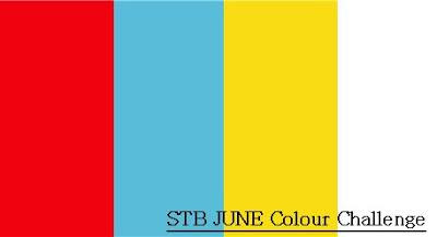
Hi everyone! Just popping in to share my take on this month's challenge at Scrap the Boys. This month there is a colour challenge happening which looks like this...


I love a good colour challenge, and I loved this one even more when I realised I could use the brand new 'You Rock' collection from Cocoa Vanilla Studio for my sample! #winning (Although I did put my own twist on it by adding in woodgrain - everything is better with woodgrain, right?)

Here is what I came up with...


I used the B side of the fabulous Plus One paper for my background. (I just can't go past a good woodgrain!) I decided to use a grid style design for my page, but didn't want it to be a traditional grid with even sized squares. Instead, I marked out the area of the page that represented my grid, and then set about finding pieces to fit inside it.


The first item I reached for when it came to filling my grid, was my photo. Once I had it placed where I wanted it to go, I then started with the cut apart paper from the collection (aptly named Random). There were lots of interesting pieces I could use, so I chose a couple of the bigger pieces and then worked my way down from there.


In addition to the cut apart paper, I also added some of Accessory Stickers, Chipboard Stickers and the brand new Washi Stickers to help fill the spaces. I then set about adding a little dimension to my design, by adhering some die cut ephemera pieces with foam tape; and also by adding some wood veneer pieces and rubber charms.


To finish off, I added some subtle splatters of white ink spray around my page.

I hope you will play along with us at Scrap the Boys this month. As always, we have a fabulous prize up for grabs for our winner, so make sure you get your entries linked up on the STB blog before the end of the month.

I will be back again soon with another project to share. Until then, happy scrapping! X

Friday, 2 June 2017

#go | Flutterby Designs

Hi everyone!
Popping in today to share my latest design team project for Flutterby Designs. This page actually began as something else and then evolved into this. (Tell me I am not the only one whose projects take on a mind of their own?)
So, I began this page playing with a selfie, some pink Dylusions paint and my Flutterby stash and this is what I ended up with...

"#go"

I actually went back and re-visited the 'No Excuses' collection for this page. I have been on a journey to lose weight and get healthier (inspired by the Flutterby boss lady herself), since October last year. It's important to remember to document your own stories, not just those of your kids or family members.


After my painted background was dry, I created a photo mat using a few 'No Excuses' filler cards, which I cut into various pieces and layered together. I also added in a paper doily from my stash and some messy cotton black cotton for texture.


This quote (cut from an Everyday Etc card), was the perfect partner for my photo and also serves as a good reminder to myself how much of this journey is a mental game.


I used the Blackboard Sticky Quotes to support my title. I love these stickers so much (there is also a different set available in white.)


Don't you love the page tab I tucked in behind my photo? It's from the coordinating 'No Excuses' sheet.


I also added one of the coordinating flair buttons (from set #408), which I layered on top of a Charms Creations star and some messy cotton thread.


To finish off my page I added a few neon enamel dots around my page, and some splatters of Colour Blast Colour Spray.

Thanks for stopping by so I could share this with you today. I will be back again soon with another project to share.
Until then, happy scrapping! X