Thursday, 28 December 2017

Best Buds | Colour Blast


Hi everyone!
I hope everyone had a fabulous Christmas with their friends and families!
Just popping in today to share my final Colour Blast design team project for the year. (I can hardly believe I am saying that - where did 2017 go?!) Today I have a mixed media scrapbook page to share that was actually inspired by one of my own pieces in my art journal. It features a photo of my boys and I created it using the new Colour Artist Inks; Black and White Heavy gessos; and a Colour Paste.


So, now to my process. To create my page I started with a sheet of white cardstock, which I stamped using Staz-On ink and a variety of background stamps that all featured circular designs from Viva Las VegaStamps and Darkroom Door.


Once I had all the stamping complete, it was time to start adding some colour. I used the new Colour Artist Inks, and I adore the vibrancy they add to my projects. To apply the inks, I simply painted them onto my page using a paintbrush in random colour blocks. The colours I used were Lime; Grass; Marine; and Oasis. I chose these shades, not only because they matched the photo I was using, but also because they were all from the same colour family and I knew they would blend well together.


After all the inks were down on the page, I spritzed a little extra water on to allow the colours to pool, spread and run further. I then allowed my page to dry before moving onto the next step.


The next step in my process involved stamping again. This time, I used some larger circle stamps from Prima to choose areas of my background I wanted to define and stamped some circles out (once again, using Staz-On ink).


The next step in my process was to block out the background surrounding my circles using Black Heavy Gesso. To do this, I simply painted the gesso onto the page using a paintbrush. I chose black because I wanted the intense colours amd the circular shapes to pop.


After the black gesso had dried thoroughly, it was time to add some highlights. This time I used Heavy White Gesso, which I applied around the outer edge on one side of each of my circles (kind of like a reverse shadow). I used my finger to apply the gesso because I like the look it gives, and the control I have over it; but if you are not one for dirty fingers, then by all means use a brush or sponge.


Again, I left my project to dry before returning to it; this time with a paint pen, which I used to define the edge of each circle. 


Now it was time to add some texture...and a bit of shimmer! I used some Sunshine Colour Paste to further enhance the white "shadows" on my circles, which I simply applied using a thin palette knife.


The next step was to address the space between and around my circles. I added lots of small spots using white paint pens. This gave my page that "galaxy" kind of look, and also lightened the page up a bit more. I also added a few small pieces of torn washi tape, just for some extra interest.


The final layer on my page before I added my photo, was to add some white die cut circles. (I used the recently released Scribble Circles die from Uniquely Creative.) These circles not only added an extra layer of visual interest, but they also helped draw the eye to the main focal point of my page, where my photo was going to go.


I then added my photo, which I had cut into a circle to fit inside one of the circles on my page.


Next, I added my title using a phrase sticker and some alphabet stickers from Cocoa Vanilla Studio; as well as some extra Cocoa Vanilla phrase stickers around my page.


To finish off my page, what else could I use but enamel dots? (Why ruin the circular theme now?) So I added some blue & lime dots randomly around my page and I was done.


Thanks for stopping by today so I could share this with you. I hope I have inspired you to try your own page using these techniques.
Before I go, I would just like to take the opportunity to thank everyone for their wonderful support this year. I love to create, and to know I am able to inspire or teach others with my work just makes it all the more worthwhile.
I will be back with lots to share in the new year! X

Monday, 18 December 2017

FA LA LA... forget it! | Flutterby Designs


Hi everyone!
Just popping in with my final design team share for Flutterby Designs for the year. And given we are creeping sooo close to Christmas; I figured I may as well get in the spirit by sharing a festive layout featuring the new 'Fair Dinkum Chrissy' collection. 
(There are still some kits available in store, you can check them out HERE)


I actually had a different layout planned for this share, but after capturing this hilarious shot of my kids with my niece and nephew the other day, I HAD to scrap it immediately!


To create this page I started by creating my watercolour background using my Flutter Colour Paints. I simply watered them down and then applied to the page with a brush. I used 'Bahama Blue' first, and then once that had dried, I applied some 'Tropicana Teal' over the top. I also added a few splatters of Colour Blast 'Mermaid' Colour Artist Ink, before setting it aside to dry.


Once dry, I took the new 'Song for Another Time' stencil, and used a sponge dauber to apply ink through it to various areas of my page. Then it was time to tackle the focal area of my page. 
I started with some of the 'Fair Dinkum Chrissy' Everyday Etc filler cards, which I cut and layered to form my photo mat. I also cut out a coordinating page tab, and added some messy cotton before mounting my photo on top. On either side of my photo I added the two blackboard speech bubble photo cut outs. (I love these, they are so fun to add to a page!)


Next, I took a couple of the cards from the 'Fair Dinkum Chrissy' Everyday Etc cards and fussy cut the Fa La La for my title from one of them, and the naughty list quote from another; then adhered them both to my page. I also used some of the Blackboard Sticky Alphas to complete my title. Just underneath the title I added the keeping shit real Black Tiny Sticky Quote.


Alongside my photo I added the super cute little santa flair button (from the 'Fair Dinkum Chrissy' set # 1); and then a couple of embellishments directly onto my photo - the organised chaos Blackboard Sticky Quote; and some small baubles that I fussy cut from the same card as the title.
To finish my page I stamped a few quotes using my Typo roller stamps, and also the date and I was done. I am happy with how this page came out, it makes me laugh!

Good luck for all your preparations (especially if you are braving the shops!) during this busy week.
Happy scrapping...and happy wrapping! X

Friday, 15 December 2017

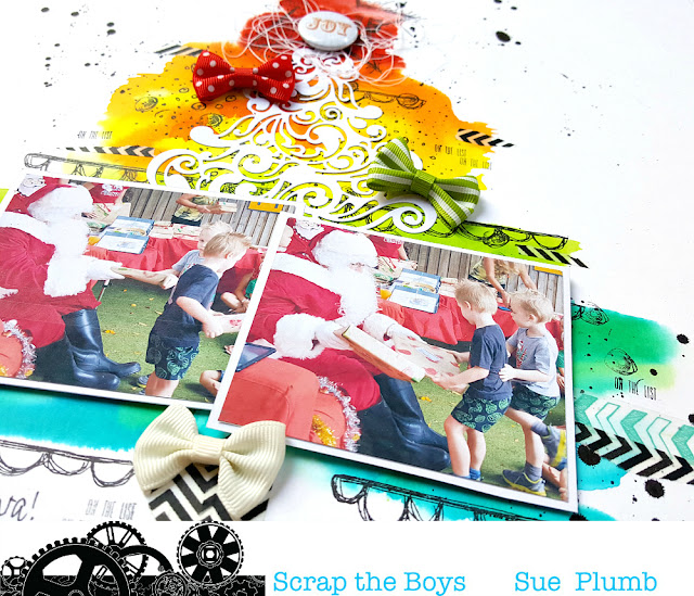
Joy | Scrap the Boys December Challenge


Hi everyone!
We are quickly creeping closer to the end of the year, so it's time for me to share my December design team layout for Scrap the Boys with you. This month's challenge is an inspirational image that looks like this...


I really loved the image, so I decided to take my inspiration from it quite literally and create my own interpretation. Here is what I came up with...


I took the opportunity to document a couple of photos of the boys getting their presents from Santa at last year's kindy Christmas party. 

I started my page by laying down the colour for my tree. I used the new Colour Artist Inks from Colour Blast, which are divine! I simply applied a small amount of water to my page, then added the ink in drops and blended it out with a brush. 


Once the ink had dried, I then added some details using stamps from Viva Las VegaStamps. My favourite 'Squiggly Star Collage' went on top of the tree; then I used the 'Doodle Frame' stamp to add some branch-like structure. Finally, I used the 'Doodle Dots' and 'Scribble Circles' stamps to add some "decorations" to my tree. 
I also added some splatters of 'Soot' Colour Artist Ink to my page to grunge it up a bit more.


Next, I took the 'Flourish Christmas Tree' die from Uniquely Creative (you can check out the fabulous range of dies and find a list of stockists on the Uniquely Creative website) and cut a white cardstock tree to lay over the top. (I love the way the vibrant ink colours showed through the intricate cut out sections!) I also added some torn pieces of washi tape to help add further structure to my tree. 


To finish off, I added some bows and a flair button - all of which were leftovers in my stash from the Cocoa Vanilla Studio 'Tis the Season' collection.

Thanks for stopping by today so I could share this with you. I know it'a a very busy time of year, but you have until the end of the month to get your entries in for this challenge and be in the running for a fabulous prize. You can link your entries up via the STB blog. Make sure you are also following the Facebook page and Instagram account for all the sponsor news and plenty of inspiration from the team and guests.
Til next time, happy scrapping! X

Sunday, 10 December 2017

These Are the Days | Cocoa Vanilla Studio


Hi everyone!
Time again to share another design team page with you - this one for Cocoa Vanilla Studio. At the moment, the CVS design team are currently challenged with creating a Christmas themed project that doesn't use a Christmas collection. 
I had heaps of fun going through my stash and collecting items from all different collections that I could use for my page.

"These Are the Days"

There are such a variety of collections used here, starting with that gorgeous wood grain paper from the 'Make a Wish' collection that I used for my background. (It is actually the B-side of the beautiful floral print Fresh Cut paper from MaW - don't you hate it when your two favourite prints from a range are back to back?! haha)


To create my design, I layered assorted papers from the 'You Rock'; 'Totally Rad'; and 'Colour Me Happy' collections to form a basic Christmas tree shape. I cut each piece to varying widths and overlapped them to add extra visual interest. The these are the days piece that formed the title in the centre of my tree was cut from one of the 'Colour Me Happy' Snip-Its sheets. 


I then began "decorating" my tree. I started with the 'You Rock' wood veneer star on top, then added the red stars that were fussy cut from the 'You Rock' Starshine paper. I also added the amazing and awesome wood veneer shapes (also from the 'You Rock' collection). Next, I added some phrase stickers that were from the 'Wild at Heart' Accessory Sticker sheet.


To further tie the wood theme into my page, I added a few Woodies (from the 'Hello Sunshine' collection) and the small love word from the 'Colour Me Happy' wood veneer words. I then livened up my tree by scattering some 'Colour Me Happy' Enamel Dots - Cool randomly around. 

To finish off my page, I used some of the new 'Bohemian Dream' clear stamps with navy ink to stamp some hearts and the love this sentiment around my page; before splattering a small amount of Colour Blast 'Marine' Colour Artist Ink around.
So there you have it - a Christmas themed page without a Christmas collection anywhere to be seen! (And I managed to include items from SEVEN different Cocoa Vanilla collections!)
Thanks for stopping by today. Until next time, happy scrapping! X

Thursday, 7 December 2017

Friends Like You | Colour Blast


Hi everyone!
Sue Plumb here today to share my latest Colour Blast design team project with you. Today I have a mixed media scrapbook page created using the new Colour Artist Inks; Colour Paste; some dies from Uniquely Creative; and a photo of my friends and I taken at a fancy dress birthday party a few months ago.


I started my page by laying down some colour using the Cranberry Colour Artist Ink. I used an old medicine dropper to add some drops of ink to my cardstock, then spread the ink using a wide brush and rough strokes. 


Next, I added wanted to add some contrast and depth to my background so I applied some Dusty Charcoal Colour Paste randomly around my page using a palette knife.


I then added further interest to my page by splattering a small amount of Soot Colour Artist Ink using a small, stiff bristled brush. (I love the fluidity of this ink for making splatters!)


Next, it was time to prepare some embellishments. I drew inspiration from the girls' feather headbands, and decided to use some of the new December release dies from Uniquely Creative to create my own feathers. After cutting some out from white cardstock, I used my Colour Artist Ink filled water brushes to colour them. I used two colours - Sunburnt and Slipper, and after the ink had dried I added some faux stitched detail using my Sharpie paint pen.


Next, it was time to construct my layout. I gathered together some papers, which I layered together to form my photo mat. On top of that I also added some frayed gauze for subtle texture before mounting my photo on top.


I used the die cut feathers to embellish around my photo, bending up some of the edges as I went to create extra dimension.


In addition to the feathers, I also used some tiny sticky quote phrase stickers and small heart stickers from Flutterby Designs which I placed around the page. For my title, I used a Project Life card, which I cut the words from.


Alongside my title, I added a handmade heart from Charms Creations, which I topped with some messy cotton thread and a flair button from Flutterby Designs.
I finished my page by adding some stamping and handwritten journaling.

Thanks for stopping by today so I could share this with you. I hope that some of you have already got your hands on some new Colour Artist Inks from one of the Colour Blast stockists (you can find a stockist list HERE) The inks are so much fun to use and the team love to see them, so pleas make sure you share your creations with us.

I will be back soon with another project to share. Until then, happy scrapping!

Tuesday, 5 December 2017

Hello Joy | Scrap the Girls December Challenge


Hi everyone!
We are certainly edging closer to Christmas, and what better way to get in the mood than with some seasonal scrapping? This year's final challenge at Scrap the Girls is called "Deer Santa" and it looks like this...


I was so inspired by this board with it's neutral tones and variety of textures; and I was only too happy to create a Christmas themed layout that deviated from the "traditional" Christmas colour palette. I took the opportunity to document one of our family moments from last year - my daughter being lifted up to place the star on the top of our tree. (And I also took the opportunity to stash-bust a few older supplies too!) 

"Hello Joy"

I started my page by laying down some very subtle colour using Colour Blast 'Midnight' Colour Shimmer Dust (which I diluted down to a lovely pale grey); which I brushed over the focal areas of my layout. I then used some of my fave stamps from Viva Las VegaStamps to reinforce my star theme and add depth to the same areas. I also added some pieces of torn washi tape (left over from my November kit from Uniquely Creative).


Next, I created my layered photo mat using a mix of paper pieces from the Cocoa Vanilla Studio 'You Rock' collection; plus some Crate Paper; and American Crafts. I also added in a piece cut from an old Kaisercraft acetate sheet; some netting and gold metallic thread for texture before mounting my photo on top.


After my photo was in place I added the Heidi Swapp acetate believe word along the bottom edge of it. Alongside the right edge of my photo I added a small Crate Paper chipboard frame, and a couple more Heidi Swapp acetate pieces. To the left of my photo I added some small phrase stickers from Cocoa Vanilla Studio.

For my title cluster at the top of the page, I repeated many of the same elements as the main focal area of the page - papers; washi tape; phrase sticker; and acetate star. The joy sticker was from Jillibean Soup.


To finish my page, I added some stamped phrases with one of my Typo roller stamps; then splattered about a little Colour Blast 'Road Base' and 'Bling' Colour Sprays.

Thanks for stopping by today so I could share my page with you. I hope you will play along with us at Scrap the Girls this month. Entries close on the 31st December and we have THREE prizes up for grabs! For our Aussie participants we have prizes on offer from D-lish Scraps and Corbett Creations; and for our International participants we have Accent Scrapbooking as our regular sponsor.
Til next time, happy scrapping! X 

Saturday, 2 December 2017

Rebel | Flutterby Designs


Hi everyone! Can you believe we are now into December?! Boy, has this year flown by!
Today I am kicking off my December design team shares with a cheeky layout I created for Flutterby Designs using the brand new 'We Run the World' collection. This range is a little sweet, a little sassy, and very pretty - just like all the girls it was inspired by, and created for. It really is gorgeous, and so fun to create with!

"Rebel"

Those who know me already know I like to push the boundaries; so it should be no surprise that I created a layout about "Vagina Shorts". (It is probably also highly likely that I am the first person to ever feature a #vaginashorts hashtag on a page! haha) But seriously, this page captures one of the essences of this collection - to do what makes you happy, and to hell with the rules!


I started my page by creating my background using the new 'Song for Another Time' stencil and some modelling paste. (You will see where the musical reference fits in later.) I then added some colour using Flutter Colour Paints - Cotton Candy Pink and Grape Soda. To apply, I sprayed some water on my page, then I watered the paint down and dabbed it on with a brush. (I sprayed a little more water in some places to allow the paint to run.) 


Once the paint had dried, I added a few splatters of Colour Blast 'Cranberry' Colour Artist Ink and some stamped phrases using a stamp from Viva Las VegaStamps. In between them, I popped a couple of the stickers from the Sticky Quotes sheet that supported my page theme.


I cut a piece of the gorgeous 'Frida' paper from the 12x12" paper pack as the base for my focal area. (The watercolour floral print on this paper is SO beautiful!) I also fussy cut a couple of the flowers to tuck along the edge of my photo mat. I then took some of the 'We Run the World' Everyday Etc filler cards and cut some pieces to add some extra layers behind; as well as one of the coordinating page tabs; then added some messy cotton thread before mounting my photos on top.


Then it was time to start adding all my embellishments. To the bottom left of my photos, I used the believe in your inner beyonce sticker from the Sticky Quotes sheet (I told you the musical reference would come); along with a small heart (that I added a touch of white paint to) from the coordinating Wood Veneer Bits. From the same set, I added the large rebel word as my title, along with another small heart nearby. Along the right side of my photos I added the this is who I am flair button; as well as the the rebel in me will never die quote that was cut from one of the Everyday Etc cards


Finally, I added my handwritten journaling (which explains everything on my page) and the word #vaginashorts above my title using some small clear alphas from my stash. A stamped date and a splatter of Colour Blast 'Stormy Weather' Colour Shimmer Spray and I was done. 

Thanks for stopping by today so I could share this with you. (I hope I have given you a bit of a giggle!) If you haven't shopped the new 'We Run the World' collection in the Flutterby store yet, you can find it in the What's New section HERE (But be quick, as some items have already sold out!)
Until next time, happy scrapping! X