Saturday, 29 January 2022

Hello Hair | August 2021 Hip Kit


Hi everyone,
I've got a fun mixed media layout to share today that was created just for ME! If you have been around for a while you would already know that mid last year I took the plunge and subscribed to Hip Kit Club's monthly scrapbook kit. Unfortunately, not long after that I had to pack all my craft supplies away and move house, and I haven't really had a chance to play with my kits since. So it was high time that I crack one open and get some creating done! I chose the August kit, which was a bright, fun kit full of a mix of different brands. I chose to document a series of photos of myself after a visit to the hairdresser last year.


I started my layout with a sheet of 300gsm cardstock and Mont Marte Dimension paint in Paynes Grey. I used my favourite Number 4 brush and the dry brush technique to add some background colour to the page. I then used floral stencil from StencilGirl (Rose Bouquet) and BeeArty Snow White Colour Paste to add some subtle detail over the top of the paint.


Next, I cut a large piece of one of the Hip Kit exclusive papers, choosing the B side for the beautiful orange colour and subtle pattern. (I always love a B side!) I distressed the edges of the paper using scissors (I was scrapping away from home and didn't have my distress tool with me) and then used my fingernail to ruffle it up a bit more. I used another of the Hip Kit papers featuring a black and white sketchy style floral pattern to add a piece above and below the orange paper. I tore along the edges of each strip to add texture. On top of the papers I added a dark grey paper doily and some frayed gauze and before placing my photos on top.


When it came to the embellishments I actually found myself a little challenged. Most of the embellishments were either the wrong colour for the palette I had chosen (I didn't really think it through before I started), or didn't fit with the theme of my page. In the end I chose the Floral Study paper by Vicki Boutin, and fussy cut several flowers from it to use as my main embellishments and tucked them in around my photos.


I chose the word smile from the Amy Tan Thickers in the kit which matched well with the pops of red from the roses on my jacket. I also found a few small pieces in the Simple Stories ephemera pack that matched with the warm tones I was using and added them to the page.


Luckily, the Simple Stories foam alphas in the kit were the perfect match for the main paper I had chosen, so I used them in my title. I finished off my layout with some of the Prima crystals; handwritten journalling; some stamped phrases; and tiny red splatters using Barn Door Distress Oxide.

Overall I was happy with how the layout turned out, but I would probably think more carefully about how my choice of colours / photos will work with the kit before I dive in next time. Oh well.

If you would like to watch how I put this layout together, I have a video available on my YouTube channel here:


If you have any questions, feel free to leave them in the comments section of my video, here on my blog post, or connect with me via my Facebook page
Until next time, happy scrapping! X

Friday, 21 January 2022

Disco Day | Cocoa Vanilla Studio


Hi everyone, popping in today to share my latest Cocoa Vanilla Studio design team project with you. For this one I decided to pull out my supplies of the beautiful 'These Days' collection as I still have plenty in my stash left to play with and was dying to use it again. I also had a sweet photo of my boys together that I took last year when they were heading off to their first school disco. Although they might be twins, you can see that they are very different and both have their own individual styles, which I thought was summed up quite well in this shot.


Despite the fact this range has quite a broad palette of soft colours, I decided to focus on predominantly the blue and green tones combined with the wood grain for my background. Before I moved onto my papery layers however, I really wanted to add some depth to the background by adding some paint and stamping. I used a white Mont Marte paint applied with a brayer, which also helped me to define the focal area of my page. Over the top of the paint, I used a brick pattern stamp from Viva Las VegaStamps with a grey ink.


For the papery layers over my background, I used a few papers from the A5 Paper Stack which I cut and tore to size. I also added a grey paper doily from my stash, a strip from the cut apart paper, and some frayed gauze for texture. My photo also had some scrap cardboard adhered to the back of it to help pop it up from the page.


For my embellishments, I started with the Die Cut Ephemera pack. I chose a doodled frame first, which I cut in half and tucked half in under the right edge of my photo. I often use frames in this way (cut into pieces and tucked into layers) as opposed to the way they were designed to be used. I also chose the stack of books from the ephemera pack as I thought this worked well with the fact it was a school disco the boys attended.


I used the gorgeous Mini Puffy Alpha stickers for my title, as I didn't want to detract from all the delicate elements I had on the page. I love these alphas sooo much, they are a perfect size and such a pretty mix of colours. Along with the puffy alphas, I also added some of the Puffy Stickers to my page - a heart, a flower and a butterfly (because you can never have too many butterflies!)


There were plenty of regular Accessory Stickers on this page too - you can see how I used the tab and flag amongst the cascade of embellishments alongside my photo, and there were several phrase stickers used as well. From the Clear Stickers sheet I used three small clusters of crosses and a green brush stroke. This coordinated beautifully with the green Epoxy Wood Button that I also included.


I finished off my layout with handwritten journalling; stamped phrases and date; and some black stamped doodled circles and dots (stamp from Viva Las VegaStamps).

I have a process video available for this layout. If you would like to see how it came together you can watch it here:


Thanks so much for stopping by today so I could share this with you. Until next time, happy scrapping! X

Friday, 14 January 2022

Colour Run | Cocoa Vanilla Studio


Hi everyone, today I have a quick share for you and yes, it's another pocket page. As I mentioned in a previous post, I have been making a concerted effort lately to ensure that each time I create a layout, that I also create an accompanying pocket page to go with it. This small amount of extra time is helping me get more photos and details documented for my family, and also use up some extra stash too.

The last layout I shared here was a mixed media page I created for Cocoa Vanilla Studio using the 'Sunkissed' collection, so of course today's page also features the same collection and documents some extra photos and details about my sons' colour run at school. 


Thankfully, this collection features a pack of Pocket Cards, which makes creating these pages so much easier! I used three different 3x4" cards on this page - one with the look on the bright side quote, and two journalling cards that I typed onto. 


For my title card, I used a piece of the Feelin' Fine patterned paper that I had cut down to 6x4" as the base. I used some old Cocoa Vanilla alphas from my stash for the word colour (the same ones I used on my previous layout). I then added the word fun that was fussy cut from a Die Cut Ephemera piece; and the word run which was created with a couple of hand cut letters, an upside down fussy cut rainbow and a white pen. A die cut sun and a clear sticker finished the card off. 


As with most of my projects, I couldn't help myself but embellish the photos directly and I also added some extra little details to my cards. I used a mix of Accessory Stickers, Clear Stickers and Puffy Stickers - all perfect for this style of page as they fit easily into the sleeves.


That's all from me for today, thanks for stopping by! If you have any questions, or if there is anything you would like to see me do over on my YouTube channel, I always welcome your suggestions and feedback.
Until next time, happy scrapping! X

Friday, 7 January 2022

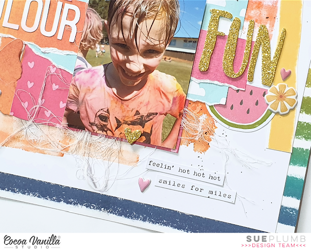
Colour Fun | Cocoa Vanilla Studio


Hi everyone and happy new year!
Today I am here to share my latest design team project created for Cocoa Vanilla Studio. This layout was created specifically for the Throwback Thursday feature, where a design team member is tasked with creating something new from an older collection. I chose the beautiful 'Sunkissed' collection that was released approximately a year ago, and features lots of vibrant colours - right up my alley!

For this layout, I wanted to create a mixed media page and decided to use some of my stash of acrylic paint. I love using paint because it is quick, easy, economical, and available in a great range of colours. And even those of you who are not “mixed media people” will usually have access to paint if you want try a technique like this yourself. (I didn’t use any fancy paints – cheap student grade acrylics will do the job!)


The photos I documented on this page are of my two boys taken on the day of their colour run at school. This was not long after they had crossed the finish line and they were both so proud of how wet and coloured they were. (And no, I didn’t bother trying to wash the clothes, they were destined for the bin anyway.) It was the colours of the paint on their clothes that inspired my colour choices for this layout.


As I mentioned above, I used acrylic paint for my mixed media background on this page. I used three different colours which I applied with a small brayer. (This method is great if you are short on time as the thin application means it dries super fast!) I then mounted my painted cardstock on top of the beautiful Good Vibrations striped paper, which created a fun page border.


Next, I added my rainbow arches, which had been fussy cut from a piece of the Bright Side paper left over from a previous project. I cut only the pink, orange and yellow arches (or what I had of them anyway) and stuck them onto my background.

I then created a layered mat for my photos to sit on using a piece of the heart print Feelin’ Fine paper, topped with a piece of the smaller scale cloud print paper from the A5 Paper Stack and finally a scrap of the Summer Lights paper. I also added a small yellow paper doily and some frayed gauze for texture before adding my photos on top.


The next step was to add my title, which I ran along the horizontal strip in my paper stack. To the left of my photos I used some alphabet stickers I had left over from the 'Love Always' collection for the word colour and then to the right, I used the word fun from the Glitter Foam Title Stickers. Look at that gorgeous golden sparkle!


With all the main components in place, it was time to add a few fun embellishments. I chose a number of pieces from the Die Cut Ephemera pack including a flag, umbrella, and a watermelon slice. These were chosen purely based on their colour, but I love that they add a touch of whimsy to the page. I also added several stickers from the Puffy Stickers pack.


I finished off with some phrases from the Accessory Sticker sheet and some tiny black ink splatters. I love how fun and colourful this layout turned out!

If you would like to see exactly how it came together, you can watch my process video here:


Thanks for stopping by so I could share this with you, I hope you are feeling inspired to bust out some of your older Cocoa Vanilla stash now too! Until next time, happy scrapping! X