Hi everyone!
I promised I would be back again soon, and it seems I have some catching up to do! Today I am sharing a project I created for the StencilGirl® Creative Team last year. For this one, the team were challenged with "Gift It or Grid It", so I decided to go with "Grid It" and create a scrapbook layout. Grid designs are often used in scrapbooking, and are particularly effective when creating layouts that feature a lot of photos, as it provides structure and prevents the page from looking too cluttered.
With my daughter just started high school this week, it's an appropriate time to share this scrapbook layout documenting all her "first day of school" photos from each of her seven years at primary school. It's such a lovely way to reflect on how much she has grown.
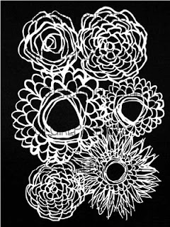
Because I knew I was going to be using a grid design for my photo placement, I wanted to created a background with less structure to contrast against the squares of the photos. As purpose of the layout was to document my daughter's growth, I decided a floral pattern would be perfect so I chose the Deconstructed Floral Bouquet stencil designed by Traci Bautista. As it didn't entirely fill my 12x12" cardstock, I also used the Deconstructed Zinnia and the Deconstructed Double Zinna to fill the remaining space (both also designed by Traci).
I used three Distress Oxide ink pads (Spun Sugar, Tumbled Glass and Squeezed Lemonade) and some small make up sponges to dab the inks onto the page through the masks. (I chose a mix of colours that would also blend to create other colours on the page.) Once the page was completely covered, I lifted the masks to reveal the background.
I then used the Numbers stencil (designed by Seth Apter) to add the numbers 1-6 on my background in a few different places using Lovely Lilac Distress Oxide and another sponge.
I then repeated the process with the smaller row of numbers from the same stencil.
Once my background was complete, it was time to set out my grid placement for my photos. I used squares of patterned paper (this one is from the Cocoa Vanilla Studio 'More Than Words' collection) as a mat for each photo. I used a small dab of liquid adhesive to hold each square in place.
I then added some scrap cardboard to the back of each photo (to help pop them up from the page) before sticking them down on top of the paper squares.
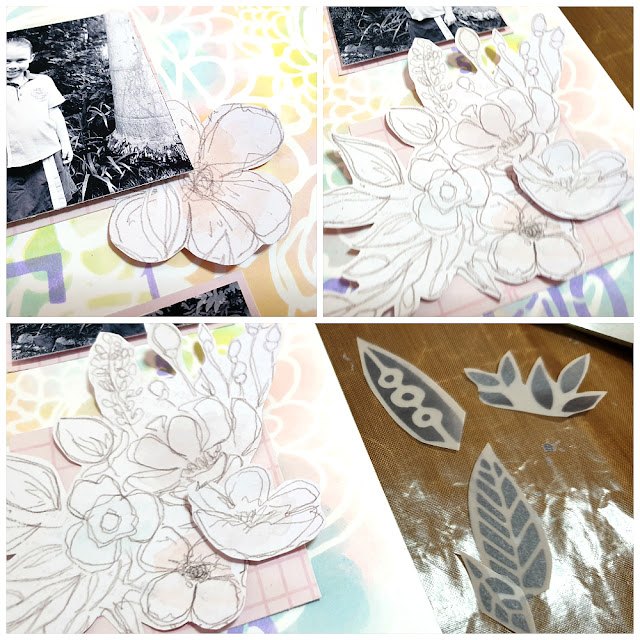
With my photos all in place, it was then time to embellish my layout. I chose another paper from the Cocoa Vanilla Studio 'More Than Words' collection, this time it was one that featured some beautiful sketched flowers and fussy cut several pieces that I tucked in around some of my photos.
I wanted some leaves to go along with the flowers, so I used the Leafy Doodle Border stencil (designed by Valerie Sjodin) and some black ink to stencil some flowers onto a sheet of vellum. I love the sectioned design of this stencil as it means it can be used in a number of different ways.
Once the ink had dried (it takes slightly longer on vellum) I fussy cut a number of them, then added them in with the flowers on the page.
For my layout title, I used some Cocoa Vanilla Studio foam title stickers, which I placed in the middle section of my grid. I love the way the bold black ties in with the photos and the stencilled leaves; providing contrast against the pastel colours of the background.
I was so happy with how this layout turned out, and the way the theme inspired me to capture these memories of my daughter's progression through primary school. I hope I have inspired you to get some supplies out and get creative too.
Here's a linked list of all the stencils I used in my project:
Thanks for stopping by so I could share this with you. Until next time, happy creating! X


No comments:
Post a Comment