Saturday, 24 September 2016

Sweetheart | Flutterby Designs

Hi Flutterby peeps!
Sue Plumb here with you sharing my latest work for Flutterby Designs. Today I have a layout to share with you featuring a (fairly typical) photo of my partner and I. (Rarely can the man have a "normal" photo with me without some sort of silly face, but hey, that's him...and I love him anyway!)

"Sweetheart"

For this layout I started with a sheet of patterned paper from the Cocoa Vanilla Studio "Colour Me Happy" collection. I opted to use this dark grey, as I want it to help my colours "pop". On top of the patterned paper, I created a mat for my photo using a selection of Everyday Etc cards. (I love the variety of patterns and colours that can be found in the filler card packs, and I also love the fact that they are always exactly the right shades to coordinate with all my other Flutterby goodies!) I also added some Photo Cut out frames to my layers, for some extra visual interest and depth.


Once I had my base layers in place, I used the "I {heart} you" stencil from the Mini Stencil set and a white gel pen to add some doodled hearts to my background. I then proceeded to drizzle it all with some white Flutter Colour paint.


Whilst my paint was drying, I added some embellishments directly onto my photo - the wood veneer sweetheart word and heart, which were coloured using my Posca pen; and the flair button (from set #249), which I nested on some messy cotton thread. I then fixed my photo in place and proceeded to embellish the rest of my layout.


Above my photo I added a couple of Page Tabs; and to the left of my photo I added a Photo Cut Out tab (from the "Bright Directions Tabs 3" sheet.) I also added some Snippet Strips and bold Enamel Dots around my page.


To finish off, I added a quote from a "Happy Together" Everyday Etc card, which I cut into strips to apply; and then I added some Rainbow Heart stickers randomly across my page.

Thanks for stopping by today so I could share this with you. I will be back soon with another project to share.
Until then, happy scrapping! X

Thursday, 22 September 2016

Love You | Cocoa Vanilla Studio

Hi everyone!
I am here today to share my latest layout using the beautiful Love Always collection from Cocoa Vanilla Studio. This layout is very special to me, as I actually created it as a wedding gift recently for my brother in law and his beautiful bride. (I can't tell you how nervous I was creating an actual wedding present!)


To create this layout I started with a beautiful black and white photo of the bride and groom and a sheet of the Note to Self script paper; to which I added a small piece from the reverse side and also pieces of the Twin Set striped paper (both sides). I also added some machine stitching to add some subtle texture, and help draw the eye down into the photo.


To help define my photo and make it "pop" from the background, I created a layered photo mat using more of the Note to Self (reverse side) and Bouquet papers; as well as a paper doily. On top of that I added a chipboard accent sticker frame (which I cut in half and placed either side of my photo).


For my title I used one of the wood veneer pieces, which I painted using my Posca pen, and I also added a small wood veneer heart (also altered with the pen). The title was enhanced using a couple of floral vellum accent pieces.


To the bottom right of my photo, I created my large embellishment cluster using the large geo heart wood veneer piece as the focal point. This was also painted using my Posca pen; and was clustered together with more of the vellum accent pieces. On top of the heart I added a flair button, which I nested on some messy cotton thread and one of the gorgeous bitty blooms.

Along the bottom of my layout I added the quote from the Lovely Things cut apart paper; and created a mini cluster using a chipboard sticker, die cut ephemera heart and a Sparkles - glitter enamel dot.


To balance my layout I added a second cluster to the left of my photo; layering together more of the chipboard stickers and adding another small painted wood veneer heart and some glitter enamel dots. I also embellished directly onto my photo using a die cut ephemera phrase and one of the tiny word stickers from the Accessory Sticker sheet. Tucked beneath the edge of the photo is one of the super cute puffy stickers.

I am so happy with how this layout came out, and very pleased to report that my gift was well received by the happy couple.
Here is a peek of how it looked in the frame...


That's all from me today. I will be back again soon with another project to share with you.
Until then, happy scrapping! X

Tuesday, 20 September 2016

D-lish Scraps September (and final) Projects!

Hi D-lish fans!
Just popping in today to share with you my September projects. These projects also mark my final ones of a member of the D-lish Scraps design team. It has been an absolute pleasure being part of this team for the past 18 months, but I felt it was time for me to step aside and allow Amanda to get some "fresh blood" onto the team.
During my time at D-lish I have had the privilege of working alongside an amazing team of ladies, not least of all the lovely Amanda herself. I will always be grateful for the opportunity to have been part of the team and represent a store I truly believe in. And I have also gained an incredible group of creative friends, and I think that is the greatest reward.

Having said that, I couldn't go past scrapping this special photo of some of the D-lish girls and myself at retreat back in July as my final project...

"Smile"

I used Crate Paper patterned papers as the basis for this layout, and lots of my favourite D-lish Scraps embellishments.


I created a layered mat for my photo using a mix of papers; a lace paper doily; and a grey grid bitty bag. Tucked into my layers was also one of the new wood veneer square mini frames.


I used lots of wood veneer pieces on this layout, including a printed veneer butterfly;  a veneer scalloped frame (from the special release Just Add Paper kit last month); and an ampersand and tiny butterfly (from another previously released JAP kit).


I layered my scalloped veneer frame on top of a dove grey paper doily; and then popped a flair button (also from a previous JAP kit) on top. I completed my cluster with a couple of resin flowers.


On the other side of my photo I created a complimentary cluster that also featured the same resin flowers; a wood veneer heart; a dip dye printed tag that I tied with twine; and a layered die cut journal piece (from a previous JAP kit).


I couldn't finish with anything other than a Corbett Creations wood veneer word for my title, I just love these so much! Then some simple stamping; printed journaling and a few flicks of gold mist.


My second to last project was this mixed media one, featuring a photo of  "my moles" and I...

"Happy Hour"

As this was such a "happy" subject and photo, I decided to draw on the yellow (the colour of happiness) from the straws in the photo and go with it as my dominant colour for this layout. I kept the rest of the palette to neutral white and a touch of grey, to allow the yellow to "pop".
My background was created using Colour Blast Shimmer Spray, and then Dylusions acrylic paint through a Dusty Attic 'Distressed Grid' stencil over the top.


I created a mat under my photo using a white lace paper doily; yellow tissue paper (from a previous Just Add Paper kit); and yellow hand-dyed muslin. I also used one of my favourite multi scallop wood veneer frames, (which I coloured with a yellow Posca pen) to add some extra depth and interest under my photo; along with a Journal It's date tab.


To go with my cocktail theme, I added a paper straw from my stash, which I enhanced with the gorgeous yellow felt bow (from last month's Just Add Paper kit). Alongside my photo I tucked in a journal spot from the same kit, on top of which I layered a flair button and some messy cotton thread.


For my title, I again used a Corbett Creations wood veneer happy word, along with some Cocoa Vanilla Studio alpha stickers. Simple handwritten journaling; a few sequins (which I cut from a strand and adhered individually) and some stamped phrases in grey ink and my layout was complete.


My other September project was this layout I created which was based on this month's 'Berry Blast' Inspiration Board Challenge...

"Family"

I started my layout with a sheet of Cocoa Vanilla Studio patterned paper as a base to frame my layout, and then used some white cardstock to create a custom mixed media background. I first used some Bubblegum Colour Blast Colour Spray; then added some Envy Colour Blast Colour Paste through my Dusty Attic 'Crosshatch' stencil. After that I added some stamping using grey Staz On ink and stamps from Viva Las Vegastamps.


Most of my embellishments on this layout came from this month's coordinating 'Berry Blast' Just Add Paper kit. I started by mounting my photo on top of some layers - including the heart shaped paper doily and some tissue paper from the current kit; as well as some more patterned paper and a piece of a heart die cut (from a previous kit).


I then selected the embellishments from the kit I wanted to use and formed clusters surrounding my photo. I liked the interesting contrast the combination of paper flowersresin flowers and the fabric Tutu bloom provided when grouped together, not only through material, but also size and colour. I also used the resin birds from the kit, and the glitter resin dots. (Because who doesn't love a bit of sparkle, right?)


To help tie the teal colour into my layout more, I used a Corbett Creations family wood veneer which I painted with the same Colour Blast Colour Paste I had used on my background. I love the shiny, textured appearance it gives. To finish my layout, I added a flair button from the kit, which I mounted on some messy cotton thread; and then scattered around a few D-lish Dots enamels.


That's all from me. Thank you to everyone for all your encouraging comments and feedback on my D-lish Scraps work over the past 18 months. I do hope I have managed to inspire you somewhere along the way!
Until next time, happy scrapping! X

Monday, 12 September 2016

Post Expo Monday | Flutterby Designs

Hi everyone!
I hope this finds you well, I am sick with flu here today. (Horrible!)
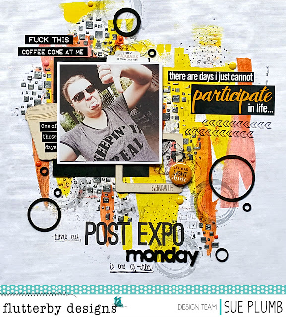
Anyway, just wanted to pop in and share my latest Flutterby Designs project with you. For this layout I decided to scrap a selfie I took at home the day after the Brisbane Scrapbook and Papercraft Expo ended back in June. After spending 4 awesome (but exhausting) days surrounded by "my people", this photo pretty much summed up how I was feeling that Monday morning.

'Post Expo Monday'

I started my layout by creating a mixed media background on some white cardstock. First, I used 3 different colours of the Flutter Colour paints, which I swiped on using an old credit card. Next, I applied some Colour Blast 'Stormy Weather' Shimmer Spray, which I applied lightly using some plastic packaging to some of the white areas of the background. I then used the 'Confetti Cubes' stencil from the Mini Stencils set to add some Colour Blast 'Steel' Colour Paste to my page. Finally, for a little extra extra depth I added some stamping, using my Viva Las Vegastamps with both black and grey Staz On inks.


For my layout design, I started by using one of the Everyday Etc 'No Excuses' filler cards as a mat for my photo. I then tucked a 'One of Those Days' page tabs in behind my photo, along with some messy cotton thread. Above my photo I added a couple of the 'Blackboard' Sticky Quotes (one of which features my absolute favourite "sentence enhancer", hehe) and alongside my photo I used the coffee cup wood veneer, which I added a Snippet Strip to, that I had cut into smaller pieces.


The large quote on my layout came from a 'One of Those Days' Everyday Etc cards, that I cut into pieces. I also used the super cute 'Everyday Life' wood veneer Insta Frame, which I tucked under the edge of my photo, and then layered it with some more messy thread and a flair button (from the new set #420) on top.


The monday in my title was from the 'Weekdays' wood veneer pack and I coloured it black using my trusty Posca pen. I also coloured some of my favourite 'Circles' wood veneer pieces the same way and scattered them around my page, along with some coordinating bold enamel dots.

Thanks for stopping by today, if you haven't already joined the Flutterby Inspiration HQ group on Facebook then make sure you do! We love to see your layouts featuring your favourite "sentence enhancers" too, so don't be shy! ;)
Til next time, happy scrapping! X

Thursday, 8 September 2016

Smile, Make a Wish & Celebrate You | Cocoa Vanilla Studio

Hi everyone!
Just popping in today to share my latest layout using the absolutely gorgeous Make a Wish collection from Cocoa Vanilla Studio. There is just so much to love about this collection, but the stand out piece for me is the stunning 'Fresh Cut' watercolour floral paper. It's so beautiful!
Given that this is a birthday themed collection, I couldn't resist scrapping a birthday photo of my little miss, although the layout I created could have worked equally well for a non-birthday picture too.


I first wanted to create a contrasting space to place my photo and embellishments, so I cut a piece from the B-side of the 'Party Dots' paper and stitched it in place on top of my base paper, leaving a wide border so plenty of the floral print could still be seen. I also rubbed a little gesso on where I knew my embellishments were going to be.


I then created a layered mat for my photo using more of the 'Fresh Cut' paper, and also both sides of the 'Daydream' paper. The word smile came from the 'Party Mix' cut apart paper and I used it as part of my title. I indicated the start of my title using the sweet floral print arrow from the chipboard sticker sheet, and used the chipboard make a wish as the second part of my title. (I love combining different elements to create titles.)


With the use of that gorgeous paper, I decided to go "full floral" and use the coordinating die cut ephemera and vellum accent pieces from the range. I layered them together and created dimension by popping some up using foam tape. I also folded the leaves up away from the page, just as I did with the butterfly wings.


I love the dimension the chipboard stickers add to a page too. You can see how I used one of the frames under my photo to help accentuate it. I simply cut the frame in half and tucked it behind each side of my photo. I then highlighted my photo further by adding two chipboard photo corners. A few blue Sparkles enamel dots helped add some small pops of contrast to my page too.


Thanks for stopping by today so I could share this with you.
Be sure to stay connected to the Cocoa Vanilla Studio blog; Facebook page; Instagram account and the Community group to keep up with all the latest Cocoa Vanilla news, inspiration and events.
Til next time, happy scrapping! X

Saturday, 3 September 2016

My Heroes | Show Us Your Stuff September Challenge

Hi again everyone!
Back today with another design team layout to share, this time for Show Us Your Stuff. This month's challenge is to use a sketch designed by Krisy Podolak, and to also include some mixed media. And as always, your project also needs to include a handmade embellishment.

Here is Krisy's sketch...


And here is what I created...

"My Heroes"

I just love this photo I snapped of my cheeky boys wearing their new "super hero" shirts with capes they got for their birthday; putting on their best tough faces.


I used a sheet of patterned paper from the Cocoa Vanilla Studio 'Made of Awesome' collection as the base for my layout. My mixed media background was created using a mix of Colour Blast 'Road Base' Colour Shimmer Spray; some of my new Viva Las VegaStamps and then topped off with some red Flutterby Designs Flutter Colour paint. I also added some small pieces of torn washi tape from D-lish Scraps.


My feature handmade embellishment was this cool flair button from Flutterby Designs, which I nested on some messy black cotton thread. (And how freakin' awesome is that cool drippy slime stamp too?)


I kept my embellishments relatively simple, as I didn't want to overwhelm the effect of the background. I used some die cut ephemera pieces, wood veneer, stickers, vellum stars and enamel dots - all from Cocoa Vanilla Studio.


The tiny alphas I used for my title were also from Cocoa Vanilla. I deliberately chose them so they would blend in with my layout, rather than stand out. Finally, I added some black splatters and some stamping and I was done.

I really enjoyed creating this layout! It was a great sketch to work with and perfect timing to give my new Viva Las VegaStamps a run. 

If you would like to join in with this month's challenge, you have until the end of the month to get your project linked up via the SUYS blog. Up for grabs for this month's winner is a fabulous prize pack from Krisy herself. In the meantime, make sure you support Krisy by popping over to her Popleopod blog and her popleopod Instagram to see her awesome projects and find links to her process videos too. 

Til next time, happy scrapping! X

Thursday, 1 September 2016

When Good Selfies Go Rad | Scrap the Boys September Challenge

Hi everyone! First of the month = happy day! Not only for all the new scrappy challenges that are released, but it's also the first day of spring here in Australia - hooray! Spring is definitely my favourite season.

The first layout I have to share with you this month is my design team layout for Scrap the Boys. I created this one when I was away on retreat and it features some selfies of my boys and I.

"When Good Selfies Go Rad"

I used the Cocoa Vanilla Studio 'Totally Rad' collection for this layout (seriously, I just don't tire of this amazing boy collection!)


I actually used up some of my scraps for this layout - layering together some of the patterned paper pieces I had left over from previous projects on top of the 'Stellar' paper with its fabulous wood grain print. (I am such a sucker for a good wood grain!) 


I embellished my layout using die cut ephemera pieces; stickers; wood veneer; a flair button; woodies; and enamel shapes all from the Totally Rad collection. The white alphabet stickers are actually from the Colour Me Happy collection.


(I love a title that's a good play on words! haha)


So, why am I in the photos when this layout was created for Scrap the Boys you might ask? Well that's because this month the challenge requires for YOU to be in the photo too! It doesn't have to be you with your son - it could be your husband / brother / father / friend, even the milkman if that's what you want! haha
Here is the challenge graphic to inspire you...


You have until the end of the month to get your layout created and link it up via the STB blog. This month there are two fabulous prizes including a 2Crafty Chipboard prize packs and a Snap! brand prize pack. 
So what are you waiting for? Get scrapping! X